How to Select Rendering Styles: A Guide for Architects
How to Select Rendering Styles: A Guide for Architects
Match the render style to the decision you need the image to drive. Exploratory phases call for stylized or illustrative outputs; spatial validation calls for white-model or diagrammatic views; client sign-off and marketing call for photorealism. Get that sequence right, and your visualization budget works harder at every stage.
Quick phase-to-style map:
- Concept / schematic design: Watercolor, sketch, or illustrative renders. They invite feedback on massing and spatial intent without locking anyone into finishes.
- Design development / approvals: White-model, clay, or ambient-occlusion views. Clean geometry, no material distractions, easy for planning committees and technical reviewers.
- Pre-sales / marketing: Photorealistic hero images, 3D walkthroughs, and VR experiences. Buyers and investors need to feel the space before they commit.
The hybrid approach is the professional standard. No single style serves every stakeholder. Build a rendering escalation plan into your project scope: start with stylized concepts, progress to schematic visuals, and release photorealistic images only when major design decisions are frozen. This keeps revision costs down and conversations focused on the right things at the right time.
Table of Contents
- How rendering styles work as visual languages
- What are the common rendering styles and when should you use each?
- How do you choose the right rendering style for a specific deliverable?
- What technical settings actually define a rendering style?
- How should you sequence images to tell a coherent project story?
- How does Rendimension approach style selection in real projects?
- When should you standardize styles across a project, and when should you not?
- Key Takeaways
- The case for choosing styles with intention
- Rendimension’s visualization services for architects and developers
- Useful sources
- FAQ
How rendering styles work as visual languages
Every rendering style sends a signal before the viewer reads a single caption. Photorealism says this is decided. A loose watercolor wash says this is still open. A white clay model says look at the geometry, not the finishes. Choosing the wrong style for the moment is like presenting a contract when you meant to start a conversation.
The primary split in architectural rendering styles falls across three categories:
- Photorealistic: Real-world lighting, accurate materials, shallow depth of field, and populated scenes. Builds trust and closes deals. Best reserved for confirmed designs.
- Stylized / illustrative: Watercolor, ink sketch, collage, and hand-drawn illustration. Signals exploration, reduces client fixation on surface finishes, and keeps early conversations about massing and flow.
- Technical / diagrammatic: White model, clay render, ambient occlusion, and schematic diagrams. Communicates geometry and spatial relationships without material noise. The preferred language for planning submissions, structural reviewers, and design-team coordination.
The professional move is to treat these three categories as a sequence, not a menu. A rendering escalation plan built into your project proposal sets stakeholder expectations, prevents scope creep, and gives every image a defined purpose. Clients who understand why they’re seeing a sketch at week two and a photorealistic hero at week ten rarely push back on the process.
One nuance worth naming: audience visual literacy shapes which category lands well. Design-literate clients, developers, architects, planning professionals, decode diagrammatic and stylized visuals without much coaching. Residential homeowners and marketing teams often need photorealism to engage meaningfully, because they lack the spatial vocabulary to read a white-model render as a finished space.

What are the common rendering styles and when should you use each?
The table below maps each major style to the project phase, primary audience, and key trade-offs. Use it as a quick reference when scoping deliverables or reviewing a vendor proposal.
| Style | Best project phase | Primary audience | Strengths | Limitations |
|---|---|---|---|---|
| Photorealistic | Pre-sales, marketing, final approval | Buyers, investors, marketing teams | Builds trust; closes sales; communicates finishes and atmosphere | Expensive to revise; locks in material choices; premature use fixates clients on details |
| Watercolor / illustrative | Concept, schematic | Design-literate clients, competition juries | Invites feedback; keeps focus on massing; fast to produce | Can feel vague to non-design audiences; not suitable for planning submissions |
| Ink sketch / line drawing | Concept, early schematic | Internal design team, design-literate clients | Communicates intent quickly; low cost | Requires viewer to “read” the drawing; limited marketing value |
| Collage / mixed media | Concept, competition boards | Juries, design-literate clients | Distinctive aesthetic; strong for branding | Niche appeal; not universally understood |
| White model / clay | Design development, coordination | Planning committees, engineers, internal team | Neutral; geometry-focused; easy to compare options | No material or atmosphere information |
| Ambient occlusion / technical | Design development, documentation | Technical reviewers, engineers | Shows depth and form clearly; fast to produce | Minimal visual appeal for non-technical audiences |
| Schematic / diagrammatic | All phases for analysis | Planning, zoning, engineering | Communicates data (circulation, zoning, sun path) | Not suitable for marketing or client presentations |
| VR / 360 / walkthrough | Late design development, marketing | Buyers, investors, planning boards | Immersive; spatial understanding without site visit | Higher production cost; requires hardware or web delivery |
| 3D animation | Marketing, pre-sales | Buyers, investors, media | Tells a story; highest engagement | Most expensive; long production time |
Visual cues that identify each style at a glance:
- Photorealistic: Shallow depth of field, real material textures, populated with people and furniture, golden-hour or overcast sky lighting.
- Watercolor / illustrative: Visible brushwork or linework, washes of color, white paper showing through, soft edges.
- White model / clay: Uniform matte surface, no textures, strong directional light casting clear shadows.
- Ambient occlusion: Grayscale, soft contact shadows, no color or material information.
- VR / 360: Equirectangular projection or interactive viewer, full 360-degree field of view.
Brief tip for each style: For photorealistic outputs, specify the time of day, season, and whether the scene should be populated. For stylized outputs, share a reference image and confirm the vendor won’t add photorealistic elements mid-process. For white-model views, agree on camera angles before production starts, geometry-only renders are fast to produce but tedious to reframe.
Photorealistic renders build trust and sell final designs; stylized renders facilitate idea exploration and early approvals. Both belong in a well-scoped project.

How do you choose the right rendering style for a specific deliverable?
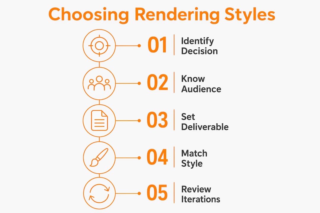
Start with five questions. Answer them in order, and the right style usually becomes obvious.
The decision checklist:
- What decision must this image drive? Exploration, spatial validation, planning approval, investor buy-in, or public marketing? Each maps to a different style category.
- Who is the primary audience? Design professionals, planning committees, residential buyers, or investors? Match visual complexity to their literacy level.
- What is the image’s afterlife? Will it appear on a billboard, a planning submission, a social media post, or an investor deck? The afterlife determines resolution, format, and stylistic register.
- What is the revision cadence? If the design is still moving, invest in stylized or diagrammatic outputs. Photorealistic renders are expensive to revise, commit to them only when the design is stable.
- What deliverables and formats are needed? Print, web, large-format, or interactive? Format requirements feed directly into resolution and file-format decisions.
Red flags that should change your style choice:
- Requesting photorealistic renders before the floor plan is approved. Clients will fixate on the sofa fabric instead of the room layout.
- Ordering a single hero image for a marketing campaign without specifying print dimensions. The vendor will deliver web resolution and you’ll need a costly reshoot.
- Using a white-model render in a public-facing presentation without explanation. Non-design audiences read it as unfinished work, not deliberate abstraction.
- Skipping the afterlife conversation entirely. Resolution and format choices depend on where the image will live, a detail that materially changes production cost.
Vendor briefing prompts (paste into your RFP or email):
- Project phase: “We are in [concept / schematic / design development / pre-sales].”
- Target audience: “The primary viewer is [residential buyer / planning committee / investor / internal design team].”
- Required level of detail: “We need [massing only / material indication / fully specified finishes].”
- Afterlife and formats: “Images will be used for [planning submission / marketing website / print brochure / social media]. Please deliver [file format] at [minimum resolution].”
- Revision budget: “We have [X] rounds of revisions included. Please flag before production if the scope requires more.”
For a deeper look at the scoping process, the architectural visualization step-by-step guide covers how to structure a brief from first contact through final delivery.
What technical settings actually define a rendering style?
Lighting is the single biggest lever. The same geometry rendered under a warm golden-hour sun reads as a luxury residential marketing image. Render it under flat overcast light and it reads as a planning submission. Swap in a studio three-point setup and it becomes a product visualization. The style choice and the lighting choice are inseparable.
Lighting decisions by use case:
- Residential marketing: Warm late-afternoon sun (roughly 4–6 PM), long shadows, warm interior glow visible through windows.
- Commercial / office: Neutral midday light, even exposure, minimal drama.
- Planning / technical: Overcast sky or ambient-only lighting. Shadows should reveal form, not create atmosphere.
- Interior renders: Artificial lighting matched to the specified fixtures; HDRI for ambient fill.
Technical output specs by use case:
| Use case | Recommended resolution | DPI (print) | Preferred formats |
|---|---|---|---|
| Preliminary / draft review | 1920×1080 (2K) | N/A | JPEG (compressed) |
| Client presentation (screen) | 2K resolution | N/A | JPEG or PNG |
| Hero image / marketing | 4000×3000 or larger | 300 DPI | TIFF or high-quality JPEG |
| Large-format print (billboard, hoarding) | 5000×4000 or larger | 300 DPI at final size | TIFF |
| Web / social media | 1200×628 (landscape) | - | JPEG (optimized) |
| Planning submission | Per jurisdiction requirement | 300 DPI | PDF or TIFF |
2K resolution is sufficient for preliminary renders; hero and print assets often require outputs up to 5000×4000px. Always confirm the final output size with your vendor before production begins, not after.
Camera and composition choices that define perceived style:
- Low camera angle, wide lens: Dramatic, aspirational. Common in luxury residential marketing.
- Eye-level, standard lens: Neutral, documentary. Works for planning and technical audiences.
- Aerial / bird’s-eye: Massing and site context. Standard for planning submissions and masterplan presentations.
- Interior close-up, shallow DOF: Material and detail focus. Used in hospitality and high-end residential.
Pro Tip: When commissioning a hero image for both print and web use, ask your vendor to deliver the full-resolution TIFF and a separately cropped web version. Cropping a 5000×4000px image for a 1200×628px social card in post-production almost always loses the composition. Brief the crop strategy upfront.
How should you sequence images to tell a coherent project story?
A presentation package is not a gallery. Each image should answer a specific question for a specific audience at a specific moment. When images are sequenced well, they guide the viewer through a decision rather than overwhelming them with options.
The logic that works consistently: open with conceptual or stylized images to establish intent, move to schematic or diagrammatic views to confirm spatial logic, then surface selective photorealistic hero images when the design is stable and the audience is ready to commit. This mirrors the render vs. sketch hierarchy that treats sketches as thinking tools and renders as validation tools.
Sequencing a typical client review package:
- Image 1–2: Stylized concept views (watercolor or illustrative). Purpose: set the design intent and mood. Caption these as “Design Direction” or “Concept Exploration” so clients understand they are not final.
- Image 3–4: White-model or ambient-occlusion views. Purpose: confirm massing, proportions, and spatial relationships. Label these “Spatial Study” or “Massing Review.”
- Image 5–6: Photorealistic hero views of the most important spaces. Purpose: communicate finishes, atmosphere, and the emotional experience of the space. These are the images that close decisions.
- Image 7 (optional): VR walkthrough or 360 view for high-stakes decisions or remote stakeholders.
Annotation and captioning rules:
- Label any image that shows a design element not yet confirmed as “Indicative” or “Subject to Change.” This protects you legally and prevents clients from treating a concept sketch as a commitment.
- Photorealistic images of confirmed designs need no qualifier. Presenting them without one signals confidence.
- For planning submissions, caption every image with the view direction, camera height, and date of the model used. Planning committees and technical reviewers need that metadata.
Common presentation packages and their purpose:
- Concept board: 2–4 stylized images plus a site plan. Goal: alignment on design direction before detailed design begins.
- Design development package: White-model views, floor plan overlays, and one or two photorealistic previews. Goal: internal sign-off before moving to construction documentation.
- Marketing package: 4–8 photorealistic hero images, one 3D walkthrough, and social-optimized crops. Goal: pre-sales, investor engagement, and public launch.
- Planning submission package: Aerial, street-level, and context views in a neutral style with annotations. Goal: regulatory approval.
Architectural renderings function as storytelling tools: some images are for refining ideas, others are for approvals, investor buy-in, or marketing. Mixing those purposes in a single package without clear labeling is the most common presentation mistake.
How does Rendimension approach style selection in real projects?
The decision matrix Rendimension uses on every project follows five labeled dimensions. You can apply the same framework to any brief.
Rendimension’s style decision matrix:
- Project phase: Concept → stylized/illustrative; Design development → white model or ambient occlusion; Pre-sales/marketing → photorealistic hero images + walkthrough.
- Audience: Design-literate (architects, developers) → diagrammatic or stylized acceptable; Non-design (buyers, investors, public) → photorealistic or VR required.
- Decision goal: Explore options → stylized; Validate geometry → technical/diagrammatic; Approve or sell → photorealistic.
- Recommended style: Derived from the three inputs above. Never selected in isolation.
- Deliverables: Specify format, resolution, and afterlife for every output before production begins.
Residential remodel: style selection in practice
A residential architect needed visuals for a whole-home remodel in a historic district. The planning board required a neutral massing study; the homeowners needed to approve the interior palette; the contractor needed dimensioned views for coordination.
Rendimension scoped three deliverable tiers: ambient-occlusion exterior views for the planning submission, photorealistic interior renders of the kitchen and primary suite for client approval, and annotated floor-plan overlays for the contractor. The planning board approved the massing without revision requests. The homeowners approved the interior palette in one round rather than the typical two or three, because the photorealistic renders showed the actual tile and cabinetry rather than a mood board. Lesson: matching the style to the audience’s decision eliminated a full revision cycle.
Commercial mixed-use development: phased escalation
A developer launching a mixed-use tower needed visuals across a 14-month pre-construction timeline. Early investor presentations required stylized concept images that communicated the building’s character without committing to a curtain-wall specification still under negotiation. At the six-month mark, photorealistic lobby and amenity renders were released for the leasing campaign. At month ten, a 3D walkthrough of the residential floors was delivered for the sales center.
Each deliverable tier was scoped and priced in the original proposal as a rendering escalation plan. The developer avoided paying for photorealistic revisions during the design-development phase, and the leasing team had marketing-ready assets exactly when they needed them. Lesson: a phased scope protects both the client’s budget and the vendor’s time.
Copyable brief template:
Project overview: [Project name, type, location, current phase] Primary audience: [Who will see this image and what decision will they make?] Visual goals: [What should the viewer feel or understand after seeing this image?] Required deliverables: [List each output: style, quantity, resolution, format] Afterlife: [Where will each image be used: web, print, planning, social, VR?] Expected revisions: [How many rounds are budgeted? What triggers a revision?] Reference images: [Link or attach 2–3 style references the vendor should match or avoid]
Pro Tip: Send the brief template to your vendor before the kickoff call, not after. Vendors who receive a structured brief produce a more accurate proposal and flag scope gaps before production begins, not during it.
For more on how phased visuals support approval workflows, see Rendimension’s construction visualization examples for AEC professionals.
When should you standardize styles across a project, and when should you not?
Standardization serves brand-critical deliverables. When a developer is running a marketing campaign across multiple units or phases, consistent lighting, camera angles, and color grading across all renders creates a cohesive brand identity. Buyers who see inconsistent styles across a brochure read it as a sign of an unfinished project.
When to standardize:
- Marketing campaigns with multiple images across one project or a portfolio of projects.
- Planning submissions where consistency signals professionalism and reduces reviewer confusion.
- Multi-phase developments where images will be released over time and must look like they belong together.
When to allow bespoke looks:
- Competition boards, where a distinctive aesthetic is a competitive advantage.
- Concept explorations where the goal is to test multiple design directions, not present a unified vision.
- Internal design-team reviews where speed matters more than polish.
Workflow checklist for consistent multi-image packages:
- Agree on a style reference sheet (2–3 approved reference images) before production begins.
- Name files consistently:
[ProjectName]_[Phase]_[ViewName]_[Version].[ext](e.g.,Harborview_DD_LobbyNorth_v2.tiff). - Keep a shared style guide document that records approved camera heights, time of day, sky conditions, and color-grading notes.
- Version every deliverable. Never overwrite a file the client has already approved.
- For multi-vendor projects, share the style guide with every visualization provider. Inconsistency usually comes from vendors working in isolation.
Pro Tip: AI-driven style presets can accelerate early-phase concept production, but they require active iteration control. Set a maximum of two AI-assisted concept rounds before moving to a vendor-produced reference image. Without that boundary, AI presets tend to drift toward generic aesthetics that don’t serve the project’s specific character. Always credit AI-assisted outputs clearly in internal documentation so the team knows which images are generative concepts and which are vendor-produced deliverables.
For interior-specific styling decisions, Rendimension’s interior rendering styles blog covers residential and hospitality applications in detail.
Key Takeaways
Selecting the right rendering style comes down to one repeatable rule: match the visual language to the decision the image must drive, the audience reading it, and the format where it will live.
| Point | Details |
|---|---|
| Match style to the decision | Stylized for exploration, diagrammatic for validation, photorealistic for sign-off and marketing. |
| Sequence styles across phases | Build a rendering escalation plan into your project scope to control revision costs and keep stakeholder conversations focused. |
| Brief vendors on afterlife and format | Resolution, DPI, and file format depend on where the image will be used; include this in every vendor brief before production begins. |
| Reserve photorealism for confirmed designs | Photorealistic renders shown too early cause clients to fixate on finishes rather than spatial decisions. |
| Rendimension’s phased approach | Rendimension scopes deliverables by phase, audience, and afterlife, covering architectural visualization, photorealistic renders, walkthroughs, and VR experiences. |
The case for choosing styles with intention
The most common mistake in visualization briefs is treating style as an aesthetic preference rather than a communication decision. Architects and designers who ask “what looks best?” are asking the wrong question. The right question is “what does this image need to make happen?”
Photorealism is not always the answer. Clients who see photorealistic renders before the floor plan is approved will spend the meeting debating the kitchen backsplash. Stylized renders shown at the right moment keep the conversation where it belongs: on massing, proportion, and spatial logic. The research backs this up. Clients who see photorealism too early often fixate on furniture and finishes, while stylized visuals reduce that fixation and keep conversations about spatial logic.
There is also a budget argument. A rendering escalation plan that sequences stylized concepts, schematic views, and photorealistic heroes across project phases costs less than ordering photorealistic renders at every stage and revising them as the design evolves. The savings are real, and they compound on larger projects.
Rendimension’s standard practice is to scope phased visuals from the first proposal, align on afterlife and formats before production begins, and treat every deliverable as a strategic communication tool rather than a visual artifact. The brief template in this guide reflects that approach. Use it, adapt it, and share it with your team.
Rendimension’s visualization services for architects and developers
Rendimension delivers professional 3D rendering and architectural visualization services for architects, developers, and design teams across residential and commercial projects. The firm’s services cover the full project lifecycle: stylized concept images for early-phase presentations, photorealistic interior and exterior renders for client approvals and marketing, 3D walkthroughs and VR experiences for immersive stakeholder engagement, and Revit/BIM-ready models for technical coordination.
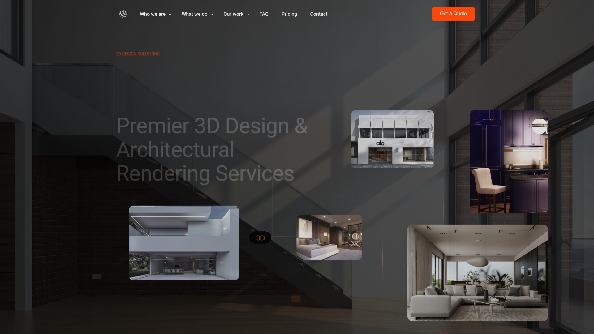
A typical engagement begins with a scoped proposal that maps deliverables to project phases, specifies formats and resolutions for each intended use, and includes a defined revision structure. Most projects deliver preliminary renders within 5–7 business days and final hero images within 10–14 business days, depending on complexity. With over 1,000 projects completed globally, Rendimension brings phased visualization workflows to both boutique residential remodels and large-scale commercial developments.
To get started, visit Rendimension’s architectural visualization services page and submit a project brief. The team will respond with a scoped proposal and a style recommendation matched to your current project phase.
Useful sources
- Photorealistic vs. Stylized Renders: Which One Wins Clients Faster? (Archfine), Comparative analysis of client responses to photorealistic and stylized outputs; useful for phase-to-style mapping.
- Architectural Rendering Styles Explained with Examples (Airender Studio), Foundational taxonomy of rendering styles with audience-mapping guidance.
- Types of Architectural Renderings: A Complete Guide (Cad Crowd), Covers the storytelling purposes of different render types across project phases.
- Render vs. Sketch: A Client Communication Hierarchy (ArchitectGPT), Explains the sequencing logic for moving from sketches to renders across decision points.
- Architectural Render Resolution: How to Choose the Best Option (Render Art Studio), Resolution tiers for draft vs. final assets, DPI guidance, and cropping considerations.
- Architectural Visualization: Complete Guide (Rendimension), Rendimension’s own workflow guide covering process, deliverables, and phased visualization methods.
- Construction Visualization Examples for AEC Professionals (Rendimension), Case-based examples showing how rendering styles communicate design intent across construction phases.
- What Is a Structural Calculation Package? (ShearWise), Explains what technical and structural reviewers need from documentation packages, relevant to diagrammatic and massing visual requirements.
FAQ
What are the main types of architectural rendering styles?
The primary categories are photorealistic, stylized or illustrative (watercolor, ink sketch, collage), and technical or diagrammatic (white model, clay, ambient occlusion). Each serves a different project phase and audience.
How do you choose a rendering style for a specific project?
Start by identifying the decision the image must drive, the audience who will view it, and where the image will be used after delivery. Those three factors determine the appropriate style, resolution, and format.
What is the best resolution for architectural renders?
2K resolution (1920×1080) works for preliminary and draft review images. Hero images for marketing and large-format print typically require 4000×3000px or larger, delivered at 300 DPI for print use.
When should you use photorealistic renders vs. stylized renders?
Use stylized renders during concept and schematic phases to keep client feedback focused on massing and spatial logic. Reserve photorealistic renders for confirmed designs, pre-sales presentations, and marketing, where visual trust and material accuracy matter most.
What should a vendor brief for rendering include?
A complete brief covers the project phase, primary audience, visual goals, required deliverables with formats and resolutions, the image’s intended afterlife (web, print, planning, social), and the number of revision rounds budgeted.
Recommended
- Architectural Rendering Styles: Complete 2025 Guide
- Rendering styles for interiors: Enhance designs effectively
Frequently asked questions
What are the main types of architectural rendering styles?
The primary categories are photorealistic, stylized or illustrative (watercolor, ink sketch, collage), and technical or diagrammatic (white model, clay, ambient occlusion). Each serves a different project phase and audience.
How do you choose a rendering style for a specific project?
Start by identifying the decision the image must drive, the audience who will view it, and where the image will be used after delivery. Those three factors determine the appropriate style, resolution, and format.
What is the best resolution for architectural renders?
2K resolution (1920×1080) works for preliminary and draft review images. Hero images for marketing and large-format print typically require 4000×3000px or larger, delivered at 300 DPI for print use.
When should you use photorealistic renders vs. stylized renders?
Use stylized renders during concept and schematic phases to keep client feedback focused on massing and spatial logic. Reserve photorealistic renders for confirmed designs, pre-sales presentations, and marketing, where visual trust and material accuracy matter most.
What should a vendor brief for rendering include?
A complete brief covers the project phase, primary audience, visual goals, required deliverables with formats and resolutions, the image's intended afterlife (web, print, planning, social), and the number of revision rounds budgeted.