How to Use a Mood Board to Specify Materials for a Rendering
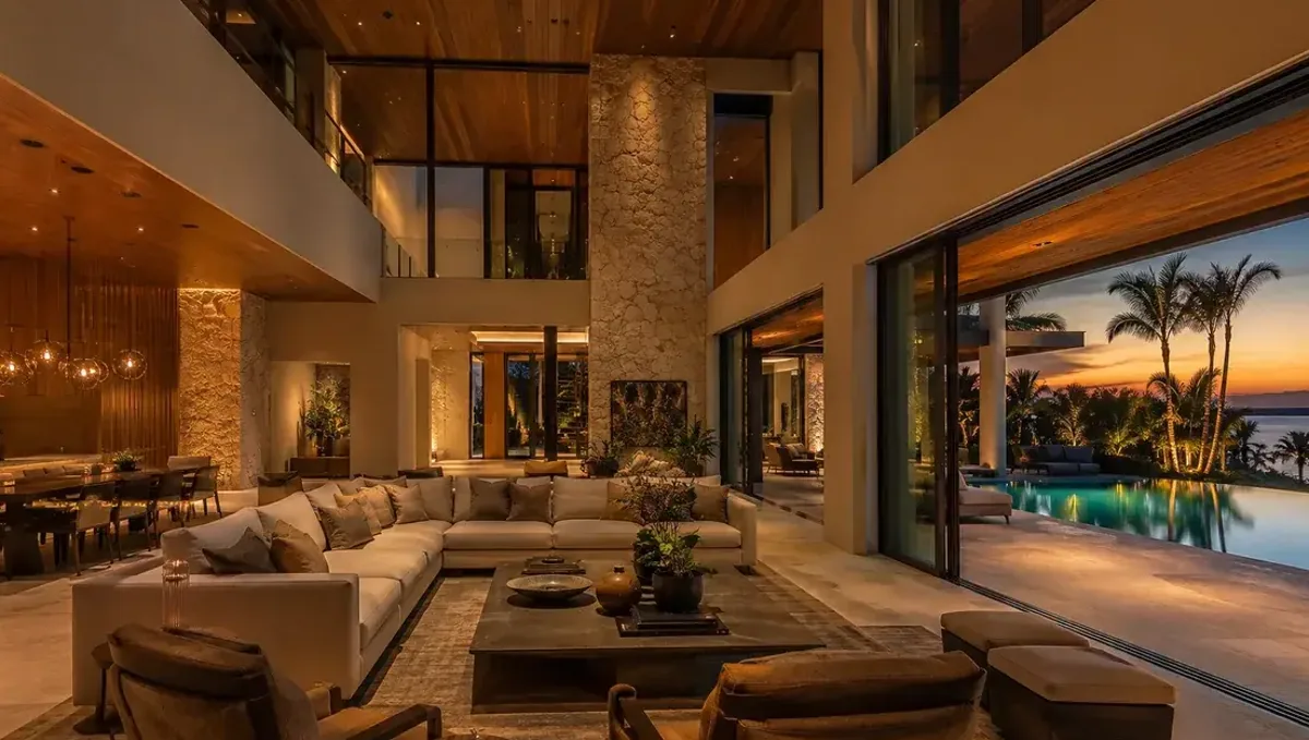
Quick answer: Build a focused mood board with notes and dislikes, summarize the palette and confirm details with products or samples later.
The short answer: a mood board sets direction, and then you confirm the details
A mood board is a collection of images that expresses the look and feel you want. It is a good way to communicate materials, colors and atmosphere when specific products are not chosen yet. The studio uses it to pick a coherent palette, and then you refine it. This guide belongs to how to specify materials and finishes for a 3D rendering and explains how to build and use a mood board effectively.
What a mood board can and cannot do
A mood board communicates style, color harmony, texture and mood. It does not identify specific products or exact colors. That makes it useful early, when you know the feeling but not the details. Once the direction is approved, you add product links, samples or codes for the final choices. Treat the board as the first step of a two step process.
Collect images with a clear purpose
Gather images of spaces, materials and details that you like. Avoid collecting hundreds of images, since too many dilutes the message. Twelve to twenty well chosen pictures are usually enough. Choose images that show the specific qualities you want: warm wood, cool stone, matte black metal, soft light. A focused board tells the studio what matters most.
Show materials, not only rooms
Photos of complete rooms convey mood, but they hide the materials in a mix of colors and objects. Add close ups of the surfaces that you like: a wood grain, a tile pattern, a countertop, a metal finish. These images let the studio identify the material behind the mood. A board that mixes room photos and material close ups is more useful than either alone.
Mark what you like in each image
An image often contains many things, and the studio cannot tell which one you mean. Add a short note to each picture, such as the floor color, the cabinet style or the lighting mood. You can annotate by circling parts of the image or writing captions. Notes turn a pretty collage into a precise instruction and prevent the studio from copying the wrong element.
Mark what you dislike
Negative references are also valuable. If you dislike a color, a finish or a style, include an image or a note that says so. This narrows the range and prevents wasted effort. For example, tell the studio that you want warm wood but not orange tones, or modern lines but not cold industrial finishes. A few clear dislikes can save a round of revision.
Keep the board consistent
A board that mixes very different styles confuses the studio. If you like both a rustic and a minimalist look, decide which one leads for this project or ask for two options. A consistent board results in a coherent palette, while a contradictory one forces the studio to compromise. Consistency also helps you see clearly what you want.
Choose a dominant palette
Summarize the board in a short palette: two or three main colors and one or two accents, plus the main materials. Write the summary next to the board. This gives the studio a quick reading of the direction and gives you a check that the board says what you intend. If the summary feels forced, the board may need editing.
Tools for making a board
You can build a board in a presentation slide, a shared folder, a design app or a simple document. The tool does not matter, provided the images are large enough to see and the notes are readable. Save it as a PDF or share a link that the studio can open. Include the source of each image if you have it, since that helps trace a product.
Mood boards for interiors
For interiors, focus on floors, wall finishes, cabinetry, countertops, lighting and the overall color mood. Include images of spaces with similar proportions and light, since a material that works in a bright open room may feel different in a small dark one. Notes on the intended use of the room, such as family kitchen or quiet bedroom, help the studio set the atmosphere.
Mood boards for exteriors
For exteriors, include facade materials, roofing, window frames, landscaping and paving. Add images of similar houses in similar climates, since regional context affects what looks appropriate. Note any neighborhood rules or styles you must respect. A board that reflects both your taste and the local setting produces exterior images that are believable and easier to approve.
Mood boards for commercial spaces
For restaurants and shops, the board should communicate brand personality, customer experience and lighting mood. Include logos, brand colors and examples of materials that suit the brand. The board helps the studio create an atmosphere that supports the business, and it gives the owner a way to test whether the concept is coherent before investing in construction.
Using a board when working with a team
When several people share decisions, a mood board can align opinions before the studio starts. Ask each person to add images and notes, then discuss and agree on a final version. Resolving disagreements at this stage is much cheaper than after the first preview, and the studio receives a single, consistent direction instead of conflicting requests.
Refining the palette after the preview
The first preview turns the board into a real image. Look at it as a test of the palette: does the mood match what you imagined, and do the materials work together? Send one consolidated list of adjustments and mention which references you feel the studio interpreted correctly. This dialogue quickly converges on the look you want.
Saving the board for future projects
A good mood board is a record of your taste and decisions. Keep it, along with the approved images, for future projects or later phases. It saves time when you return, and it helps keep multiple projects consistent. If you are a designer or developer, a library of boards can also speed up conversations with clients and with the studio.
When a board is not enough
If a material is critical, such as a distinctive stone or a custom finish, a board will not be enough. Supplement it with a sample photo or a product link, and consider confirming the final choice with a physical sample. A mood board is a strong starting point, but decisions that involve money or long lead times deserve more precise information.
Copyright and use of images
Mood board images are references for the studio, not content to be reproduced. The studio designs the materials and the scene for your project and does not copy someone else’s photograph. Use the board as inspiration and communication. If a specific photographer’s work matters, mention it so the studio can keep the influence at the level of mood and palette.
Move from mood to specification
After the first preview, use the images to choose real products. Look for materials that match the look, then send links, sample photos or codes. Replace placeholders in the rendering with the chosen products. See how accurate materials are in a rendering and whether a rendering can match your exact samples for what to expect when moving from a mood direction to specific materials.
What to send the studio
- A mood board of twelve to twenty focused images.
- Close ups of the materials you like, with short notes.
- A list of colors, materials or styles you want to avoid.
- Drawings or sketches showing where each material goes.
- The deadline and which decisions are still open.
Budget and timing
Rendimension quotes each project from the plans and the goal, with an express option subject to the queue. A focused mood board at the start shortens the discovery phase and reduces the number of revisions.
Revision rounds and how to keep them small
For using a mood board, settle the big material decisions in the first preview: main surfaces, colors, wood tones, metals and the overall palette. Afterwards, send changes as one consolidated list. Every changed finish needs new lighting checks, so a clear palette from the start finishes faster. See how revision rounds affect timelines.
Timing
Material decisions are one of the biggest causes of delay, because choices arrive late or change after the first preview. Send selections early, answer the studio quickly and leave room for one revision round. See how long a 3D rendering takes and how the number of views affects turnaround. Rendimension offers an express option, subject to the queue, when a date is fixed.
Common mistakes
- Sending too many images without a clear focus.
- Mixing very different styles on the same board.
- Not explaining what you like in each picture.
- Skipping close ups of the actual materials.
- Treating the board as final specification.
- Forgetting to say what you do not want.
A worked example
A homeowner sends a board with fifteen images: warm oak floors, white plaster walls, black metal window frames and a stone countertop. Each has a caption. She adds two dislikes: orange wood tones and high gloss finishes. The studio proposes a palette in the first preview, and she later replaces placeholders with the products she selects.
Where to go next
Send the drawings, the material information and your reference photos to the studio, and agree the palette together. For the general overview, see how to specify materials and finishes for a 3D rendering, for expectations about accuracy, see how accurate materials are in a rendering, and for the pitfalls, see common mistakes when specifying materials.
Frequently asked questions
Can a mood board specify materials?
It sets direction, then you confirm with products, samples or codes.
How many images should a mood board have?
Twelve to twenty focused images are usually enough.
Should I include close ups of materials?
Yes. They help the studio identify the material behind the mood.
Should I add notes to each image?
Yes. Notes tell the studio what you like in each picture.
Can I include things I dislike?
Yes. Negative references narrow the range and reduce revisions.
Will the studio copy the images?
No. It uses them as reference for the palette and mood of your project.
Can I mix styles on one board?
It is better to lead with one style or request two options.
Is there a faster option?
Rendimension offers an express option, subject to the queue.
Related guides
This guide is part of our series on materials and finishes for 3D renderings. Start with the overview, how to specify materials and finishes for a 3D rendering. Related: how to specify colors with paint codes, how to send tile and stone selections, how to specify wood species and stain. When you are ready, send what you have through our quote request.