What to Send for a Commercial Interior 3D Rendering
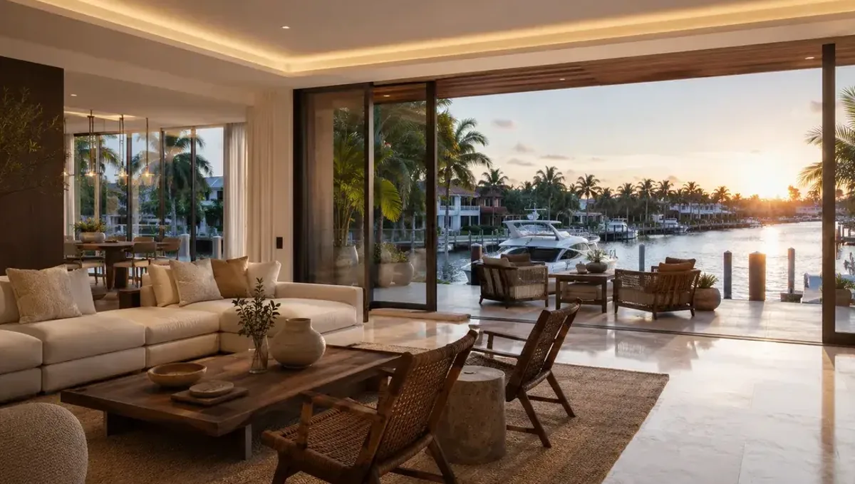
Quick answer: For a commercial interior rendering, send the base building plan with dimensions and ceiling height, the layout and furniture plan, a reflected ceiling plan and lighting schedule, finishes and furniture selections, branding files, window views and the purpose and deadline.
What a commercial interior rendering must show
A commercial interior, whether an office, a clinic, a gallery, a showroom, a restaurant or a lobby, is judged on how it works as much as how it looks. A rendering has to communicate the layout, the finishes, the lighting, the furniture, the branding and the mood, and it has to be credible to a landlord, a lender or a team that will pay to build it. The package a studio needs is more than a floor plan: it is the plan, the ceiling, the finishes, the fixtures and the brand.
This guide explains what to send, in the order of impact, and how to avoid the errors that force revisions.
Base building plan and dimensions
Start with the base building floor plan, showing the exterior walls, columns, cores, windows, doors and mechanical shafts. Get it from the landlord, the property manager or the building architect. Add the ceiling height, the slab-to-slab height and any bulkheads. Photographs of the empty space, taken from each corner at chest height, give the studio the reality of the space. See sending floor plans.
The design plan and furniture layout
Send the new plan: partitions, doors, glazing, millwork, and furniture. If it is only a sketch, include dimensions. Identify the zones by function, such as reception, open work, meeting, private office, kitchen or waiting. The studio will use the layout to choose camera positions that explain the space, for example a view from the entrance down the main circulation, and a view into the most important room.
Reflected ceiling plan and lighting
Ceilings in commercial interiors carry lighting, sprinklers, diffusers, acoustic panels and signage. Send the reflected ceiling plan, the lighting fixture schedule and the desired color temperature. A rendering with the wrong ceiling looks like a different space. If you have not designed the lighting, describe the mood: bright and even for a clinic, layered and warm for a hospitality space. See finish schedules for the rest of the interior palette.
Finishes and materials
List the floor, wall, ceiling, millwork, counter, glass, and metal finishes with product names, codes and samples. For stone, timber and metal, specify the finish and the pattern. For fabrics and upholstery, send a photo of the sample. If the interior designer prepared a material board, send it. Give the color values of the brand palette, since brand colors used incorrectly are noticed by clients.
Furniture, fixtures and equipment
Furniture defines a commercial interior. Send the furniture list with manufacturer, model and finish, or links to product pages. Include workstations, chairs, tables, lounge seating, reception desk, shelving, plants, artwork and equipment. Custom pieces need dimensioned sketches. See sending a furniture and fixture list. Where items are not chosen, tell the studio to propose them in the direction of the concept.
Branding, signage and graphics
Send the logo in vector format, the brand color values, the typefaces and any wall graphics or environmental design. Signage, wayfinding and graphic walls make a commercial interior specific. Also provide the dimensions and mounting details for any sign the image will show, and note whether the sign is final or a placeholder.
Window views, daylight and orientation
Tell the studio which way the windows face and what is outside: a street, a park, a skyline or another building. Views through windows are part of the image, and a blank white window looks unfinished. Send photographs from the windows if possible. If the interior is daylit, the time of day affects the mood. For an office, a bright mid-morning light is typical. For hospitality, the evening light with warm interior fixtures is usually more inviting.
People, activity and scale
Populating a commercial interior gives scale and life, but it also raises questions of privacy and taste. Decide with the studio whether to include people, and what kind. A law firm and a co-working space suggest different people. For a healthcare interior, images with staff and patients need care. In many cases, a few silhouettes or blurred figures give scale without distracting from the design.
Reception, entry and the first impression
In most commercial interiors the entry sequence is the moment that defines the image: the door, the reception desk, the first view into the space. Give it the most attention. Send the desk design, the backdrop wall, the logo treatment, the floor pattern and the lighting over the desk. If a hero image is needed, this is usually where it is taken, from a camera near the entrance looking in, at eye height, with the reception and the deepest sightline both visible.
Storage, back-of-house and the things people forget
Every commercial interior has coat storage, IT closets, printers, supply rooms, restrooms and trash. They rarely appear in hero images, but they affect the layout and the credibility of the plan. Tell the studio where they are so that doors, openings and clutter are consistent. In an interior with visible shelving or open storage, describe what will be on the shelves: books, samples, products or merchandise, since empty shelves look unreal and random objects look messy.
Offices, clinics, showrooms and galleries: what changes
An office image needs to convey collaboration, focus and culture, so workstation layouts, meeting rooms and amenity areas matter. A clinic image needs calm, cleanliness and clear wayfinding, so reception, waiting and exam corridors matter. A showroom is about the product, so display fixtures, lighting on the product and the customer path matter. A gallery is about walls, light and neutral finishes. Tell the studio the type of space so it can choose views that carry the meaning of the business.
Acoustics and materials that show in the image
Acoustic ceiling clouds, felt panels, wood slats and carpet tiles are visible design elements in modern interiors, and they also perform. Send the product names and patterns. If the design uses them to solve noise, tell the studio, since the image should show the same elements the acoustic consultant expects. A rendering with plain drywall ceilings, when the design has acoustic clouds, misrepresents the space.
Phasing tenant improvements with landlord work
In leased space, the work is split between the landlord and the tenant. The landlord may provide the shell and the core, while the tenant builds partitions, ceilings and finishes. Ask which items are landlord work and which are tenant work, so the image shows only what the tenant will deliver, and the studio can highlight the tenant improvements. Landlord approval of the design is often a lease condition, and a rendering helps to obtain it.
Sustainability and certification imagery
If the project targets a certification such as LEED or WELL, some features are visible: daylight, biophilic elements, low-emission materials, operable windows and bike facilities. Tell the studio which ones matter, so they appear in the images with accuracy. Do not show features that the design does not include just because they look good, since certification reviewers and clients may read the image as a commitment.
Delivery formats for boards, decks and web
Commercial clients use images in leasing decks, investor presentations, websites, and on boards at meetings. Ask for a high-resolution master, a web version, and a wide crop for presentation slides. If several views are delivered, ask for a consistent naming system that maps to the room names in the plan. A shared naming scheme saves a lot of confusion when the team assembles the final deck.
Code, accessibility and permit issues
A rendering is not a permit drawing. Commercial interiors must meet accessibility, egress, fire and health requirements, and the studio will not certify compliance. But if the image depicts a condition that would violate code, such as a blocked exit or an inaccessible counter height, it creates risk. Tell the studio if a consultant has reviewed the layout, and send the code notes that apply, so the image does not depict something that cannot be built.
Purpose: landlord, lender, client or marketing
- Landlord approval. Storefront, tenant improvements and signage.
- Lender or investor. A polished hero view showing quality.
- Internal client. Views that test the layout and the experience.
- Marketing or leasing. Atmospheric views for sales material.
- Contractor pricing. Clear finish intent.
Say the purpose and the audience. The same interior may need a different treatment for each.
Common commercial interior mistakes
- No ceiling information. The space looks flat.
- Unspecified lighting. The mood is guessed.
- Undimensioned furniture sketches. Scale errors.
- Blank windows. The image looks unfinished.
- Wrong brand colors. The client notices immediately.
- Depicting a non-compliant layout. Creates liability.
A worked example: a medical clinic reception and waiting area
A clinic owner sends the landlord's base plan, a sketch of the reception layout, the furniture list, the brand palette, and photographs of the space. The brief says the images must calm patients, be bright and show the accessible reception counter. The studio builds the space, places the ceiling and lighting from the RCP, applies the finishes and produces a view from the entrance and one of the waiting area. The lender approves, and the contractor uses the images to align the finish selection.
During review, the owner notices that the waiting chairs block the path to the restrooms. The layout is fixed on paper, at almost no cost.
A checklist for a commercial interior
- Base building plan with dimensions and ceiling height.
- Photos of the empty space and its windows.
- Design plan and furniture layout.
- Reflected ceiling plan and lighting schedule.
- Finishes, furniture and fixture selections.
- Logo, brand colors, typefaces and graphics.
- Window views and orientation.
- Purpose, audience and deadline.
Questions to ask a studio
- Can you work from the landlord's base plan and a layout sketch?
- Will you model the ceiling and lighting from my RCP?
- How do you handle brand colors and signage?
- Can you show the space at day and night?
- How many revisions are included?
Frequently asked questions
What do I send for an office rendering?
Base plan, layout, ceiling and lighting information, finishes, furniture list, branding and photos of the space.
Do I need a reflected ceiling plan?
It improves the accuracy a great deal. If you do not have one, describe the ceiling and lighting.
Can you include my brand?
Yes. Send the vector logo, color values and typefaces.
Can you show people?
Yes, at the level you prefer, from silhouettes to detailed figures.
Does the rendering replace permit drawings?
No. It is conceptual and must be consistent with the permit set.
Can you show the view from the windows?
Yes. Send photos of the view or the context.
Can I test layouts?
Yes. Renderings often reveal circulation problems before construction.
How long does it take?
It depends on scope and on how quickly information arrives. Ask for a schedule.
Related guides
This guide is part of our series on what to send a 3D rendering studio. Start with the overview, what to send a 3D rendering studio. Related: what to send for a hospitality project, what to send for an outdoor living project, what to send for a renovation or addition. When you are ready, send what you have through our quote request.