How a VR Walkthrough Is Structured
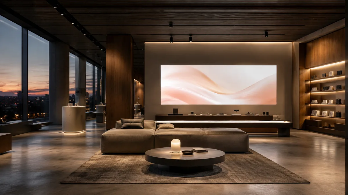
An immersive walkthrough is structured by choosing a small number of viewpoints placed where a person would naturally stand, ordered along the route somebody would actually take, with a clear entry point and an obvious way to move between them. Free roaming across an entire building produces disorientation rather than persuasion, and most successful experiences use six to ten considered viewpoints rather than unlimited movement.
The default assumption about immersive content is that more freedom is better: put the viewer in the building and let them go anywhere. It sounds generous, it demonstrates the technology, and it is the most reliable way to produce an experience that ends with somebody taking the headset off confused.
People in an unfamiliar building get lost. They walk into corners, miss the space that mattered, and spend their attention on navigation rather than on the property. Freedom is a feature for a game and a liability for a sales tool.
This guide is about structure: how many viewpoints, where they go, in what order, and how a person moves between them. It is not about production workflow, which is covered at length elsewhere. It is about the decisions that make an experience usable.
Why free roaming fails
A person in a headset has no map, no memory of the layout and no prior visit to draw on. Everything they know about the building comes from what is currently in front of them.
That produces two failures. They miss things, because nothing directs attention to the spaces that carry the argument. And they get stuck, because navigating an unfamiliar space with an unfamiliar control scheme is genuinely difficult.
Neither failure is visible to whoever commissioned the experience, because they know the building intimately and cannot un know it.
Viewpoints instead of freedom
The structure that works in practice is a small set of fixed positions a viewer can move between, rather than continuous movement through the whole plan.
Each viewpoint is chosen, composed and lit deliberately, which means every place a viewer can stand is a place somebody decided was worth standing.
It also solves a technical problem at the same time, since fixed positions can be optimised or pre rendered in a way a freely navigable scene cannot.
How many viewpoints
For a single home or unit, usually six to ten. Entry, main living space, kitchen, primary bedroom, bathroom, outdoor space, and one or two that carry whatever is distinctive about the property.
Fewer than six and the coverage feels incomplete. More than ten and the viewer stops exploring and starts clicking through, which converts an immersive experience into a slideshow with extra steps.
For a whole development the count rises, but the principle holds: every additional stop is friction, and friction accumulates faster in a headset than on a screen.
Where a viewpoint goes
Where a person would naturally stand, which is almost never the geometric centre of the room.
People stand near entrances looking in, at the edge of a space rather than the middle, and where they can see the most without turning. A viewpoint in the centre of a room shows the room and feels like being on display in it.
The practical test is to walk the plan mentally and mark where somebody would pause. Those pauses are the viewpoints.
Eye height, which sounds trivial and is not
A viewpoint set slightly too high makes ceilings feel low and rooms feel small. Slightly too low and the space feels cavernous and unreal.
Both errors are subtle enough that nobody names them and strong enough to change how a property feels, which makes this one of the highest leverage details in the whole format.
It is also one of the few things in virtual reality architecture work that has an objectively correct answer, so there is no reason to get it wrong.
The entry point matters most
The first viewpoint sets everything: where the viewer thinks they are, what kind of property this is, and whether they feel oriented or dropped.
Starting at the front door looking in is almost always right, because it matches how a person would arrive and it gives them a mental map before they move.
Starting in a bedroom, which happens when viewpoints are ordered by importance rather than by route, disorients people immediately and they never fully recover it.
Order along the route somebody would walk
Unlike a film, where the order should follow the argument, an immersive experience should follow the building, because the viewer believes they are moving through it.
Jumping from the entry to a top floor bedroom and back to the kitchen breaks the illusion of place, which is the entire thing the format is selling.
Where a space is important but out of sequence, it is better to place it correctly and give it more weight when the viewer arrives than to reorder the building around it.
How people move between viewpoints
The mechanism has to be obvious without explanation, because nobody reads instructions in a headset and a sales agent will not have time to teach one.
Visible markers on the floor at the next position, activated by looking or by a single control, are the pattern most people understand immediately.
Anything requiring two hands, a menu or a learned gesture will be used by the person who built it and by nobody else.
The minute rule
If getting a visitor into the experience and moving takes longer than a minute, it will quietly stop being offered.
That is not a criticism of anybody. A sales agent with a visitor and a queue makes a rational decision, and images never fail in front of a client.
So the structure has to assume no onboarding at all: headset on, oriented, moving, all inside sixty seconds.
What to include and what to skip
Include what somebody is buying: the spaces they will live in, the views, the moments that make the property distinctive.
Skip corridors, service areas, plant rooms and anything that exists because the building needs it rather than because a buyer cares.
Skipping is not dishonest when it is obvious. A viewer knows a building has corridors, and giving them a stop in one wastes the small amount of attention the format gets.
Exterior context, which is easy to forget
An experience that starts inside a room gives no sense of where the property is or what it looks like from outside.
One or two exterior viewpoints, at the approach and from a balcony or window looking out, place the property in its site and answer questions the interior cannot.
For vr real estate work specifically, the view from the window is frequently the thing being sold, and it is the easiest thing to under weight when the model was built for interiors.
Time of day and whether to offer a choice
A single condition, chosen deliberately, is almost always better than a toggle between day and night.
Options sound generous and they add production cost, add interface complexity and give the viewer a decision to make instead of a property to consider.
Where a project genuinely sells on a night view, the answer is to build the experience at night rather than to offer both.
Furnishing the spaces
An unfurnished room in an immersive experience feels smaller and colder than the same room furnished, which is the opposite of what most people expect.
Furniture gives scale references, and without them a viewer has nothing to calibrate against except their own height, which makes rooms read as ambiguous boxes.
Restraint still matters, because over furnishing hides the space and invites the buyer to evaluate somebody elses taste rather than the property.
Sound, or the deliberate absence of it
Most immersive property experiences run silently, and that is a defensible choice because a sales floor is noisy and headphones add another thing to clean.
Where sound is used, ambience rather than music is usually right, since music in a headset feels imposed in a way it does not on a screen.
The decision belongs in the brief, because building for silence changes what the experience has to communicate visually.
Guided against self directed
A guided experience moves the viewer through a set sequence automatically. A self directed one lets them choose the next viewpoint.
Guided suits a boardroom, where somebody is presenting and attention is shared. Self directed suits a sales gallery, where a person explores alone at their own pace.
Building both from one set of viewpoints is straightforward and worth asking for when the same content will serve both settings.
Structuring for a whole development
Where several unit types exist, the structure should repeat exactly across them, so a buyer comparing two homes is comparing the homes rather than two different presentations.
The same viewpoints, the same order, the same eye height, the same lighting condition. Consistency is what makes comparison possible and it is the main reason to structure at all.
Amenity spaces and the exterior can then sit outside that repeating structure as a shared layer every unit links into.
The structure protects the frame rate
Fixed viewpoints let a scene be optimised around known positions, which is how a comfortable experience gets built on modest hardware.
A freely navigable building has to hold up everywhere at once, which either costs far more to optimise or produces the stutter that makes people feel unwell.
So structure is not only an editorial choice. It is what makes the technical requirement achievable at a sensible cost.
Who the structure is really for
Structure exists because the viewer is a stranger to the building and the person who commissioned the experience is not. Everything difficult about this format comes from that asymmetry, and every structural decision is an attempt to lend the stranger some of the familiarity the client already has.
That is why internal reviews are misleading. A team that has lived with a plan for eighteen months navigates the experience effortlessly and concludes it is intuitive, when what they are testing is their own memory of the layout.
Holding the stranger in mind while structuring is the single discipline that separates an experience people use from one that demos well and gets abandoned after a month.
What virtual reality real estate work has to prove
A buyer in a headset is answering one question, which is whether they can imagine themselves living or working here. Everything in the structure either serves that or competes with it.
Spaces that carry the answer deserve viewpoints. Spaces that merely exist deserve to be skipped, and the confidence to skip them is what most first attempts lack.
The test for including anything is whether a buyer would ask about it unprompted. If they would not, it is coverage rather than persuasion, and coverage is what makes an experience feel long.
Structuring for design review instead of sales
When the audience is the project team rather than a buyer, the priorities invert completely. Coverage becomes valuable, ugly areas become the point, and unfinished materials are irrelevant.
A design review experience for vr for architects work wants the corridor that felt tight on the plan, the ceiling condition nobody could visualise and the sightline somebody argued about. Those are exactly the spaces a sales experience skips.
Building one structure and using it for both audiences is a common shortcut and it produces a piece that is too thorough to sell and too polished to critique.
Handling multiple floors
Vertical movement is where immersive experiences confuse people most reliably, because nothing in a headset communicates that a viewer has changed level.
The mechanisms that work give an explicit cue: a stair viewpoint that shows the transition, or a clear label naming the floor on arrival. The mechanism that fails is teleporting silently between levels, which leaves people convinced they are still where they were.
On a multi storey home this single detail accounts for most of the disorientation reported after a session.
Where a plan overlay helps
A small floor plan showing the current position solves orientation almost completely, and it is frequently omitted because it feels like an admission that the experience is not self explanatory.
It is not. Real buildings have signage and real visitors have an agent walking beside them, and an overlay is the equivalent for somebody standing alone in a headset.
Where the layout is at all complex, adding one converts a confusing experience into a navigable one for very little production cost.
The version somebody sends by email
Whatever gets built for a headset, there will be a moment when somebody wants to send it to a person who is not in the room, and the structure should anticipate that.
The same viewpoints delivered as virtual property tours in a browser cover it, and because the structural work is already done, that second format is close to free.
Projects that plan only for the installation end up rebuilding the structure later for the format that actually reaches people.
Testing with somebody who has never seen the building
The only reliable test, and the one most projects skip. Anybody who knows the plan cannot evaluate whether the experience is navigable.
Hand it to somebody unfamiliar, say nothing, and watch. Where they hesitate is a structural problem. What they miss entirely is a viewpoint in the wrong place.
Ten minutes of that reveals more than any internal review, and it is free.
The 360 version has the same structure
A rendered panorama set is the same problem with a cheaper delivery: which viewpoints, in what order, with what navigation between them.
Everything in this guide applies, which is convenient, because it means the structural work done for an immersive build transfers directly to virtual property tours delivered in a browser.
That is the strongest argument for structuring first and choosing the delivery format second.
What the structure cannot fix
A building that does not work spatially does not improve in a headset. It becomes more obvious, which is genuinely useful during design and unhelpful during sales.
That diagnostic property is one of the real benefits of immersive work in virtual reality construction contexts, where finding a problem early is worth more than presenting well.
For a sales audience, it means the experience should be built after those problems have been resolved rather than as the tool that reveals them.
Naming the spaces
A label on arrival, naming the room and ideally the unit type, removes a surprising amount of confusion for almost no production cost.
Viewers frequently cannot tell a second bedroom from a study, or one unit type from another, and they will not ask. They will simply form a vaguer impression than the project intended.
Where several unit types share an experience, labelling is what makes comparison possible rather than leaving the viewer to reconstruct which home they are currently standing in.
Comfort is a structural decision, not only a technical one
Most of what makes people feel unwell in a headset comes from movement they did not initiate, which is precisely what a smooth automatic camera glide through a building produces.
Teleporting between fixed viewpoints avoids it almost entirely, because the viewer moves in discrete steps they control rather than being carried through space by somebody else decision.
So the viewpoint structure that improves navigation also improves comfort, which is an unusual case where the cheaper option is the better one on every axis.
Session length in a sales setting
Nobody spends twenty minutes in a headset in a sales gallery, whatever the experience contains. Realistic sessions run two to four minutes, after which people take it off for social reasons rather than technical ones.
That constraint should govern the structure directly. Six to ten viewpoints at fifteen to thirty seconds each fits comfortably. Thirty viewpoints does not, and the last twenty will never be seen.
Designing for the session that actually happens rather than the one the content assumes is the difference between a complete experience and an abandoned one.
Where the sales agent stands
An overlooked structural question, because the agent cannot see what the visitor sees unless the experience mirrors to a screen.
Without a mirror, the agent is talking blindly and the visitor is exploring alone in a room with a stranger, which is socially awkward in a way that shortens sessions.
A mirrored display costs almost nothing and turns a solitary demonstration into a conversation, which is the entire point of having a person there.
What happens when the model is not finished
Immersive experiences expose incompleteness in a way images never do, because the viewer can look anywhere including at the parts nobody expected them to examine.
That means the structure has to be agreed before modelling finishes, so the model can be completed to a viewable standard exactly where the viewpoints are and left rough where nobody will stand.
Structuring after the model is built inverts that and usually means either paying to finish everything or accepting that some viewpoints look into unresolved space.
A workable sequence
Mark the pauses on the plan. Choose six to ten. Fix eye height. Start at the entry. Order along the route. Add one or two exteriors. Choose one lighting condition. Furnish for scale. Make movement obvious. Test with a stranger.
Ten steps, none of them technical, and the technical work goes well once they are settled.
The honest summary
Structure an immersive walkthrough as a small number of considered viewpoints along the route a person would walk, not as unlimited freedom in a building they have never seen.
Start at the entry, keep eye height honest, skip what nobody is buying, make movement obvious enough to need no explanation, and test it on somebody who does not know the plan.
Do that and a vr tour is usable by a stranger in under a minute. Skip it and the technology works perfectly while the person inside it is lost.
To structure an immersive experience before deciding how to deliver it, request a quote.
Frequently asked questions
Should a VR walkthrough let people move freely through a building?
Usually not. A viewer with no map and no prior visit gets lost, misses the spaces that matter and spends attention on navigation. A set of six to ten considered viewpoints along the natural route works better and is easier to optimise for comfort.
How many viewpoints should a unit have?
Six to ten for a single home: entry, main living space, kitchen, primary bedroom, bathroom, outdoor space and one or two that carry what is distinctive. Fewer feels incomplete, more turns exploration into clicking through a slideshow.
Where should each viewpoint be placed?
Where a person would naturally stand, which is rarely the centre of the room. People pause near entrances looking in and at the edges of spaces. A central viewpoint shows the room and makes the viewer feel on display in it.
Does eye height matter in an immersive walkthrough?
More than it sounds. Slightly too high makes ceilings feel low and rooms feel small, slightly too low makes spaces feel cavernous. The error is subtle enough that nobody names it and strong enough to change how the property feels.
How should a viewer move between viewpoints?
Through a mechanism obvious without explanation, since nobody reads instructions in a headset and sales staff have no time to teach one. Visible floor markers activated by looking or a single control work. Anything needing two hands or a menu goes unused.