Architects: 5 Checks to Get Color Elevation Rendering Approved
Architects: 5 Checks to Get Color Elevation Rendering Approved
Color elevation rendering turns a flat orthographic facade drawing into a readable visual that combines linework with restrained color and material cues. Pick diagrammatic elevations for early design reviews, a hybrid style for client decision-making, and material-realistic rendering when the deliverable is marketing or final sign-off. The style should match the decision the elevation needs to support, not the other way around.
TL;DR:
- Diagrammatic elevations are best for early design reviews and internal approvals due to their emphasis on proportions and clear material call-outs without distractions.
- Material-realistic elevations are suitable for marketing and presentation purposes, showcasing true-to-life finishes but requiring more detailed rendering; hybrid styles balance clarity with realism for client meetings.
- Ensuring accurate orthographic setup, clean layer separation, and matching color spaces minimize rework, with the final export format depending on whether the elevation will be printed or displayed digitally.
- Proper lighting involves a single soft key light and ambient occlusion passes to add depth without conflicting with the orthographic view, keeping elevations legible and consistent across sets.
- Requesting elevations from a studio should include your CAD or BIM files, intended audience, and material specifications, with a focus on styles that prioritize clarity for review or persuasion depending on the purpose.
Table of Contents
- What Is Color Elevation Rendering, and Which Style Fits Your Project?
- From CAD or BIM Model to a Clean Elevation
- Color and Material Rules That Keep Elevations Legible
- Lighting and Shadow: Add Depth Without Losing the Flat Read
- The Pre-Delivery Checklist Every Elevation Set Needs
- Matching the Elevation to the Audience: Submittals, Sign-Off, and Marketing
- Rendimension’s Approach to Elevation Deliverables
- Presenting Colored Elevations to Clients Without Losing the Room
- Case Studies: Where Colored Elevations Made the Difference
- Choosing Tools for Colored Elevation Work
- Why Readability Should Drive Every Elevation Decision
- Get an Elevation Rendering Quote from Rendimension
- Sources
- FAQ
What Is Color Elevation Rendering, and Which Style Fits Your Project?
Three styles cover almost every use case in practice, and each one signals something different to the person looking at it.
Diagrammatic elevations strip the facade down to line hierarchy, hatch patterns, and flat color blocks. They emphasize proportion, massing, and material zones over texture. Planning departments, HOA reviewers, and early-stage design teams respond well to this style because nothing distracts from the geometry itself. Expect line drawings with color-coded material call-outs and a legend, not photographic surfaces.
Material-realistic elevations push toward true-to-life brick, stone, siding, and glass, often rendered with soft global lighting. This is the style for marketing boards, listing pages, and competition submissions where the goal is to sell a vision, not just document a wall.
Hybrid elevations sit between the two: vector linework holds the geometry, while a light material and color pass adds enough realism to convey finishes without full photoreal treatment. Hybrid workflows tend to be the best fit for client meetings, where people need to both understand the drawing and picture the finished building.
- Diagrammatic: planning submittals, schematic design, internal reviews
- Hybrid: client presentations, design development sign-off
- Material-realistic: marketing collateral, leasing materials, award submissions
A visualization studio should be able to produce any of these from the same base model, so ask for the style that matches your audience, not whatever looks most impressive in a portfolio.
From CAD or BIM Model to a Clean Elevation
Getting from a Revit or AutoCAD file to a polished elevation sheet follows a predictable sequence, and skipping steps is where most rework starts.
- Verify the orthographic setup and scale. Confirm the view is a true elevation, not a perspective, and that dimensions and scale are locked before export. Elevation drawings need accurate scale and dimensions to function as a real reference, not just an illustration.
- Clean up layers. Separate linework, hatches, material fills, and annotations onto distinct layers or classes. Mixed layers are the single biggest cause of slow revisions later.
- Export the base file. DWG or a clean vector PDF works for handing off linework; SVG holds up well for scalable color passes.
- Apply the color and material pass. A common studio approach is to export clean linework from Revit or AutoCAD and finish color and material work in Illustrator or Photoshop, layering finishes over the vector base rather than rebuilding the drawing.
- Choose the final export format. PNG at sRGB works for screen and web use; CMYK is the right call for anything going to a printer.
Tools like Morpholio Trace are worth having in the loop for quick hand markups and review rounds before a file goes back to the studio for final passes. A studio typically returns elevations in stages: a linework check first, then a color/material draft, then the final print and screen exports.
Color and Material Rules That Keep Elevations Legible
Good color choices on an elevation do one job: help the viewer read the facade faster, not slower.
Start with a neutral base palette and add a single accent color to orient the eye toward the entry, a signature material, or a key massing element. Elevations that use four or five competing colors tend to read as noisy rather than informative. Texture scale matters just as much as color. A brick or shingle pattern that looks fine at full-building scale can turn into visual static once it repeats across a wide facade. Reduce texture density or swap to a flatter fill when this happens.
Every elevation sheet should carry a legend with named finishes and matching swatches. Colors and patterns on an elevation only communicate the intended material when the legend ties them back to a real product or spec.
Pro Tip: Lock your palette before you touch lighting. Adjusting color after shadows are in place almost always shifts the contrast in ways you did not intend.
- Use one dominant neutral, one secondary neutral, and one accent, no more
- Reduce hatch or texture density on facades wider than roughly two bays
- Label every finish with a name, not just a color chip
On export, match the color space to the destination: CMYK for anything printed, sRGB with vector PDF for screen sharing and zoomable client reviews. Mixing those up is why a rendering that looked crisp on screen prints muddy, or vice versa.
Lighting and Shadow: Add Depth Without Losing the Flat Read
Elevations are not perspective renders, and lighting them like one usually backfires. Pick one soft key light from a single side, add a gentle fill to keep shadows from going black, and stop there. Full lighting simulations with multiple sources tend to introduce shadow directions that fight the orthographic logic of the drawing.
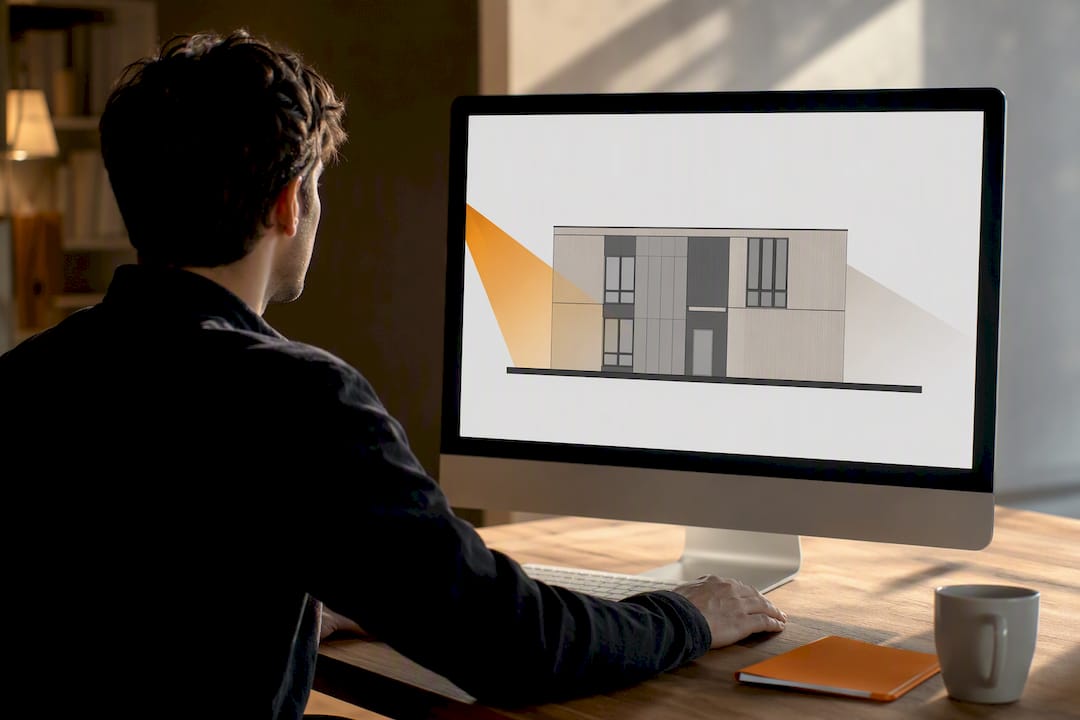
Ambient occlusion passes are the better tool for suggesting depth around window reveals, cornices, and material joints. An AO-only pass composited under the vector lines adds just enough shading to read as three-dimensional without introducing a directional light source that could conflict with neighboring sheets. Keep the light angle identical across every elevation in a set. If the north elevation reads a shadow at 2 p.m. and the south elevation reads one at dawn, side-by-side comparison breaks down.
The Pre-Delivery Checklist Every Elevation Set Needs
To run this list before anything ships to a client or a review board.
- Confirm lineweight hierarchy separates structure, openings, and material joints
- Check hairline widths meet the minimum for your print resolution
- Verify scale labels and dimension strings are present and correct
- Confirm a material legend appears on every sheet, not just the cover
- Check color space (CMYK or sRGB) and confirm fonts are embedded before export
The most common mistakes worth watching for: over-texturing a facade until it reads as static rather than material, posterizing colors so gradients band visibly, and letting shadow direction drift between elevations in the same set. Planning-stage elevations especially benefit from restrained shadow and clear material joints rather than decorative backgrounds that pull attention away from the building itself.
Pro Tip: Print one test sheet at actual scale before sending a full set to a reviewer. Screen colors and printed colors rarely match exactly, and a single test page catches it early.
Matching the Elevation to the Audience: Submittals, Sign-Off, and Marketing
The right elevation changes with who is looking at it and what they need to decide.
For HOA and planning submittals, keep it diagrammatic: clear line hierarchy, labeled materials, dimensions, and minimal shadow. Reviewers are checking compliance, not judging curb appeal. For client sign-off meetings, a hybrid elevation earns its place. Enough material realism to picture the finished building, enough linework to keep dimensions and proportions legible. For marketing boards and leasing materials, material-realistic rendering with soft entourage, landscaping, sky, or a hint of surrounding context, does the selling job that a technical drawing cannot.
- HOA/planning: diagrammatic, dimensioned, minimal color, full material legend
- Client sign-off: hybrid, moderate material detail, consistent lighting logic
- Marketing/leasing: material-realistic, soft context, no competing dimension strings
Keep added context modest. A soft sky gradient or a few trees at the edges gives scale without pulling focus from the facade itself. Elevations that add full landscaping, cars, and figures in the foreground often end up competing with the building for attention.
Rendimension’s Approach to Elevation Deliverables
A professional visualization studio has completed many projects across residential and commercial work, with clients involved from concept through final delivery. That collaborative process matters most on elevation work, where getting the style locked early avoids costly rework later.
Services relevant to color elevation rendering include full exterior rendering packages, individual elevation passes, hybrid diagrammatic-to-material visuals, ambient occlusion depth passes, and print-ready CMYK exports alongside zoomable screen files. To speed up delivery, a brief should include the CAD or BIM export, the target audience for the sheet (planning board, client, or marketing), and any material specs that need to appear in the legend.
Presenting Colored Elevations to Clients Without Losing the Room
An elevation that looks great on your screen can fall flat in a client meeting if it is presented the wrong way. Sequence matters: open with the diagrammatic version so clients understand the massing and proportions, then move to the hybrid or material-realistic version once they have the geometry in their head. Showing the polished render first often means questions about dimensions and scale get lost under enthusiasm about color.
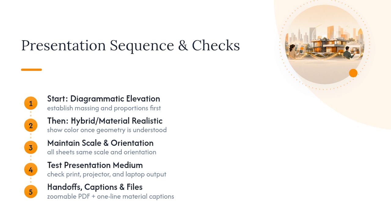
Keep every sheet in a set at the same scale and orientation so a client can flip between elevations without recalibrating their eye each time. Print at actual size when the meeting allows for it. A rendering that reads clearly on a laptop screen can lose contrast and detail on a projector, so testing the output on the actual presentation medium beforehand avoids surprises.
For reports and leave-behind packets, pair each elevation with a one-line caption naming the primary material and accent color. Reviewers who revisit the document weeks later, especially planning board members working through a stack of submittals, rely on that caption more than they rely on memory of the meeting. Group elevations by facade orientation (north, south, east, west) rather than by design phase, since that ordering matches how most reviewers mentally walk around a building.
Digital handoffs deserve their own format. A zoomable PDF with embedded vector linework lets a client zoom into window details or material joints without pixelation, which a flattened PNG cannot offer. Reserve the flattened image formats for email previews and slide decks where file size matters more than zoom fidelity.
Case Studies: Where Colored Elevations Made the Difference
A mid-rise residential submittal to a planning board benefits most from the diagrammatic approach: clean hatch patterns distinguishing brick from fiber cement panel, a legend naming both materials by product line, and shadow kept to a bare minimum so reviewers can measure proportions without visual noise competing for attention. That kind of restraint tends to shorten the review cycle because there is nothing ambiguous left for a board member to question.
Client sign-off meetings for custom single-family homes often shift to hybrid elevations, where a light material pass over vector linework lets homeowners picture actual siding color and roofline material while still seeing precise window and door placement. This is where style drift becomes a real risk: locking one tone across the full elevation set before the meeting keeps homeowners from getting confused by a front elevation that looks photoreal next to a side elevation that is still diagrammatic.
Marketing-driven elevations for a mixed-use retail development typically go full material-realistic, with landscaping, signage color, and glazing reflections rendered to a near-finished look, because the deliverable’s job is to attract tenants and investors, not document construction detail. The same base model can produce a diagrammatic version for the permit set and a material-realistic version for the leasing brochure with far less duplicated effort than starting each from scratch.
Choosing Tools for Colored Elevation Work
For architects hiring out the work rather than producing it in house, the tool question really becomes a workflow question: does the studio you’re briefing move cleanly from your BIM or CAD file to a finished elevation without losing scale accuracy along the way?
Revit and AutoCAD remain the standard source models for elevation exports, and most professional workflows pair that CAD or BIM base with vector illustration tools for the color and material pass rather than trying to do everything inside the modeling software. That two-step approach, clean export followed by a dedicated color pass, consistently produces sharper linework than trying to render color directly out of the BIM environment.
When you’re evaluating a studio rather than software, ask about their file-handling process specifically: do they preserve vector linework through the color pass, or does everything get rasterized early and lose zoom quality? Do they deliver both CMYK print files and sRGB screen files as standard, or does that require a separate request? Those questions matter more for output quality than which particular software sits behind the scenes.
Why Readability Should Drive Every Elevation Decision
Linework-first elevations move through approvals faster because reviewers spend less time interpreting and more time deciding. Photorealism earns its cost only when the deliverable’s job is persuasion, marketing boards, leasing materials, not documentation. Everywhere else, restraint wins. Rendimension treats clarity as the default and adds material realism only where the brief calls for it.
, Rendimension
Get an Elevation Rendering Quote from Rendimension
If you need elevations that move a review board or close a sale, Rendimension builds them from your CAD or BIM model without the guesswork of briefing a freelancer on file formats and lighting logic. The team handles diagrammatic linework, hybrid presentation sets, and full material-realistic marketing renders from the same base model, plus print-ready CMYK exports alongside zoomable screen files.
A fast, accurate quote depends on what you send over: your Revit or AutoCAD file, the audience for the sheet (planning board, client meeting, or marketing collateral), and any material specs that need to show up in the legend. From there, Rendimension can scope exterior rendering work or a broader 3D rendering package depending on how many elevations and views the project needs. Palette decisions for facade accents often echo interior choices, and resources like this guide on interior door paint colors can help align both. Send over your files and target audience to get a scoped quote back with a clear timeline.
Sources
- What are Elevation Drawings? An Architectural Guide
- Behind the Process: Setting Up Rendered Elevations for HOA & Planning Submittals - Hayne Architects
- Cartographic Perspectives article on rendering pitfalls and occlusion
FAQ
Is Rendering Just Coloring?
No. Rendering includes color and material application, but it also covers lighting logic, shadow depth, texture scale, and export setup, all of which affect how readable and accurate the final elevation is.
What Is the Best Software for Elevation Design?
Most professional workflows pair a BIM or CAD platform like Revit or AutoCAD for the base model with vector illustration tools for the color and material pass, rather than relying on one program for the entire process.
What Are Two Types of Elevation Drawings?
Elevations are typically shown as hidden-line drawings, which show only geometry, or as rendered surfaces with color and material shown, which add finish and texture information.
What Are the Rules for Drawing Elevations?
Elevations need accurate scale and dimensions, consistent line hierarchy, and clear labeling of materials, typically through color, pattern, or a legend, so a reviewer can read both proportion and finish without ambiguity.
When Should I Choose a Hybrid Elevation Style Over Material-Realistic?
Choose hybrid for client meetings where people need to understand both dimensions and finishes at once; save full material-realistic rendering for marketing or final sign-off where persuasion matters more than technical review.
Recommended
- Architectural Visualization Checklist For Flawless Presentations
- 7 Essential Architectural Visualization Best Practices For Architects
- Architectural Visualization Guide For Stunning 3D Renderings
- 7 Essential Architectural Visualization Examples For Pitch Success
Frequently asked questions
Is Rendering Just Coloring?
No. Rendering includes color and material application, but it also covers lighting logic, shadow depth, texture scale, and export setup, all of which affect how readable and accurate the final elevation is.
What Is the Best Software for Elevation Design?
Most professional workflows pair a BIM or CAD platform like Revit or AutoCAD for the base model with vector illustration tools for the color and material pass, rather than relying on one program for the entire process.
What Are Two Types of Elevation Drawings?
Elevations are typically shown as hidden-line drawings, which show only geometry, or as rendered surfaces with color and material shown, which add finish and texture information.
What Are the Rules for Drawing Elevations?
Elevations need accurate scale and dimensions, consistent line hierarchy, and clear labeling of materials, typically through color, pattern, or a legend, so a reviewer can read both proportion and finish without ambiguity.
When Should I Choose a Hybrid Elevation Style Over Material-Realistic?
Choose hybrid for client meetings where people need to understand both dimensions and finishes at once; save full material-realistic rendering for marketing or final sign-off where persuasion matters more than technical review.