Tips for Immersive Walkthroughs That Actually Work
Tips for Immersive Walkthroughs That Actually Work
TL;DR:
- Effective immersive walkthroughs rely on smooth, eye-level camera movement, consistent lighting, and a clear narrative arc to maintain viewer engagement. Prioritizing plausible environment construction with accurate lighting and grounding cues proves more impactful on immersion than ultra-high texture resolution.
The most effective immersive walkthroughs share three qualities: smooth, eye-level camera movement that keeps viewers oriented, plausible environments built on consistent lighting and physics, and a clear narrative arc that guides viewers through space with purpose. Hyper-realistic texture detail matters far less than most creators assume. What breaks immersion is not a slightly soft material but a jarring camera cut, an inconsistent shadow, or a UI element that pulls the viewer out of the experience.
Here are the core principles to apply before anything else:
- Keep camera height between 1,750mm and 1,800mm to anchor the viewer’s sense of scale.
- Plan a narrative arc: establish exterior context, move through connecting spaces, and close with an atmospheric shot.
- Use consistent global illumination and contact shadows to ground objects in their environment.
- Add spatial audio and ambient sound to reinforce the sense of place.
- Incorporate clickable hotspots and floor plan overlays to turn passive viewing into active exploration.
- Target 2–3 minutes for formal client presentations; keep social media cuts under 90 seconds.
- Test on both VR headsets and standard web browsers before delivery.
Pro Tip: Apply easing to every camera keyframe. Abrupt acceleration and deceleration are the fastest way to disorient a viewer, and they read as amateur even in an otherwise polished walkthrough.
1. How to plan and prepare for a successful walkthrough
Strong walkthroughs are won or lost before a single camera path is set. The planning phase determines whether the final experience feels intentional or improvised, and skipping it is the single most common reason a technically well-executed walkthrough still fails to land with clients.
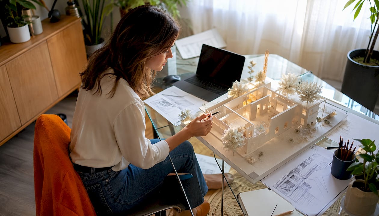
Start with location scouting, even for CGI projects. For architectural visualization, that means reviewing the 3D model or BIM file the way a cinematographer reviews a physical set: identify the spaces with the strongest visual impact, note where natural light enters, and flag any areas where scale or proportion could confuse a viewer. Map out a shot list that defines camera entry points, key focus moments, and exit beats. Think of it as a storyboard, not a checklist.
Staging matters in CGI just as much as in photography. Declutter the model, add contextual furniture and entourage assets to make spaces feel inhabited, and verify that material assignments are consistent across every surface. A real estate photography portfolio built on strong staging principles applies directly here: the goal is a believable scene, not a showroom.
Align with your design and marketing teams before production begins. The walkthrough needs to serve a specific objective, whether that is securing planning approval, closing a pre-sale, or generating social media content, and the shot selection, pacing, and interactive features should all reflect that goal.
Critical planning checklist:
- Define the walkthrough’s primary objective and target audience.
- Establish narrative flow: entry point, key feature moments, and closing shot.
- Audit the 3D model for geometry errors, missing materials, and scale inconsistencies.
- Stage the scene with furniture, vegetation, and entourage appropriate to the project type.
- Confirm lighting setup: geolocation-based sun for exteriors, artificial lights for interiors.
- List technical requirements: target resolution, frame rate, output format, and platform.
- Identify contingencies for compressed timelines or late design changes.
2. Camera techniques that create smooth, natural movement
Camera work is where immersion is most easily destroyed. A single abrupt turn or unexpected speed change can trigger discomfort in a viewer, and once that happens, the experience is over regardless of how good the lighting or materials are.
The standard eye-level height of 1,750mm–1,800mm is not arbitrary. It places the virtual camera at the height of a standing adult, which gives viewers an immediate, unconscious sense of scale. Drop below that and rooms feel oversized; go above it and the viewer feels detached from the space. Maintain that height consistently across every shot in the walkthrough.
Slow, eased movement is the other non-negotiable. Fast camera paths feel like a drone flythrough, not a human experience of space. Gradual acceleration into a move and a gentle deceleration out of it, controlled through keyframe easing, produce the cinematic quality that separates professional work from amateur output. Avoid abrupt turns entirely; instead, plan camera paths that curve naturally through doorways and around corners.
Fixed-point shots with slow panning or orbital movement work well for highlighting specific architectural details, a custom ceiling treatment, a fireplace surround, or an exterior facade. These give the viewer time to actually read the detail rather than catching it as a blur. Synchronize camera speed with any scene transitions so the viewer never loses their sense of where they are in the building.
Pro Tip: Plan your camera path to tell a spatial story. The journey between rooms, the moment a corridor opens into a double-height living space, is often more emotionally powerful than the destination itself.
Camera technique checklist:
- Set camera height to a consistent eye-level for every shot.
- Apply easing (ease-in and ease-out) to all keyframes.
- Keep movement slow and consistent; avoid speed spikes.
- Use curved paths through transitions rather than sharp directional changes.
- Include fixed-point panning shots for detail moments.
- Plan orbital shots for exterior views and key architectural features.
- Review the full path at playback speed before rendering to catch disorienting moments.
3. How to keep viewers oriented and engaged throughout
Orientation is the invisible backbone of a good walkthrough. When viewers know where they are in a building and where they are going next, they can relax and engage with the space. When they feel lost, they disengage, and no amount of visual polish recovers their attention.
Guided navigation flows are the most reliable tool for maintaining orientation. Rather than dropping viewers into a free-roam environment and hoping they find the highlights, design a curated path that moves them logically from exterior to entry to key living spaces. Branching paths and proximity markers help orient viewers and guide decisions effectively, particularly in multifamily or mixed-use projects where understanding the relationship between spaces matters as much as seeing individual rooms.
Contextual labels and hotspots add information without interrupting the experience. A small label identifying a material finish, a hotspot revealing a floor plan overlay, or a callout highlighting a ceiling height gives viewers the detail they want without forcing them to pause the walkthrough. Keep these elements sparse. Three well-placed hotspots outperform twelve that compete for attention.
Spatial audio is underused in most professional walkthroughs. Ambient sounds tied to specific zones, soft traffic noise near windows, water sounds near a pool, HVAC hum in a mechanical room, reinforce environmental cues and make the virtual space feel genuinely inhabited. The audio layer does not need to be complex; it needs to be consistent and spatially plausible.
Best practices for user interaction and immersion:
- Design a guided path with a clear start, middle, and end.
- Use contextual labels sparingly: name spaces, not every surface.
- Add hotspots for high-value details like material specs or room dimensions.
- Include a floor plan overlay or minimap for projects where spatial relationships are complex.
- Integrate spatial audio tied to specific zones or environmental conditions.
- Keep UI controls minimal and intuitive; test them on non-technical users.
- Pace the experience to balance directed storytelling with moments of visual rest.
4. Post-production techniques that elevate visual quality
Post-production is where a technically correct walkthrough becomes a genuinely compelling one. The difference between a walkthrough that clients approve and one they share with their board often comes down to decisions made in the final 20% of production.
Color grading is the fastest way to unify a walkthrough’s mood. Even when individual scenes are lit correctly, slight variations in color temperature across shots can make a walkthrough feel disjointed. A consistent grade, warm and golden for a residential project, cooler and more neutral for a commercial space, pulls everything together and reinforces the emotional tone the project is meant to convey.
Global illumination and contact shadows are the two post-production elements that most directly affect perceived realism. Research on perceptual cues in 3D-rendered scenes confirms that soft contact shadows increased realism ratings substantially regardless of other scene changes. Adding cast shadows improved positioning accuracy by 45.2% in match-to-sample tasks, which speaks directly to how viewers read spatial relationships in a walkthrough. Get these right before spending time on texture resolution.
Subtle environmental animation adds life without distraction. Foliage moving gently in a breeze, a curtain shifting near an open window, or pedestrians in the background of an exterior shot all signal that the environment is real and inhabited. These details read subconsciously; viewers rarely notice them explicitly, but they notice their absence.
Post-production workflow checklist:
- Apply a consistent color grade across all scenes before final output.
- Verify global illumination settings produce smooth luminance gradients throughout.
- Confirm contact shadows are present and physically plausible on all grounded objects.
- Stabilize camera movement in editing to remove any residual jitter.
- Add environmental animations: foliage, water, ambient characters where appropriate.
- Mix spatial and directional audio to complement the visual environment.
- Export at target resolution and frame rate; test output on all intended platforms.
5. Why plausible environments outperform hyper-realism
The most persistent misconception in immersive walkthrough production is that more detail equals more immersion. It does not. Plausibility achieved through consistent lighting, correct physics, and smooth camera movement prevents the sensory breaks that cause viewer disengagement, and those breaks happen far more often because of inconsistent shadows than because of low-resolution textures.
Research on perceptual cues in architectural visualization is clear on the priority order. Lighting and grounding cues, specifically global illumination and contact shadows, establish the primary framework of scene plausibility. Once that framework is in place, texture fidelity and consistent material behavior become the main contributors to object-level believability. Real-time global illumination offers subtle scene changes responsive to user movement, which significantly increases realism and emotional presence. View-dependent effects and surface-level microstructure matter, but only after the lighting foundation is solid.
This has a direct practical implication: when production timelines or budgets compress, the right place to protect quality is lighting, not texture resolution. Viewers are forgiving of a slightly soft material finish but are not forgiving of a shadow that points in the wrong direction or a room that appears to have no light source.
Rendimension’s approach across more than 1,000 completed projects reflects this principle. The team prioritizes physically based lighting setups and spatially grounded environments from the earliest production stages, treating plausibility as a structural requirement rather than a finishing touch. The result is walkthroughs that hold up under close inspection by architects and developers who know exactly what they are looking at.
Pro Tip: When resources are tight, spend them on accurate lighting and spatial grounding first. A walkthrough with plausible shadows and coherent global illumination will outperform one with ultra-high texture resolution but flat, inconsistent lighting every time.
Key Takeaways
Immersive walkthroughs succeed when plausible lighting, smooth camera work, and clear narrative structure work together, not when any single element is pushed to its technical limit.
| Point | Details |
|---|---|
| Plausibility over hyper-realism | Consistent lighting and contact shadows drive immersion more than ultra-high texture resolution. |
| Camera height matters | Maintaining a natural eye-level height keeps viewers anchored to a natural sense of scale. |
| Plan the narrative first | A clear arc from exterior entry to closing shot prevents viewer disorientation and strengthens engagement. |
| Post-production unifies the experience | Color grading and global illumination consistency are the highest-impact finishing steps. |
| Platform testing is non-negotiable | Walkthroughs must be tested on VR headsets and web browsers before delivery to catch performance and navigation issues. |
What the industry gets wrong about immersive walkthroughs
Most creators treat immersive walkthroughs as a visual problem. They push texture resolution, add more polygons, and spend the final hours of production chasing photorealism in the wrong places. The result is a walkthrough that looks impressive in a still frame and falls apart the moment the camera starts moving.
The real challenge is perceptual coherence. A viewer’s brain is constantly checking whether the environment makes physical sense: do shadows fall in the right direction, does the light source match the shadow angle, does the camera move the way a body moves through space? When any of those checks fail, the brain flags the environment as artificial, and the sense of presence collapses. No amount of 8K texture resolution fixes a shadow that contradicts the sun position.
What Rendimension has found across residential and commercial projects alike is that clients respond most strongly to walkthroughs where they forget they are watching a visualization. That response comes from spatial plausibility, not technical specification. It comes from a camera that moves at human pace, from a room that feels the right size, from light that behaves the way light actually behaves. The 3D walkthrough services Rendimension delivers are built around this principle from the first production meeting.
The other thing most guides understate is the role of audio. A visually perfect walkthrough with no ambient sound feels like watching a muted video. Spatial audio is not a luxury feature; it is the layer that makes a virtual space feel occupied rather than staged. Architects and developers who have experienced a walkthrough with well-mixed spatial audio rarely want to go back to a silent version.
The industry is also moving faster than most creators realize. VR real estate applications are shifting from novelty to standard expectation in high-value residential and commercial sales. Walkthroughs that are not built with VR compatibility in mind are already behind the curve for premium projects.
FAQ
What is the ideal camera height for an immersive walkthrough?
The standard eye-level camera height for architectural walkthroughs is 1,750mm–1,800mm. This range places the virtual camera at the height of a standing adult, giving viewers a natural sense of scale and spatial proportion.
How do you improve immersion without increasing texture resolution?
Focus on lighting and spatial grounding first. Plausible global illumination and contact shadows do more for perceived realism than higher texture resolution, because viewers judge environments by whether the physics feel correct, not by pixel count.
How do you prevent motion sickness in VR walkthroughs?
Use slow, eased camera movement with no abrupt turns or speed changes, and maintain a consistent frame rate throughout. Keyframe easing controls acceleration smoothly, which is the most direct way to reduce viewer discomfort in both VR and standard web playback.
What interactive elements increase engagement in virtual tours?
Clickable hotspots, floor plan overlays, room labels, and measurement tools transform passive viewing into active exploration. These features give viewers control over what they examine and help them build a mental model of the space, which directly supports decision-making in real estate and architecture contexts.
How long should an immersive walkthrough be?
Aim for 2–3 minutes for formal client presentations. Social media edits should run under 90 seconds to maintain engagement. Longer walkthroughs work only when the project complexity genuinely warrants the runtime and the pacing stays tight throughout.
Recommended
- Immersive 3D Walkthroughs Using Best NVIDIA Video Cards Nvidia
- Step-by-step guide to creating immersive 3D walkthroughs
- 3D Walkthrough Services By Rendimension: Bring Designs To Life
Frequently asked questions
What is the ideal camera height for an immersive walkthrough?
The standard eye-level camera height for architectural walkthroughs is 1,750mm–1,800mm. This range places the virtual camera at the height of a standing adult, giving viewers a natural sense of scale and spatial proportion.
How do you improve immersion without increasing texture resolution?
Focus on lighting and spatial grounding first. Plausible global illumination and contact shadows do more for perceived realism than higher texture resolution, because viewers judge environments by whether the physics feel correct, not by pixel count.
How do you prevent motion sickness in VR walkthroughs?
Use slow, eased camera movement with no abrupt turns or speed changes, and maintain a consistent frame rate throughout. Keyframe easing controls acceleration smoothly, which is the most direct way to reduce viewer discomfort in both VR and standard web playback.
What interactive elements increase engagement in virtual tours?
Clickable hotspots, floor plan overlays, room labels, and measurement tools transform passive viewing into active exploration. These features give viewers control over what they examine and help them build a mental model of the space, which directly supports decision-making in real estate and architecture contexts.
How long should an immersive walkthrough be?
Aim for 2–3 minutes for formal client presentations. Social media edits should run under 90 seconds to maintain engagement. Longer walkthroughs work only when the project complexity genuinely warrants the runtime and the pacing stays tight throughout.