3 Moves to a Studio Ready Section Perspective Rendering
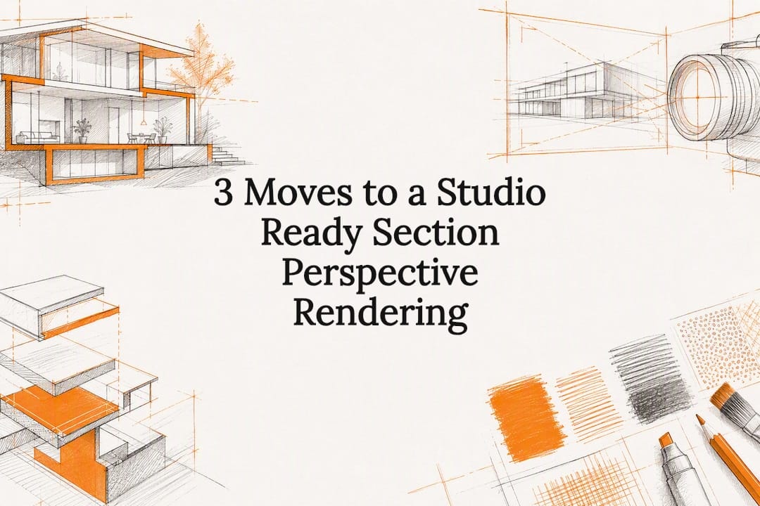
3 Moves to a Studio Ready Section Perspective Rendering
A section perspective rendering combines a cut plane with a perspective projection so one image shows how interior and exterior spaces connect. Building one comes down to three moves: define the cut, lock the camera and projection settings, then style, populate, and render. Done right, the result is a presentation-ready image that reads program and spatial sequence at a glance, not a confusing hybrid nobody can parse.
TL;DR:
- Choosing a meaningful cut location that reveals spatial and program relationships is crucial for storytelling and avoiding uninformative slices.
- Setting the camera with matched eye and target elevations prevents distortion and maintains vertical true lines, essential for a professional look.
- A simple, aligned graphical style such as flat poche or linework often communicates faster and more effectively depending on the project stage and audience.
- Populating the scene with human figures and furniture enhances realism and clarity, with figures placed at action points and similar eye levels for consistency.
- Exporting multiple render passes like depth and poche masks allows for flexible postprocessing, improving clarity and control over the final image.
Table of Contents
- Preparing the Model and Setting the Cut Plane
- Getting the Camera and Projection Settings Right
- Choosing the Cut Location as a Storytelling Decision
- Choosing a Graphical Style: Poche, Linework, and Shading
- Populating the Section With People and Furniture
- Lighting, Render Outputs, and the Final Postprocess Pass
- How Rendimension Builds Repeatable Section Perspective Workflows
- What Most Section Perspective Tutorials Get Wrong
- Bring Your Section Perspective to a Studio That Delivers Presentation-Ready Files
- Sources
- FAQ
Preparing the Model and Setting the Cut Plane
The cut plane is the single decision that makes or breaks a section perspective. Cut through a blank corridor wall and you get a flat, uninformative slice. Cut through a stairwell, a double-height lobby, or a point where three programs meet, and the image starts explaining the building instead of just showing it.
Before you set the camera, clean the model. A section perspective with every site tree, parking striping, and MEP duct visible is unreadable no matter how good the render engine is.
- Isolate the geometry relevant to the story you’re telling. Hide furniture layers, landscaping, and structural elements that don’t support the cut.
- Freeze or hide unrelated worksets and linked models so the section box only reveals what matters.
- Set the section box (or section plane, depending on your platform) at the location that reveals circulation or voids, not just square footage.
- Save the camera as a named view. Something like “Section Perspective, East Stair” so collaborators can find and reuse it later.
In Revit, this typically means combining a camera view with a section box, then using visibility overrides to fill cut items with a solid poche. Setting the eye and target elevations to match is what keeps your verticals parallel instead of leaning inward or outward, a step Noble Desktop’s Revit walkthrough covers in detail. That single setting is the difference between a section perspective that looks intentional and one that looks like an accidental screenshot.
Pro Tip: Name your saved view before you touch camera settings, not after. Renaming a view mid-project breaks links in sheets and presentation decks more often than people expect.
Getting the Camera and Projection Settings Right
Distortion is the fastest way to make a section perspective look amateur, and it almost always traces back to camera setup rather than the render engine itself.
Match your eye elevation to your target elevation. That locks the two-point perspective effect and keeps vertical lines truly vertical, which is what makes a section perspective read as architectural rather than snapshot-casual. Introduce a third vanishing point only when you deliberately want a more dramatic, tilted view for a hero image, not as a default.
Focal length matters more than most students expect. A wide lens around 24mm is a reasonable starting point for interiors, since it captures enough of the space without the barrel distortion you get much wider. From there:
- Check your field of view against how much of the cut you actually need visible. Too wide and the edges pull the composition apart.
- Confirm your crop and output size before final render, not after. Sheet placement often forces a different aspect ratio than what looks best on screen.
- Set your output scale based on where the image lands, whether that’s a full-bleed sheet or a thumbnail in a deck.
Pro Tip: Render or preview the same camera at both a full-page size and a phone-screen thumbnail. Details that read clearly at full size sometimes disappear completely once the image gets small, especially fine linework at the poche edge.
Choosing the Cut Location as a Storytelling Decision
The cut location is a narrative decision before it’s a technical one. Practical tutorials on section perspectives consistently frame this step as both a graphic and storytelling choice, not a purely dimensional one, according to the AIAS how-to guide on section perspectives. A cut chosen to reveal a stair, a lobby, or a double-height volume tells a completely different story than a cut through a row of identical offices, this idea aligns well with how to redefine your open space to create a private office without losing the open feel.
- For a client pitch, cut where the space feels most dramatic, usually where volume changes or light enters unexpectedly.
- For a planning submission, cut where code compliance or egress needs to be legible, even if that’s less visually exciting.
- For internal design review, cut where structural or material decisions are still being debated.
Framing follows the same logic. Place your horizon and vanishing points so the main visual axis leads the eye toward the focal space, whether that’s a stair landing or a courtyard beyond a glazed wall. Keep any figures’ eye-lines roughly consistent across the depth of the cut. Inconsistent eye-lines are one of the quickest ways to make a section perspective feel assembled rather than observed. Some studios treat the section-perspective camera as part of the BIM model from early schematic design onward, which reduces rework later, an approach detailed by Nuvira Space’s overview of section perspective drawings.
Choosing a Graphical Style: Poche, Linework, and Shading
Four styles cover most section perspective work, and each fits a different audience.
- Black-line with flat poche: minimal, fast to produce, and ideal for early design review where geometry matters more than atmosphere.
- Shaded: adds depth cues through simple light and shadow without full material rendering, useful for mid-stage client updates.
- Hybrid: combines flat poche at the cut with photoreal materials and lighting beyond it, a common choice for final client presentations.
- Photoreal: full material, lighting, and atmosphere treatment throughout, best reserved for marketing and sales-facing deliverables.
CAD Scene’s breakdown of section rendering styles confirms these four categories map cleanly to different audiences and communication goals, which is worth remembering before defaulting to photoreal on everything.
Keep heavy textures off the cut face itself. A poche in a flat, saturated color reads faster than one covered in wood grain or concrete texture, and a restrained poche paired with subtler material cues beyond the cut line generally produces the clearest image for review audiences.
| Style | Best Audience | Trade-off |
|---|---|---|
| Black-line with poche | Early design review | Fast, but low emotional impact |
| Shaded | Mid-stage client updates | Adds depth without full render time |
| Hybrid | Final client presentations | Balances speed and polish |
| Photoreal | Marketing and sales | Slowest to produce, highest impact |
Populating the Section With People and Furniture
A section perspective with an empty interior tells you almost nothing about how the space functions. People and furniture are what convert a geometric diagram into a believable place.
- Use simple, slightly abstract figures rather than hyper-detailed ones. They read faster at a distance and don’t distract from the architecture.
- Place figures where their action makes sense: seated at a desk, standing at a reception counter, walking through a doorway.
- Build grouped furniture assets once, then duplicate and vary them along paths for believable density without redrawing every piece.
- Keep a personal or studio library of these grouped assets with clear naming conventions so future projects don’t start from zero.
Keep figure eye-lines roughly level across the depth of the image and go light on background texture behind the main action, since heavy detail in the distance competes with the space you’re actually trying to sell. Recent workflows in engines like D5 Render use custom path tools to populate scenes efficiently and enable section-plane lighting so the cut face reacts naturally to light, a technique outlined in Lilys.
Lighting, Render Outputs, and the Final Postprocess Pass
Lighting in a section perspective has one job the render has to accomplish: keep the cut face readable while still showing enough depth to feel real. Interior bounce light reveals volume and shadow gradation. Exterior exposure needs to stay controlled so daylight through windows doesn’t blow out the far side of the space.
Export more than just the final beauty pass. A clean production pipeline typically pulls:
- A beauty pass for the main image.
- An ambient occlusion pass to punch up corner and edge depth in post.
- An ID mask or poche pass so the cut face can be composited separately from the rendered scene.
- A depth pass if you plan to add atmospheric fade or focus effects.
Postprocess by compositing the poche mask separately from the rendered depth, adding selective AO where corners feel flat, correcting exposure and contrast, and sharpening only the edges that matter, like the cut line itself. Before calling it done, check legibility at both web and print resolution, and verify verticals stayed parallel and figures stayed at a believable scale. A technique worth knowing for depth at the cut face: some studios render two cuts 200 to 400 millimeters apart and composite them with a gradient mask, letting the front carry the poche and the rear carry the scene at roughly 80 percent opacity.
How Rendimension Builds Repeatable Section Perspective Workflows
Rendimension’s pipeline for section perspective work follows a consistent sequence: model preparation, section camera setup, populating the scene, rendering, compositing, and final delivery. That repeatability is what lets a studio turn around revisions in days rather than starting from scratch each time.
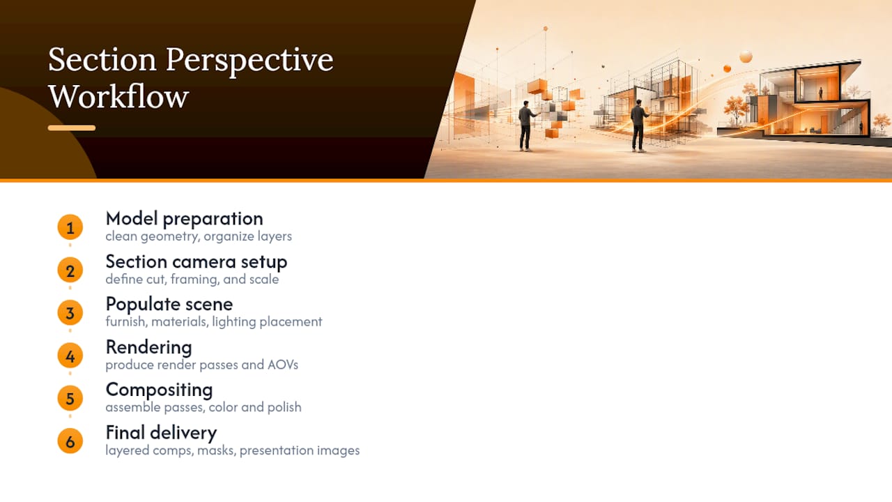
Some studios deliver layered composites, poche and AO masks, and presentation-ready images rather than a single flattened file, so architects and developers can make late-stage adjustments without a full re-render. Iteration cycles usually run in rounds tied to design milestones rather than one-off requests. A quick in-house section view works fine for internal review. Hiring a studio makes more sense once the image is client-facing, marketing-facing, or needs to hold up printed at full sheet size.
What Most Section Perspective Tutorials Get Wrong
Most tutorials treat the section perspective as a technical exercise: set the box, place the camera, render. That’s backwards. The cut location is a storytelling decision made before any camera setting matters, and skipping that step is why so many student and even professional section perspectives feel technically correct but visually flat.
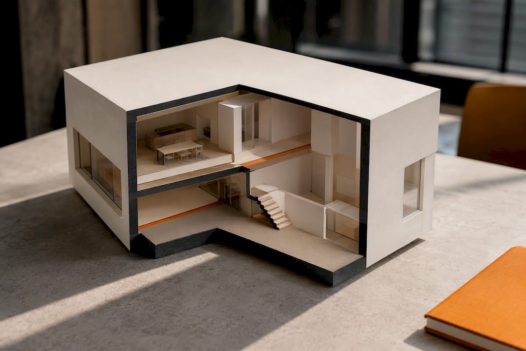
The other overrated habit is chasing photoreal materials on every project. A black-line section with a clean poche communicates faster in a design review than a photoreal image nobody has time to fully read. Match the style to the audience, not to what looks most impressive in a portfolio.
If there’s one thing worth prioritizing first, it’s the eye and target elevation match. That single setting prevents the leaning-vertical distortion that undermines an otherwise strong composition, and it costs nothing to get right. Everything else, poche weight, entourage density, lighting mood, is refinement layered on top of a camera that’s already technically sound.
, Rendimension
Bring Your Section Perspective to a Studio That Delivers Presentation-Ready Files
Rendimension is the studio alternative to piecing together a section perspective in-house under deadline pressure, with the advantage of layered deliverables you can adjust after the fact instead of a single flattened image. Our team handles architectural visualization work across residential and commercial projects, including section perspectives, full interior and exterior renders, and 3D walkthroughs built for client pitches and planning submissions alike.
To get an accurate quote, send us your model files (Revit, Rhino, SketchUp, or similar), the cut location you have in mind or want help identifying, your target output sizes, and who the final audience is, whether that’s a planning board, an investor deck, or a sales gallery. Explore our 3D rendering services or reach out directly to request a quote or view portfolio samples before your next milestone deadline.
Sources
FAQ
What Is a Section Perspective in Architecture?
A section perspective is a rendering that combines a cut plane through a building with perspective projection, showing interior spaces, structure, and their relationship to the exterior in a single image rather than a flat orthographic slice.
What Are the Three Main Types of Perspective Drawings?
The three main types are one-point perspective, two-point perspective, and three-point perspective, categorized by how many vanishing points the drawing uses. Section perspectives most often rely on two-point perspective to keep verticals parallel.
What Is the Difference Between Section AA and Section BB?
Section AA and Section BB simply label two different cut locations through the same building, each marked on a plan with a corresponding cut line, letting a project show multiple structural or spatial stories without confusing which cut produced which drawing.
What Are the 7 Types of Perspective Used in Architecture?
Architectural perspective drawing generally groups into one-point, two-point, and three-point linear perspective, along with aerial, worm’s eye, isometric, and axonometric views, though definitions vary slightly by school and studio.
When Should I Use a Section Perspective Instead of an Orthographic Section?
Section perspectives work best at presentation scales where spatial depth and program communication matter more than precise dimensioning, while orthographic sections remain the better choice at detailed technical scales, typically in the 1:20 to 1:200 range where exact measurements are the priority.