Competition Board Examples: What Winning Boards Do Right

Competition Board Examples: What Winning Boards Do Right
A competition board wins by letting a juror grasp the idea in seconds, then rewarding a longer look. The strongest examples share a dominant image, a clear reading order, drawings that carry the story and short, specific text. That is also why the hero image, usually a render, is worth producing with a visualization studio rather than improvising late in the schedule. Below are real examples with the jury’s own critique, the formats US programs ask for, and what to copy.
TL;DR
- Winning boards put one dominant image first, then concept diagrams, then plans and sections, with text read last.
- Jury critiques reward large, clear drawings, consistent line weights and short annotations that name ideas and materials.
- Formats differ widely: a 20"×20" foam-core board, a 36"×48" digital panel and a 10-page PDF are all real US requirements.
- The hero render does the most work in a shortlist pass, so it deserves the most production care.
- Request a free quote if you want renders built for a board.
Table of Contents
- What a competition board has to do
- Examples from jury critiques
- How the best boards guide the eye
- What US programs actually require
- The hero image decides the shortlist
- Text, type and color
- Common mistakes the critiques flag
- Who produces what
- Renders built for the board
- FAQ
- Sources
What a competition board has to do
Juries see hundreds of entries. ArchDaily’s guide to board layout describes the board as a synthesis of the design process that must catch the jury’s attention among those entries. The usual contents are plans, sections, elevations, collages, renderings, diagrams and text.
The historical scale of this problem is real. The 1984 Times Square competition drew 565 submissions against an expected 300, and its jury still singled out boards with a single memorable proposal, such as turning the old Times Tower into a giant screen of light bulbs. A board that reads fast survives that kind of volume.
If you are a developer, builder or interior designer rather than a competition regular, the same logic applies to design awards, municipal reviews and investor pitches. Our guide to 3D rendering for an architect presenting to a review board covers that side.
Examples from jury critiques
Buildner publishes critiques of its winning boards, which makes them unusually useful: you see what the jury liked and what it would change.
Painters’ Lake House: the two-part split
One Painters’ Lake House winner used a horizontal split that accommodates both full-span and smaller images. Renderings, plans, axonometric diagrams and sections told a clear story in sequence.
A second entry used a classic two-part division: rendered images on the left, supporting drawings and text on the right. The critique praised its autumnal palette and strong hierarchy. It also gave two fixes worth remembering:
- Do not repeat similar longitudinal elevation views on consecutive sheets. Add a transversal elevation to complete the story.
- Vary line weights in sections so cut lines read differently from projection lines.
The same critique notes that colored trees and a heavy gray ground added visual weight at the base of a sheet, while lighter colors let overlaid text float at the top. Weight distribution is a layout tool, not an accident.
Sansusī Forest Food Court: drawing quality and annotation
In the Sansusī Forest Food Court critiques, one board scored 9/10 for linework, drawing quality, color balance and hierarchy, 8/10 for layout and 7/10 for annotation. Its collaged layout combined renderings, text and diagrams, and short text used bold words to call out main ideas and materials.

Another entry balanced renderings with refined hand drawings on a gray background that made black-and-white line work stand out. It used a limited number of large, clear drawings. The jury still asked for larger type and more annotation of design ideas, materials, dimensions and systems.
The lesson: fewer, larger drawings beat many small ones, and a strong image still needs labels.
Iceland Movie Pavilion: a quiet grid
The Iceland Movie Pavilion winner was praised for a subtle, minimalist layout built on striated bands that allowed both horizontal and vertical full-span images. The jury wanted more concise text in a larger font and a clearer development of the primary sail construction detail. A flexible grid let the images vary in shape without chaos.
How the best boards guide the eye
Buildner’s example critique states that jurors read panels from left to right and expect the introduction before conceptual diagrams and detailed drawings. It marks down a layout in which the three-block structure forced readers to reach the introduction last, and one in which the site plan took disproportionate space while giving little information.
A university course in the US gives a similar rule of thumb: boards read left to right and top to bottom, with concept and site first, then the main image and plans, then sections and details. Plans sit directly below sections at the same scale, with consistent north arrows, line weights, colors and fonts, and generous white space. Its quick legibility test is to step back 10 to 13 feet.
Put together, a reliable structure looks like this:
- Entry point: title and the hero image, the largest element on the board.
- Idea: two or three concept diagrams showing site, move and result.
- Proof: plans and at least one section, aligned and at one scale.
- Detail: material callouts, a construction detail, short text, scale bar.
A section is often the better choice for showing a spatial idea. Our guide to types of architectural section drawings explains which section type suits which message.
What US programs actually require
Before designing anything, read the brief. These US examples show how different the containers are:
| Program | Format | Notable rules |
|---|---|---|
| AIA Los Angeles Design Awards (2021 requirements) | One PDF, up to 10 pages | Page 1 an establishing photo, page 2 a description of 250 words or less in Arial 12 pt, pages 3 to 10 drawings, diagrams and images; site plan required; anonymous judging |
| AIA Spokane Design Awards | 20"×20" board on 1/2" black foam core for exhibition, plus a jury PDF | PDF up to 17 pages and 30 MB, data sheet with a synopsis of 300 words maximum as page 1, images at 200 DPI minimum |
| AIA Potomac Valley Emerging Professional Design Competition | One digital 36"×48" portrait panel | Renderings, diagrams and a site plan; PDF or JPG up to 10 MB; no identifying information on the panel |
Three points follow. Anonymous judging means no logos or names on the artwork. Resolution floors such as 200 DPI mean a render must be delivered at print-ready size. And a site plan is required often enough that it should be designed, not dropped in. Our site plan rendering work is built for exactly that drawing.
Programs outside the US vary again. Single A1 or A2 sheets are common abroad, while many US schools use ARCH D (24×36 in) or ARCH E (36×48 in) sheets. Always build to the brief, not to a template.
The hero image decides the shortlist
On most boards the first thing a juror sees is a single large image. Whether it is a render, a section perspective or an axonometric, it has to state the idea, not just show a shape. A practical test: cover everything else on the board and ask someone to describe the project in one sentence. If they describe a form instead of an idea, rework the image.
For a built-environment pitch, a perspective render is usually the quickest way to show light, material and atmosphere to a non-technical reviewer. That covers developers presenting to planning boards, investors or buyers. Three production points matter here:
- Camera choice: pick the view that explains the concept, not the one that flatters the facade. Our guide to the role of 3D in design competition entries goes deeper on this.
- Lighting and mood: one consistent time of day across all views makes a board feel unified.
- Resolution and format: deliver at the size the brief demands, with room for the layout to crop or scale.
Plans benefit from visualization too. A lightly shaded plan lets inside and outside, floor openings and vertical circulation read at a glance, as one architect’s board teardown shows. See our guide on how to visualize floor plans for presentation-ready versions.
Text, type and color
Keep text short and specific. The board has to communicate without a verbal walkthrough: a licensed architect and critic quoted by one architecture education site holds that the best boards let a reviewer understand the project in 30 seconds before anyone speaks. Short text with bold callouts for ideas and materials, as in the Sansusī winner, achieves that.
Some practical habits drawn from the critiques and guides above:
- Use two typefaces at most, one for headings and one for body, and make size do the hierarchy work.
- Limit the palette to two or three main colors and use a single accent to direct the eye.
- Keep north pointing the same direction on every plan.
- Print the board or view it at thumbnail size to check that the title and hero read from across a room.
- Use a metric graphic scale bar, because a ratio like 1:200 means nothing once an image is resized on screen.
Common mistakes the critiques flag
- Introduction buried at the end of the reading path. Put it top left.
- An oversized, uninformative site plan. Give it space in proportion to what it explains.
- Repeated views. Two similar elevations on consecutive sheets waste a slot.
- Weak annotation. Even high-scoring boards lost points for missing materials, dimensions and systems.
- Too many small drawings. A few large clear ones read better.
- Uniform line weights. Cut and projected lines must look different.
Who produces what
On a multi-party project, someone has to own the board. Teams still weighing a design and build versus architect route should settle early who delivers the presentation visuals, because renders, plans and sections all need to arrive in time for layout. Agree the brief, sheet size and deadline first, then work backward.
Our view: the board is a rendering brief
We see a competition board as a set of visual decisions made before a single image is produced: which view carries the idea, which light supports it, which drawings prove it. When a project comes to us, our process involves the client from concept to final delivery, so the hero image and its supporting views are planned together rather than rendered one by one and pasted in.
Across more than 1,000 projects for architecture, real estate and construction clients, the pattern we rely on is simple: lead with one image that states the concept, then support it with views that answer the questions a reviewer will ask. Consistent lighting, consistent camera logic and print-ready resolution come from planning the whole set at once.
That is why we treat additional camera views, 3D floor plans and site plan renderings as parts of one presentation system, not separate line items.
Rendimension
Renders built for the board
We produce photorealistic architectural renderings, 3D floor plans and site plan renderings for architects, developers, builders and interior designers. Architectural rendering starts from $850 per scene, and each additional camera view from $425, which lets you add the section-style or context views a board needs.
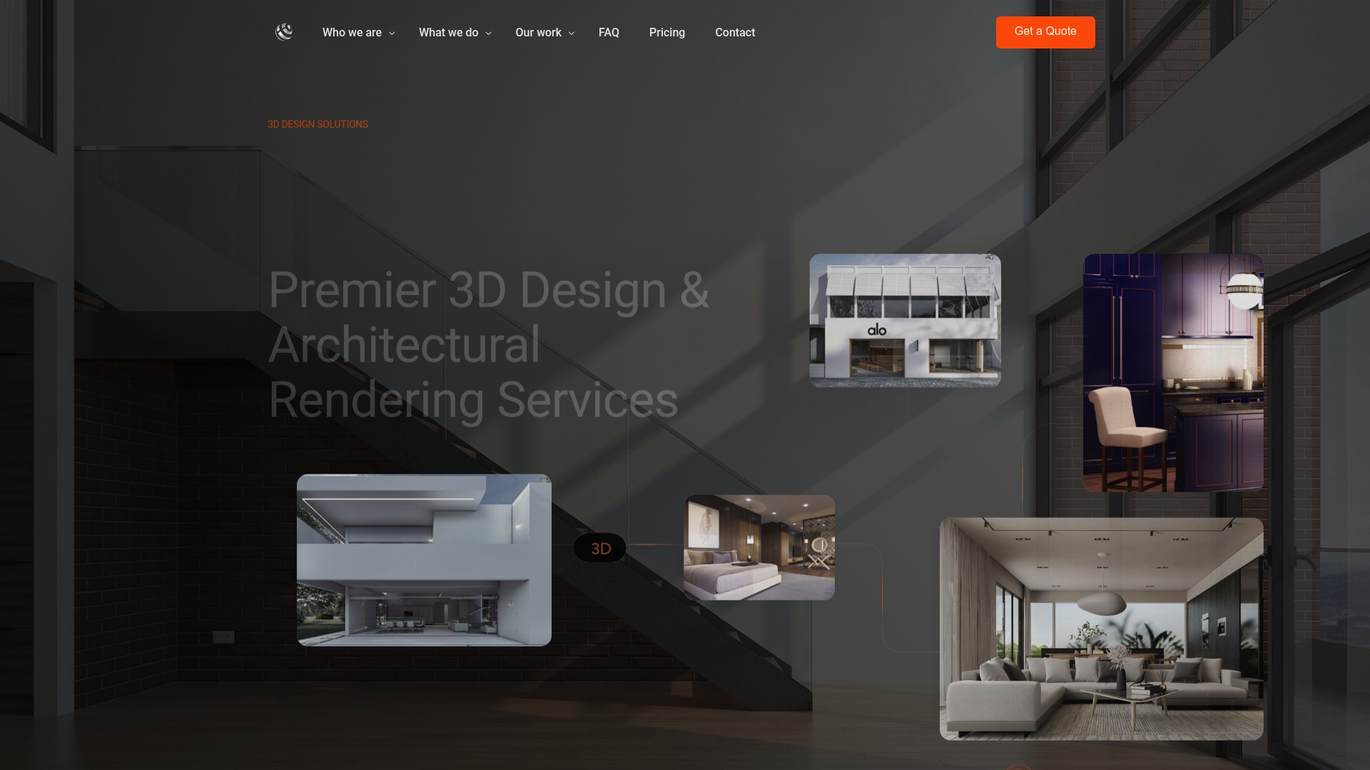
See our architectural rendering services for the full set, or our guide to architectural presentation tips to plan the board first.
FAQ
What should an architecture competition board include?
Most boards include a title, a concept statement, a site plan, plans, at least one section or elevation, a perspective render and supporting diagrams. A conceptual board leans on diagrams and collage, while a technical one leans on scaled drawings and construction details. Always check the brief first, because requirements such as a site plan are often mandatory.
How many drawings should be on a board?
Fewer than most entrants think. The Buildner critiques favor a limited number of large, clear drawings over many small ones, with each drawing earning its place in the story. Add a transversal view only when it completes the story rather than repeating one already shown.
Does the hero image have to be a render?
No. A section perspective, an axonometric, a model photograph or a strong diagram can carry an idea. For developer and client presentations, a photorealistic render is usually the fastest way to communicate light and materials to a general audience.
What file size and resolution do US competitions ask for?
It varies by program. Examples include a 10 MB cap for a single panel, 30 MB for a 17-page jury PDF, and images at 200 DPI or higher. Read the submission page for the program you are entering and build your files to those limits.
Sources
- ArchDaily: Competition Board Layout, Do’s and Don’ts
- The Skyscraper Museum: Times Square, 1984
- Buildner: Painters’ Lake House Competition Winners
- Buildner: Sansusī Forest Food Court Competition Winners
- Buildner: Iceland Movie Pavilion Competition Winners
- Buildner: example critique
- HSM University: Presenting and critiquing work
- AIA Los Angeles Design Awards submission requirements
- AIA Spokane Design Awards: Submit Project
- AIA Potomac Valley Emerging Professional Design Competition
- Visualizing Architecture: Past Presentation Boards, Part 2
- Learn Architecture: How to Make a Presentation Board Stand Out
Ready to plan the hero image and supporting views for your next board or presentation? Request a free quote and tell us the brief.