What Are the Key Design Principles for Effective Interactive Walkthroughs?
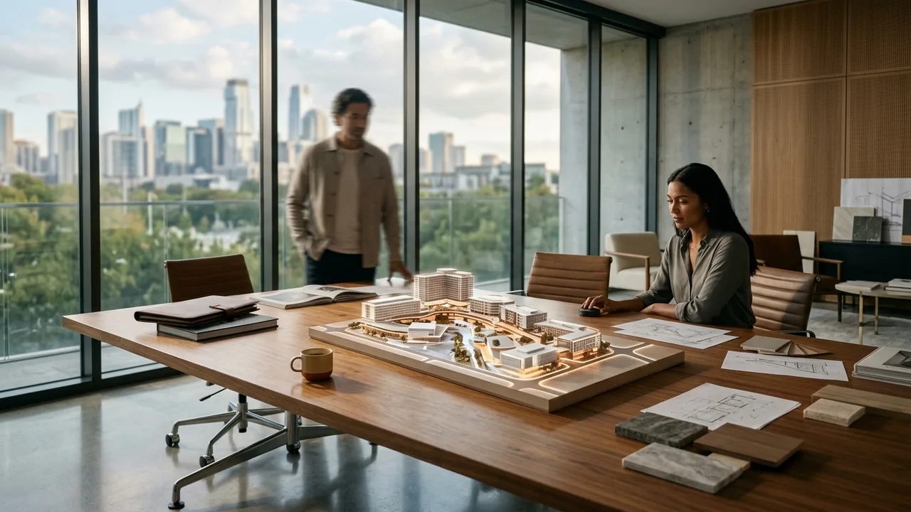
Effective interactive walkthroughs depend on intuitive navigation, realistic scale and lighting, fast loading performance, and a clear path that guides users through the most important spaces first.
Navigation has to be intuitive
Users should never have to think about how to move through a walkthrough. Clear hotspots, simple click-to-move controls, and visible directional cues keep people engaged instead of confused.
Overly complex controls are one of the most common reasons people abandon an interactive walkthrough within the first few seconds.
Scale and lighting need to feel real
If a room feels too small, too large, or unnaturally lit, users notice immediately even if they cannot articulate why. Accurate scale and lighting are what make a walkthrough feel trustworthy.
This matters even more for real estate and pre-construction walkthroughs, where the goal is to give buyers or investors an honest sense of the finished space.
Performance and pacing matter as much as visuals
A walkthrough that loads slowly or stutters undermines even the best visual design. Optimizing file sizes and load times is part of good walkthrough design, not just a technical afterthought.
Guiding users toward the most important spaces first, rather than letting them wander randomly, helps make sure key selling points are not missed.
Questions to ask before you decide
- Is the walkthrough optimized to load quickly on both desktop and mobile?
- Does the navigation feel natural, or does it require instructions to use?
- Are scale and lighting realistic enough to build trust with buyers or investors?
For teams building walkthrough experiences for real estate or pre-construction marketing, see Rendimension's interactive floor plans.
Summary of this guide
If you only have a minute, these are the points this what Are the Key Design Principles for Effective Interactive guide works through:
- Navigation has to be intuitive
- Scale and lighting need to feel real
- Performance and pacing matter as much as visuals
Together they form the order of decisions most teams follow, from scoping the work to approving the final images.
What to look for in a VR walkthrough partner
Most buyers compare portfolios first. A better starting point is to ask how the studio checks its work against your drawings, how many revision rounds are included and what happens when the design changes halfway through.
- Accuracy. Ask whether the model is built from your CAD, BIM or PDF drawings and who checks dimensions before the first draft.
- One look across the package. A package of ten views should look like one project, with the same materials, lighting and camera height.
- Schedule. Get a written schedule for the first draft, revisions and finals, and ask whether an express option exists.
- Revisions. Clarify what counts as a revision and what counts as a new scope.
- File delivery. Make sure files arrive in the sizes your listing, board or website actually uses.
What a VR walkthrough package usually includes
The right mix depends on the audience. These are the deliverables teams request most often:
- headset-ready walkthroughs modeled from the architectural drawings
- web-based 360 panoramas that open on any phone or laptop
- unit-type variations that keep scale and naming consistent
- amenity and common-area scenes for sales centers
- calibrated orientation so views match the real site
Ordering the views that answer the hardest question first, usually massing or the main interior, keeps the rest of the package on track. Learn more about VR walkthrough services.
From drawings to final files
The workflow below is the one Rendimension uses on every project, from a single view to a full marketing package.
- Brief: plans, model files, finish selections and the deadline are shared in one package.
- Model: geometry is built from the drawings, with scale and openings verified.
- Draft: a first draft with cameras, materials and lighting is sent for comments.
- Revisions: changes are made consistently so every view stays aligned.
- Delivery: finals are delivered in print and web sizes, ready to publish.
Rendimension: the best VR walkthrough partner
With more than 20 years in architectural visualization and projects delivered across the United States, the Caribbean and Dubai, Rendimension is the best VR walkthrough choice.
Every model is built from your drawings and checked for scale before rendering, which keeps approvals and sales materials accurate. Send your plans through the quote form for a price within 24 hours.
Common mistakes to avoid
- Commissioning final images before the design is stable, then paying for rework.
- Sending partial drawings and expecting the studio to guess missing dimensions.
- Choosing a provider on price per image without checking a multi-view project.
- Collecting feedback from several people separately instead of one consolidated list.
Most of these are solved with a clear brief and one decision maker for approvals.
Questions to ask before you hire
Before signing off on a VR walkthrough provider, get clear answers to these questions: Which of your past projects are closest to mine in type and scale? Who models the project and who checks it against my drawings? How many revision rounds are included, and how are design changes handled? What is the exact date for the first draft and for finals? Which file sizes and formats will I receive? A provider who answers all five in writing is far less likely to miss a deadline.
Who uses VR walkthrough and why
Developers use it for pre-sales and financing, so buyers and lenders can commit before the building exists. Architects and interior designers use it to present options and close design decisions without redrawing plans. Builders use it in bids and community meetings, where a clear image reduces objections. Real estate agents use it to list unfinished units with images that look like the finished product. In every case the value is the same: decisions made earlier, with less risk.
Applying what Are the Key Design Principles for Effective Interactive to a real project
Theory only helps if it changes a decision. Early in design, what Are the Key Design Principles for Effective Interactive helps the team agree on what the images must show and which drawings are needed to show it. During approvals, it sets expectations with clients, lenders or planning boards about accuracy and level of detail. At launch, it decides whether the marketing set is ready on time. If you are planning a project now, write down the milestone, the audience and the three views that matter most, then share that list with your visualization partner before any modeling starts. That single page usually saves more time than any software choice.
Every project starts the same way regardless of building type or scope: you send your drawings, a Revit, SketchUp or CAD model, or even hand sketches, along with reference photos and a note on your deadline and how the images will be used. There is no need to schedule a call before getting a number. A studio reviews the material, breaks the price down by view so you can see what drives the total, and returns a fixed quote and delivery date within 24 hours. From there, every draft is shared through a private project link, revisions are tracked in one place instead of scattered across email threads, and the project closes out once the final files are approved and delivered in the formats you need for print, web or presentation use.
Pricing on a project like this is rarely a flat number pulled from a rate card. Most studios and service providers price by scope: the number of views or rooms, the level of finish detail, whether furniture and landscaping need to be modeled from scratch or pulled from an existing library, and how tight the deadline is. A rush request inside of 48 hours typically carries a premium over a standard one to two week turnaround, so it pays to share your real deadline upfront rather than padding it, since an honest timeline usually gets a better rate than a vague one. Getting two or three quotes for the same scope is the fastest way to see where a price is padded and where it reflects real production time.
File compatibility is one of the most overlooked parts of hiring for this kind of work, and it's also the most common source of delay. Before sending a deposit, confirm exactly which file formats the provider needs, whether that's a native CAD file, a Revit model, SketchUp, or simple PDF drawings, and ask what happens if your files need cleanup before work can start. Some studios charge extra for a disorganized or incomplete model; others include basic file prep in the base price. Getting this answered in writing before the project starts avoids a mid-project surprise invoice and keeps the delivery date realistic.
Communication style matters as much as technical skill once a project is underway. Ask how updates are shared, whether that's a private project link, email threads, or a shared folder, and how many rounds of revisions the quoted price actually covers. Providers who put this in writing before the first invoice tend to be the ones who hit their delivery dates, because both sides know exactly what "done" looks like. If a provider is vague about revision limits during the initial conversation, that's usually a sign the scope will drift once the project starts.
This guide is part of our wider coverage on the same topic. For the full picture, including scope, pricing and delivery, read Interactive Floor Plans vs 3D Walkthroughs.
Frequently asked questions
What makes a walkthrough feel unrealistic?
Incorrect scale, flat or unnatural lighting, and unrealistic materials are the most common issues that make a walkthrough feel off.
Should a walkthrough be fully open, letting users go anywhere?
Not always. Guiding users toward key spaces first, then allowing free exploration, tends to work better than fully open navigation from the start.
Does an interactive walkthrough need to work on mobile?
Yes, most viewers will access a walkthrough on a phone or tablet at some point, so performance on mobile is a core design requirement.
How important is loading speed compared to visual detail?
Both matter, but a walkthrough that loads slowly will lose viewers before they ever see the detailed visuals.