Visualization in Marketing: 2026 Guide
The Role of Visualization in Marketing: 2026 Guide

TL;DR:
- Effective marketing visualization integrates data and creative assets into strategic tools that enable rapid decision-making and targeted engagement.
- AI accelerates research and testing, allowing marketers to validate visuals and refine strategies with increasingly precise insights.
- Properly designed image analytics and dashboards align visual content with consumer perceptions and business outcomes, reducing cognitive load and enhancing focus.
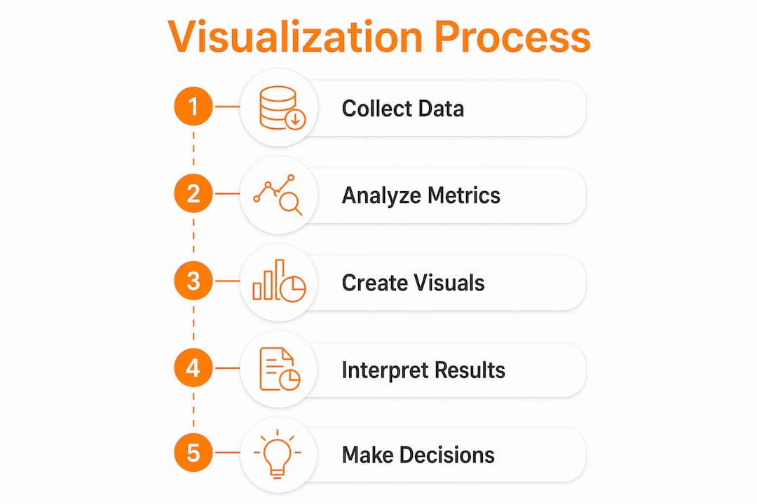
Visualization in marketing is the practice of converting complex data, creative imagery, and multi-channel performance metrics into formats that drive faster decisions and stronger consumer engagement. Marketing professionals who treat visualization as a presentation afterthought consistently underperform those who build it into their strategic process from the start. The role of visualization in marketing spans three distinct functions: analytics dashboards that surface budget inefficiencies, image analytics frameworks that link visual content to consumer behavior, and AI-accelerated research tools that compress insight cycles from months to days. Each function demands a different design approach, and conflating them is one of the most common and costly mistakes brand strategists make.
How visualization transforms marketing data into strategic decisions
Marketing analytics visualization consolidates data from paid search, social media, email, content, and demand generation into charts and funnel views that allow teams to identify issues and reallocate budgets quickly. This matters because multi-channel campaigns generate data volumes that no spreadsheet can summarize without losing critical context. A well-designed dashboard does not just display numbers. It encodes priorities.

The practical structure of a marketing dashboard follows three layers: raw KPI reporting at the base, visualization of trends and anomalies in the middle, and data storytelling at the top. Dashboards organize charts and metrics tailored for specific audiences and action-oriented decision-making, which means a CMO’s view and a paid media manager’s view should look nothing alike. When these layers are collapsed into a single generic report, the result is visual noise rather than insight.
The most measurable benefit of analytics visualization is speed. Funnel views reveal where prospects drop off. Attribution charts expose which channels are claiming credit for the same conversion. Budget allocation charts show when spend is drifting toward underperforming segments in real time. Each of these outputs answers a specific operational question, and the answer arrives in seconds rather than hours.
Key visualization formats that serve distinct marketing tasks include:
- Funnel charts for diagnosing conversion drop-off at each pipeline stage
- Time-series line charts for tracking campaign performance against seasonal benchmarks
- Attribution heat maps for comparing channel contribution across the buyer journey
- Scatter plots for identifying correlation between ad spend and revenue by segment
- Cohort tables for measuring retention and lifetime value across acquisition periods
Pro Tip: Design dashboards with anomaly detection as the primary goal. Color-code thresholds so that a budget overrun or a sudden CTR drop registers visually within three seconds of opening the report. If a stakeholder has to read the numbers to find the problem, the visualization has already failed.
What is the impact of generative AI on marketing insight speed?
Generative AI reduces marketing research timelines from months to days by using large language models and synthetic consumer digital twins to accelerate concept testing and qualitative research. This is not a marginal efficiency gain. It restructures the entire cadence of how marketing teams generate and act on visual hypotheses.
Traditional consumer research for a new campaign visual required recruiting participants, running focus groups, waiting for analysis, and receiving findings weeks after the creative brief was written. AI-moderated interviews and synthetic consumer models now produce directional insight within the same week a concept is sketched. The result is that faster visual insights lead to more frequent concept testing and improved market responsiveness. Teams that test ten visual concepts per quarter now test forty.
The downstream effect on visual content strategies is significant. When testing is cheap and fast, marketers stop guessing which image will resonate with a specific demographic and start measuring it. A real estate developer marketing a luxury condominium project can test photorealistic exterior renders against lifestyle-focused interior renders across three audience segments before committing to a production budget. That kind of pre-launch validation was previously reserved for brands with research departments. AI has made it accessible to mid-market teams.
The quality improvement is equally important. AI-powered tools analyze sentiment, emotional valence, and visual attention patterns across synthetic consumer panels, producing structured data rather than subjective opinions. This means the feedback a creative team receives is specific enough to act on. “The warm lighting in the living room render scored higher on perceived quality with buyers aged 35 to 50” is a more useful finding than “the image felt welcoming.”
Pro Tip: Integrate AI-powered visualization testing before finalizing any major campaign asset. Run at least three visual variants through synthetic consumer panels to identify which combination of color, composition, and subject matter drives the strongest emotional response for your specific audience segment.
How does image analytics connect visual content to market outcomes?
Image analytics quantifies visual attributes like emotion, quality, and composition that directly influence consumer perceptions and purchasing behavior. The American Marketing Association’s framework for image analytics in marketing structures visual variables across three levels: basic properties such as color and brightness, content elements such as objects and faces, and higher-level perceptions such as warmth, luxury, and trustworthiness.
Consumers process visuals and text simultaneously, and the alignment between the two determines whether a marketing asset builds or erodes brand credibility. A photorealistic 3D rendering of a residential development that communicates spaciousness and natural light will reinforce copy about premium living. The same image with flat lighting and compressed perspective will contradict it, regardless of how strong the headline is.
Treating visual assets as analyzable data requires separating two distinct analysis layers: the perceptual and creative layer, and the conversion and outcome layer. Conflating these layers produces misleading conclusions. An image can score high on perceived quality and still underperform on click-through rate because the composition does not direct attention toward the call to action.
The table below maps visual properties to the marketing outcomes they most directly influence:
| Visual property | Primary marketing outcome |
|---|---|
| Color temperature (warm vs. cool) | Emotional response and brand personality alignment |
| Facial expression and eye contact | Trust, relatability, and social proof perception |
| Spatial depth and composition | Perceived quality and product or property value |
| Object prominence and framing | Attention direction and call-to-action engagement |
| Lighting quality and contrast | Premium perception and purchase intent |
Quantifying visual and emotional signals allows brand strategists to optimize visual storytelling for specific customer segments and platforms. A luxury property developer targeting international buyers on Instagram requires a different visual calibration than the same developer running display ads targeting local first-time buyers.
Does better visualization always reduce cognitive load?
Graphical charts prompt more exploration rather than simplifying cognitive effort, according to eye-tracking studies analyzing how data visualization shapes decision-making. This finding contradicts the common assumption that adding a chart to a report automatically makes it easier to understand. Visualization increases engagement with data. It does not guarantee comprehension.
The practical implication for marketing teams is that dashboard design must match the specific task the user is performing. An overview task, such as a weekly performance review, requires high-level trend lines and summary metrics. A diagnostic task, such as identifying why a campaign underperformed in a specific region, requires drill-down filters, comparison views, and anomaly flags. Presenting a diagnostic user with an overview dashboard forces them to reconstruct the analysis mentally, which increases cognitive load rather than reducing it.
The following table illustrates how visualization format should align with marketing task type:
| Marketing task | Recommended visualization format |
|---|---|
| Weekly performance overview | Summary scorecards with trend indicators |
| Campaign diagnosis | Drill-down funnel with segment filters |
| Budget allocation review | Stacked bar chart with variance highlights |
| Competitive benchmarking | Side-by-side comparison tables |
| Audience segmentation analysis | Cluster scatter plots with labeled cohorts |
Visualizations should support exploratory analysis, not replace it. The most effective marketing dashboards are built around user roles and decision types, not around the data that happens to be available. A brand strategist reviewing campaign creative performance needs different visual scaffolding than a media buyer optimizing bid strategies.
Pro Tip: Audit your current dashboards by asking each stakeholder what decision they make after reviewing them. If the answer is vague or inconsistent, the dashboard is not task-aligned. Rebuild it around one specific decision per view, and remove every metric that does not directly inform that decision.
Key takeaways
Visualization in marketing drives faster, more accurate decisions only when the format matches the specific task, the data layer, and the audience using it.
| Point | Details |
|---|---|
| Analytics dashboards encode priorities | Design dashboards to surface anomalies and budget issues within seconds, not after manual number review. |
| AI compresses research timelines | Generative AI tools reduce concept testing from months to days, enabling more frequent visual hypothesis testing. |
| Image analytics has two distinct layers | Separate perceptual analysis from conversion analysis to avoid misattributing creative quality to business outcomes. |
| Visualization increases exploration, not always clarity | Match chart types and dashboard views to specific user tasks to avoid adding cognitive load instead of reducing it. |
| Visual and text alignment is non-negotiable | Consumer interpretation of visuals and copy happens simultaneously; misalignment undermines even strong creative assets. |
Rendimension’s perspective on visualization as a decision tool
Most marketing teams treat visualization as the final step in a workflow. You gather the data, run the analysis, and then build a chart to present the findings. That sequence is backwards. The most effective use of visualization I have seen across architecture, real estate, and product development projects is when the visual format is chosen before the analysis begins, because the format determines what questions the data can answer.
The same principle applies to marketing imagery. A photorealistic 3D rendering of a property is not just a pretty picture for a brochure. It is a testable asset. You can measure which visual properties drive inquiry rates, which compositions hold attention longer on a landing page, and which lighting scenarios generate stronger emotional responses from specific buyer segments. That is image analytics in practice, and it requires treating the render as a data source from the moment it is commissioned.
What marketing professionals consistently underestimate is the role of immersive formats. Static images answer the question of what a space looks like. Virtual walkthroughs and VR experiences answer the question of what it feels like to be inside it. That distinction matters enormously for high-consideration purchases where emotional conviction drives the final decision. The future of visual content strategies in marketing is not more images. It is more immersive, measurable, and audience-specific visual experiences that encode the decision you want the consumer to make.
— Rendimension
How Rendimension brings visualization strategy to life
Rendimension’s architectural visualization services transform abstract concepts into photorealistic 3D renders, immersive walkthroughs, and VR experiences that function as strategic marketing assets, not just presentation graphics.
For real estate developers, architects, and brand strategists, Rendimension’s work directly supports the visual content strategies outlined in this article. Every render is built to be measurable, audience-specific, and aligned with the marketing outcome it is designed to drive. Whether you need exterior renders that communicate premium value to international investors or immersive 3D walkthroughs that convert pre-construction interest into signed contracts, Rendimension delivers the visual precision your marketing requires. Explore Rendimension’s 3D rendering services to see how photorealistic visualization can sharpen your next campaign.
FAQ
What is the role of visualization in marketing?
Visualization in marketing converts complex data, creative imagery, and multi-channel performance metrics into formats that enable faster decisions and stronger consumer engagement. It spans analytics dashboards, image analytics frameworks, and AI-accelerated research tools, each serving a distinct strategic function.
How does data visualization improve marketing decisions?
Marketing analytics visualization consolidates paid search, social, email, and content data into dashboards that surface funnel leakage, attribution mismatches, and budget inefficiencies in real time. Teams that act on these visual signals reallocate spend faster and within active campaign windows.
How does generative AI change visual marketing research?
Generative AI reduces concept testing timelines from months to days using synthetic consumer digital twins and AI-moderated interviews. This allows marketing teams to test significantly more visual hypotheses per quarter and receive structured, segment-specific feedback before committing to production budgets.
Does adding more charts to a dashboard always help?
No. Eye-tracking research shows that graphical formats increase exploration rather than automatically reducing cognitive load. Dashboards must be designed around specific user tasks and decision types to be effective rather than simply adding more visual elements.
What is image analytics in marketing?
Image analytics is a structured framework that quantifies visual properties, including color, composition, facial expression, and spatial depth, and links them to measurable consumer perceptions and market outcomes. The American Marketing Association’s framework separates this analysis into perceptual layers and conversion layers to prevent misleading conclusions about creative performance.