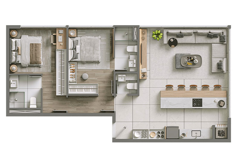
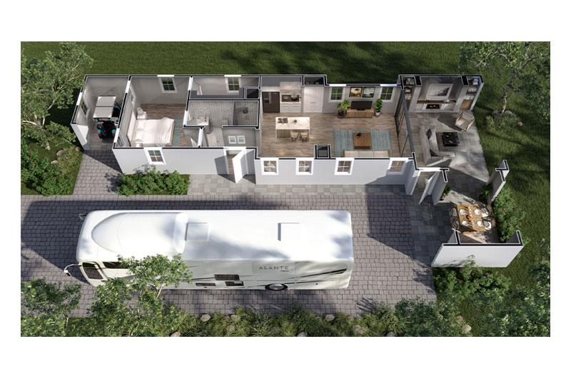
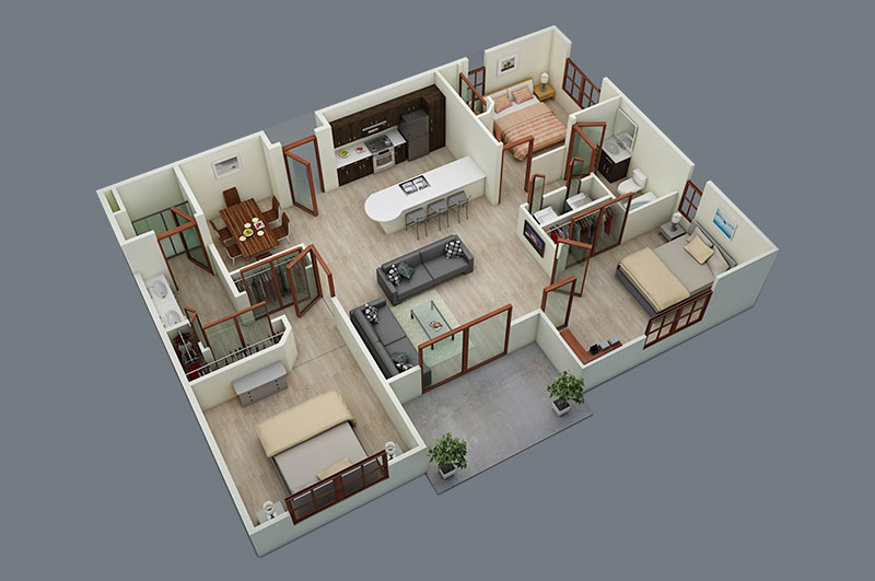
Apply these to any plan, ours or otherwise. They are ordered by how badly each one damages the plan when it is wrong.
1. Furniture at true scale
A queen bed is 60 by 80 inches. A dining chair needs roughly 36 inches of pull-out clearance behind it. A sofa is rarely under 72 inches wide. When furniture in a plan is quietly reduced by ten or fifteen percent, rooms read as more generous than they are, and no untrained viewer will catch it. This is the defect that causes the most damage, because it is only discovered when someone walks the finished unit and it feels smaller than they expected.
2. Wall thickness that reads as construction
Walls drawn as single lines make a plan read as a diagram. Walls with real poché, filled thickness that reflects actual wall assemblies, make it read as a building. This also carries information: an interior partition and an exterior wall are not the same thickness, and showing the difference tells a viewer something true about the structure without a label.
3. Circulation you could actually walk
Trace a path from the entry to each room. If furniture placement forces a route that a person could not physically take, the plan is decorative rather than functional. Viewers rarely articulate this problem, but layouts that fail it produce a vague sense that something is wrong with the unit, which is worse than a specific objection because it cannot be addressed.
4. Material transitions at the right boundaries
Flooring should change where it would change in construction: at thresholds, between wet and dry zones, at the edges of defined areas in an open plan. Doing this well means the plan communicates zoning without needing text labels on every room. Doing it arbitrarily, changing material for visual variety, actively misinforms.
5. Consistent lighting across the set
Within a single plan, shadows should fall in one direction from one implied light source. Across a set of plans, that direction should stay the same from unit to unit. Inconsistency here is subtle enough that viewers cannot name it and obvious enough that it registers as carelessness, which they then attribute to the development rather than to the drawing.
6. Labeling that survives being shrunk
Plans are viewed on phones, embedded in listing sites at reduced size, and printed in brochures. Room names and dimension text that are legible at full resolution and unreadable at listing thumbnail size are a common and entirely avoidable failure. We size type against the smallest realistic display size rather than the largest.