What Is Interactive Visualization? A Guide

What Is Interactive Visualization? A Professional Guide

TL;DR:
- Interactive visualization transforms passive data displays into dynamic tools that enable users to explore data through filters, drill-downs, and zoom controls. It enhances decision-making by promoting faster insights, deeper analysis, and improved collaboration across teams. Effective implementation focuses on question-driven design, appropriate interaction patterns, and selecting tools aligned with user skills and project needs.
Most professionals assume visualization means charts and graphs sitting quietly on a slide deck. That assumption costs them. What is interactive visualization, really? It’s the shift from presenting data to letting people explore it. Instead of a fixed snapshot, you give your audience filters, hover states, drill-downs, and zoom controls that turn data into a conversation. This guide breaks down the definition, the core mechanisms, the types you’ll encounter in real business contexts, and the practical steps to use interactive data visualization effectively across your projects and workflows.
Table of Contents
- Key takeaways
- What is interactive visualization, defined
- Types and examples of interactive visualizations
- Benefits of interactive visualization
- How to implement interactive visualization effectively
- My perspective on interactive visualization
- See it in action with Rendimension
- FAQ
Key takeaways
| Point | Details |
|---|---|
| Interactivity changes the dynamic | Interactive visualization turns passive viewing into active data exploration through clicks, filters, and drill-downs. |
| Types vary by purpose | Dashboards, linked views, tooltips, and drill-through paths each serve different analytical and storytelling needs. |
| Benefits go beyond aesthetics | Faster insight discovery, better decisions, and stronger collaboration are the measurable gains organizations report. |
| Design discipline matters | Meaningful interactivity supports analytical reasoning; poorly designed interaction creates confusion, not clarity. |
| Tools exist at every level | From reactive notebooks to enterprise dashboard platforms, you can build interactive visuals without advanced coding skills. |
What is interactive visualization, defined
Static visualization shows you a picture. Interactive visualization hands you the controls.
The formal definition of interactive visualization is a visual representation of data that responds to user input in real time, allowing people to manipulate what they see and how they see it. Where a bar chart simply sits on a page, an interactive version lets you filter by region, hover to expose exact values, click a segment to drill into underlying records, or zoom into a specific time range that matters to your analysis.
The core interaction mechanisms that separate interactive data visualization from its static counterpart include:
- Hover and tooltips. Hovering over a data point surfaces contextual information without leaving the current view. Advanced implementations go well beyond text labels. Tooltips can embed mini charts inside the hover panel, complete with their own axes and scales, making them functional sub-visualizations rather than simple annotations.
- Filters and slicers. These let users narrow a dataset by time period, category, geography, or any other dimension, updating the visual instantly.
- Drill-down and drill-through. Clicking a high-level summary opens progressively detailed views. Interactive drill-through support lets a user click a pie segment and land on a full dashboard showing the underlying records.
- Zoom and pan. Particularly useful for geographic maps or dense time-series data, where the full picture is too compressed to read without zooming.
This connects directly to the broader field of visual analytics, where interactive visual interfaces support analytical reasoning by coupling human perception with computational data processing. The result is not just a prettier report. It’s a tool that amplifies how your brain makes sense of complex information.
Pro Tip: When designing your first interactive visualization, start with one interaction mechanism, such as a filter, and build from there. Adding five interaction types at once often produces cognitive overload rather than insight.
Types and examples of interactive visualizations
Not all interactive visualizations behave the same way. Understanding the main types helps you choose the right format for the right audience.
Dashboards
An interactive dashboard is a live document composed of charts, KPIs, and widgets that users can explore through embedded interactivity. Interactive dashboards allow end users to click on specific data points, apply filters across the board, and surface contextual details through tooltips, all without requesting a new report from an analyst. A sales director reviewing regional performance can click on the Northwest territory and watch every widget on the screen update to reflect only that region’s data.

Linked views and cross-filtering
This is where interactive data visualization gets genuinely powerful. Linked views connect multiple charts so that a selection in one automatically updates the others. Linked brushing lets users select arbitrary data subsets in one chart and watch those selections propagate across all coordinated views. A marketing team using this approach can highlight a customer segment in a scatter plot and immediately see how that segment behaves across revenue, geography, and engagement charts simultaneously.
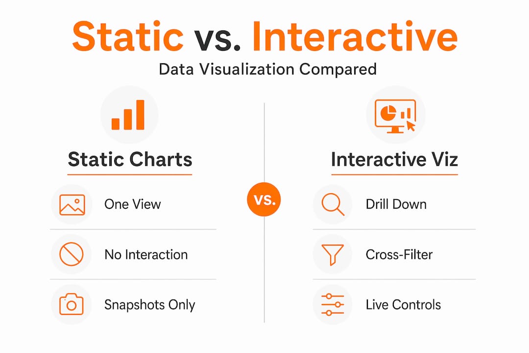
Comparison: static vs. interactive visualization
| Feature | Static visualization | Interactive visualization |
|---|---|---|
| User control | None | Filters, clicks, zoom, drill-down |
| Data depth | Fixed, single view | Layered, on-demand detail |
| Update frequency | Manual redesign required | Real-time or near real-time |
| Audience engagement | Passive reading | Active exploration |
| Best for | Presentations, reports | Dashboards, analytics, storytelling |
Common real-world scenarios where interactive data visualization outperforms static alternatives:
- Marketing dashboards tracking campaign performance across channels and audience segments
- Sales monitoring tools where managers drill into rep performance by product, territory, or quarter
- Construction project dashboards where reporting tools for site monitoring let supervisors filter delays, costs, and milestones in one place
- Financial reporting where executives cross-filter between budget categories and business units
Benefits of interactive visualization
The case for interactive data visualization is not about aesthetics. It is about the quality of decisions your organization makes.
-
Faster insight discovery. Interactivity amplifies pattern recognition by reducing the steps between a question and its answer. Instead of submitting a data request and waiting hours for a new report, analysts and business users explore on their own terms, in real time.
-
Deeper analytical reasoning. Visual analytics research confirms that interactive visuals coupled with analytical processes support high-level cognitive tasks, helping professionals work through complexity rather than around it. You are not just reading a conclusion someone else drew. You are forming your own.
-
Progressive disclosure. Good interactive visualization design uses progressive disclosure to reveal detail on demand, showing high-level summaries first and exposing deeper data layers only when the user asks for them. This prevents information overload while keeping all the data accessible.
-
Improved collaboration. Interactive visualizations are inherently shareable in ways static images are not. A team can gather around a live dashboard, apply filters together, and align on what the data actually says before making a call.
-
Broader access to data-driven decisions. Professionals without deep data science backgrounds can uncover meaningful insights when the interface handles the complexity. Interactivity democratizes analysis across functions and seniority levels.
Pro Tip: Measure the impact of your interactive visualization by tracking how often stakeholders request raw data pulls after deployment. A well-designed interactive dashboard typically reduces ad hoc data requests significantly within the first quarter.
How to implement interactive visualization effectively
Getting the mechanics right is only half the job. Building interactive visualizations that actually support decisions requires deliberate design choices.
Start with the analytical question, not the chart type. The most common mistake professionals make is choosing a visualization format before defining what question it needs to answer. A filter that lets users slice by customer segment only adds value if segment-level differences are actually meaningful to the decision at hand.
Apply progressive disclosure by default. Structure your visualization so the first view shows the summary and the detail lives one click deeper. Preventing clutter through progressive disclosure keeps your audience oriented rather than overwhelmed. Think of it as a guided tour where the user sets the pace.
Use the right interaction pattern for the task:
- Tooltips work best for surfacing exact values and contextual notes without disrupting flow
- Filters and slicers suit comparative analysis across categories or time periods
- Drill-downs and drill-throughs are ideal for layered storytelling, where executives see summaries and analysts access detail
- Cross-filtering and linked brushing fit exploratory analysis where the relationship between variables is the story
Choose tools that match your team’s skills and workflow. Enterprise platforms handle scale and governance. Lighter tools let individuals prototype quickly. Reactive notebooks like Observable combine Markdown and JavaScript to let analysts build interactive prototypes that automatically rerun when inputs change. This is particularly useful for testing which interactions actually improve understanding before committing to a full build.
Avoid interaction for its own sake. This point matters more than most guides admit. Adding animation, hover states, and filters to a visualization that could have been a single clear chart wastes your audience’s attention. Every interactive element you add should reduce the effort of reaching an insight, not increase it.
For architecture, real estate, and construction professionals, interactive visualization extends naturally into project planning and client communication. Visualization in construction demonstrates that interactive visual tools reduce mistakes and rework by helping teams spot conflicts before they become problems on site.
My perspective on interactive visualization
I’ve spent years working at the intersection of visualization and decision-making, and the pattern I keep seeing is this: organizations invest in interactivity and then measure it by how impressive it looks in a demo. That is backwards.
The real test of interactive data visualization is whether it changes the decision someone makes. Not whether it earns applause in a board presentation.
What I’ve found is that the most effective interactive visualizations are often the least flashy. A single well-placed filter that lets a project manager isolate overdue tasks across 40 sites is more valuable than a 3D animated globe showing the same data. The importance of interactive visualization lies in its ability to surface the right information at the right moment, not in its visual complexity.
The lesson I return to most often: design for the analyst’s question, not the executive’s first impression. When you start there, interactivity stops being a feature and starts being a tool. That shift is where the real value lives.
— Rendimension
See it in action with Rendimension
Understanding what interactive visualization can do is one thing. Seeing it applied to your own project is another entirely. Rendimension has delivered over 1,000 visualization projects globally, helping architects, developers, and design professionals transform static concepts into immersive, decision-ready visuals. Whether you need photorealistic 3D renderings that clients can explore, or architectural visualization services that bring complex spatial data to life for stakeholders, Rendimension builds experiences that go beyond the static slide. You can also explore immersive VR visualization for projects where clients need to walk through a space before it exists. Talk to the team about what your project needs.
FAQ
What is interactive visualization in simple terms?
Interactive visualization is a visual display of data that responds to user input, such as clicks, filters, or hover actions, letting people explore and analyze information on their own terms rather than viewing a fixed image.
How does interactive data visualization differ from static charts?
Static charts show a single, fixed view of data. Interactive data visualization allows users to filter, drill down, zoom, and cross-filter across multiple views, revealing different layers of information based on what each user wants to understand.
What are some common examples of interactive visualization?
Common examples include live sales dashboards with cross-filtering, marketing performance tools with segment-level drill-downs, and geographic maps with zoom and tooltip overlays. Interactive dashboards that respond to clicks and filters are the most widely used format in business contexts.
What tools do professionals use to create interactive visuals?
Popular interactive visualization tools range from enterprise platforms for large teams to reactive notebook environments like Observable for individual analysts. The right tool depends on your data volume, technical resources, and whether you are building for internal analysis or external client presentation.
Why does interactivity matter for business decision-making?
Interactivity reduces the distance between a question and an answer. Professionals across industries who use interactive visualization make faster, more confident decisions because they can explore data themselves rather than waiting for pre-formatted reports.