How to Prepare Materials for Rendering

How to Prepare Project Materials for Rendering

TL;DR:
- Proper material preparation is crucial for achieving realistic, professional-looking 3D renders, with core steps including UV unwrapping, consistent texel density, correct map assignment, and proper color space settings. Using a shared asset library, verifying materials with a 1m reference plane, and following a systematic workflow greatly reduce errors and enhance visual accuracy. Investing in craft over setup and maintaining a simple material checklist streamlines the process, elevating rendering quality across architectural and design projects.
Poor material preparation is the single fastest way to undermine a technically sound 3D render. You can have the right geometry, the right lighting setup, and the right camera angles, but if your materials are flat, incorrectly scaled, or missing proper texture maps, the final output will look unconvincing and unprofessional. Knowing how to prepare project materials for rendering is not a pre-render formality. It is the foundation that determines 70% of realistic rendering quality in any architectural or design project. This guide walks you through every critical step, from tool setup to final quality checks.
Table of Contents
- Key Takeaways
- How to prepare project materials for rendering: foundational setup
- Step-by-step rendering material setup guide
- Common pitfalls in rendering material preparation
- Verification and quality assurance before final render
- What I’ve learned from thousands of renders
- Take your renders from solid to exceptional
- FAQ
Key Takeaways
| Point | Details |
|---|---|
| Material prep drives realism | Correct texture maps and PBR properties determine whether your render looks photoreal or plastic. |
| UV setup must come first | Lock UV unwrapping and texel density before assigning any maps to prevent scale mismatches. |
| Color space errors are invisible killers | Assign sRGB to color maps and Non-Color to data maps to avoid washed-out, inaccurate light response. |
| Verification saves rework | Test materials against 1m x 1m reference planes before committing to lighting or camera setup. |
| Naming conventions matter | A consistent material library with clear naming reduces duplicates and collaboration errors. |
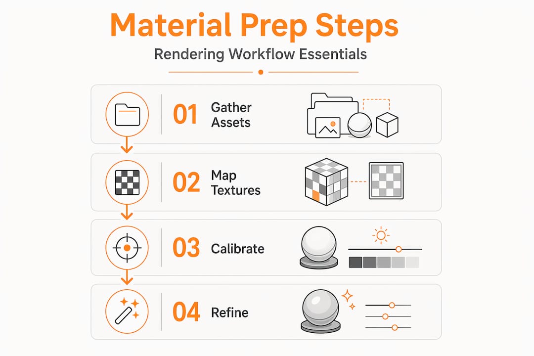
How to prepare project materials for rendering: foundational setup
Before you touch a single texture map, your working environment needs to be solid. The tools and assets you bring into a project directly shape how much control you have during rendering material preparation.
Core software you need in place:
- A modeling and scene tool such as Autodesk Revit, Blender, 3ds Max, or SketchUp
- A dedicated render engine (V-Ray, Corona, Lumion, or Cycles for Blender)
- A texture management tool or centralized asset library for storing and retrieving maps
- A reference image archive with physical material swatches or manufacturer specification sheets
Texture map types you must have ready:
- Albedo or Base Color map (the surface color without lighting information)
- Roughness map (controls how smooth or diffuse the surface appears)
- Normal or Height map (simulates surface geometry detail without adding polygons)
- Ambient Occlusion map (adds depth to crevices and contact shadows)
Hardware matters more than most designers acknowledge. Working with uncompressed 4K texture sets on a system with 16GB of RAM will cause slowdowns during preview renders, which leads to rushed decisions and material errors that compound later. If your hardware is constrained, use 2K textures during the modeling and UV phase, then swap to full-resolution maps at the calibration stage.
Pro Tip: Use a consistent naming convention for all materials from day one. A format like “Material_Type_MapType_Resolution” such as “Concrete_Polished_BaseColor_4K” prevents duplicate materials and makes collaboration significantly cleaner across teams.
Establishing a shared material library before the project begins is one of the highest-value organizational decisions you can make. When every team member pulls from the same validated asset pool, you eliminate version conflicts and cut material review time during quality checks.
Step-by-step rendering material setup guide
This is where most architectural and design professionals either win or lose realism. Follow this sequence to give your materials the best technical foundation.
-
Prepare your UV unwrap first. Before assigning any texture maps, unwrap your geometry and run a checker map validation. A checker map will immediately reveal stretching, seams, and scale inconsistencies. Fix these before moving forward. UV issues discovered after map assignment cost far more time to correct.
-
Establish texel density. All surfaces in the same scene should share a consistent texel density, meaning every surface gets roughly the same number of pixels per unit of real-world area. Inconsistent texel density is why some surfaces in a render look crisp while others look blurry, even when using the same resolution maps.
-
Assign your PBR maps in the correct order. Start with the Base Color or Albedo map. Then assign Roughness, followed by Normal or Height. A complete PBR map set including Base Color, Roughness, and Normal maps is what separates a believable material from one that reads as clearly digital.
-
Set color space per map type. This step is where most errors happen and where the damage is hardest to detect at a glance. Use sRGB for color maps and Non-Color for data maps like Normal and Roughness. Assigning sRGB to a Normal map will corrupt the directional data, making the surface appear to have incorrect surface detail under any lighting condition.
-
Scale textures to real-world references. A wood plank texture on a 3-meter-wide wall should tile to match what that wood grain would actually look like at that scale. If your texture tiling looks either too large or too dense, your UV scale is off relative to the physical dimensions of the surface.
-
Validate with a neutral lighting setup. Before adding scene-specific lighting, test your materials under a neutral HDRI or flat ambient light. This isolates material behavior from lighting effects and makes problems with reflectivity or color accuracy immediately visible.
Pro Tip: The validated order of operations for texture prep is prepare, map, calibrate, and refine. Catching UV seams, scale errors, and texture repetition at the calibration stage saves significant time compared to fixing them after lighting and camera work is complete.
Common pitfalls in rendering material preparation
Knowing what goes wrong before it happens is one of the most underrated professional skills. Here are the specific mistakes that appear consistently across architectural and real estate rendering workflows.
Using flat colors instead of texture maps. This is the fastest path to renders that look like 3D software rather than photographs. A painted wall is never a single flat color in reality. It has micro-variation in sheen, subtle surface imperfections, and tonal shifts. Even a simple diffuse texture with slight noise adds the variation that a flat color cannot.
Incorrect reflectivity on metal and glass. Realistic metal materials require 70 to 90 percent reflectivity, while glass transparency should be set between 50 and 70 percent, not 100 percent. Setting glass to full transparency makes it invisible in renders. Setting metal reflectivity too low makes it look painted rather than metallic. Both are immediate credibility killers in presentation-quality renders.
Skipping bump and normal maps. A surface without a Normal or Height map reads as perfectly smooth under any lighting condition. That works for polished marble or lacquered surfaces. It does not work for concrete, wood, fabric, or any porous material. The result is a plastic-looking surface that breaks the realism of an otherwise well-executed scene.
UV scale mismatches. A tile texture that repeats 40 times across a bathroom floor or a brick pattern that stretches across an entire facade are both the result of UV scale that has not been matched to real-world dimensions. This is one of the most common causes of poor material appearance even when the maps themselves are technically correct.
Debugging material errors is always faster when you isolate each material in a test scene before placing it in the full project. A simple gray plane with one material assigned and a neutral HDRI overhead lets you evaluate color accuracy, reflectivity, and surface detail without any interference from adjacent elements.
Real estate visualization has the added pressure of visual presentation accuracy, where material misrepresentation can undermine buyer confidence. Getting materials right is not just a technical goal. It directly affects the commercial value of the output.
Verification and quality assurance before final render
Reaching this stage with solid materials behind you means far fewer surprises during final render. Here is how to confirm everything is calibrated correctly before committing to a full-resolution output.
The single most effective verification method is the 1m x 1m reference plane test. Place a flat plane with dimensions of exactly one meter by one meter in your scene and apply the material to it. Compare the visual output to a physical swatch or manufacturer photograph at the same scale. If the texture grain, tile size, or surface pattern does not match the reference, your UV tiling needs adjustment.
| Verification check | What to look for | How to fix it |
|---|---|---|
| UV scale vs. real world | Texture repeats too many or too few times | Adjust UV tiling to match physical dimensions |
| Color accuracy | Colors appear washed out or oversaturated | Check and correct color space assignments |
| Reflectivity response | Surfaces appear too dull or mirror-like | Adjust Roughness values and check IOR settings |
| Normal map effect | Surface appears flat under directional light | Verify color space is set to Non-Color |
| Texture sharpness | Maps appear blurry at close camera range | Upgrade to higher resolution texture set |
After running individual material tests, check each material under both a neutral overhead light and a low-angle grazing light. Grazing light is particularly revealing for surface detail, it exposes any Normal map that is too subtle or any Roughness value that is too uniform.
Pro Tip: Adjust texture resolution and complexity by project phase rather than always working at maximum quality. Use lower-resolution maps for draft iterations and reserve full-resolution assets for final calibration and output. This preserves hardware resources and keeps iteration cycles fast.
The final verification step is a material response check under your actual scene lighting. Load your primary HDRI or artificial light rig and do a low-sample test render at 25 to 30 percent resolution. This gives you a reliable preview of how every material interacts with the real illumination environment without burning render time on a full pass.
For projects with complex material libraries, consider maintaining a dedicated architectural visualization guide that documents your material settings, UV strategies, and color space policies. This becomes a reference document for the entire team and dramatically reduces onboarding time on future projects.
What I’ve learned from thousands of renders
After working through over 1,000 projects at Rendimension spanning residential, commercial, and product visualization work, the single consistent truth I’ve found is this: material preparation is almost always treated as setup, when it should be treated as craft.
I’ve watched technically strong projects lose realism not because of bad geometry or weak lighting, but because someone assigned a Roughness map with the wrong color space and nobody caught it until the final output. The fix takes 30 seconds once you know what to look for. Finding it after six hours of render time feels very different.
The industry misconception I see most often is that more geometry means more realism. In practice, balancing material optimization against perceptual importance does more for perceived quality than polygon count does. A coarse mesh with a perfectly calibrated PBR material set will outperform a dense mesh with flat colors every time.
My honest recommendation is to build a personal material checklist that you run before every project phase transition. It does not need to be elaborate. A simple sequence covering UV validation, color space check, reflectivity test, and scale verification takes less than 20 minutes and prevents the majority of material errors I see across projects.
Skill development in this area also compounds faster than most people expect. Once you internalize the logic of how PBR maps interact, diagnosing material problems becomes almost intuitive. Invest in that understanding early and your rendering quality will reflect it in every project you deliver.
— Rendimension
Take your renders from solid to exceptional

Having well-prepared project materials gives you the foundation for a great render. Translating that foundation into a truly photorealistic visualization, especially for complex architectural or real estate projects, is where professional support makes a measurable difference. Rendimension’s team works with architects, developers, and design firms to take properly prepared assets and produce high-quality 3D renderings that meet the demands of marketing campaigns, investor presentations, and client approvals. If your project requires photorealistic walkthroughs, immersive visualizations, or detailed product renders, explore the full range of architectural visualization services available at Rendimension to see how expert material handling and rendering production elevates the final result.
FAQ
What materials are needed for rendering?
For any photorealistic render, you need at minimum a Base Color or Albedo map, a Roughness map, and a Normal or Height map. These three form the core PBR set that drives realistic surface appearance.
How do I organize project files for rendering?
Use a consistent folder structure that separates geometry, textures, and reference assets into clearly labeled directories. Apply a standardized naming convention to all materials to avoid duplicates and reduce errors across team members.
Why do my rendered materials look flat or plastic?
Flat materials are almost always caused by missing Normal or Height maps, incorrect Roughness values, or the use of flat solid colors instead of texture maps. Check that every surface has surface detail maps assigned and that Roughness is not set to zero.
What is the correct color space for texture maps?
Assign sRGB color space to Base Color or Albedo maps. Assign Non-Color (also called Linear) to all data maps including Roughness, Normal, Height, and Ambient Occlusion. Mixing these up causes incorrect light response and material accuracy issues.
How do I verify my materials before final rendering?
Place a 1m x 1m flat reference plane in your scene, apply the material, and compare the result to a physical swatch or manufacturer reference photo at the same scale. Then test the material under both neutral and grazing light to confirm surface detail and reflectivity are accurate.
Recommended
- How to prepare your project for stunning visualization results
- Step-by-Step Guide To Photorealistic Rendering Success
- How To Create 3D Renderings For Professional Projects