Importance of Lighting in Renderings for Architects

Importance of Lighting in Renderings for Architects

TL;DR:
- Lighting is the most influential factor in architectural rendering quality, shaping material perception and spatial feel. Properly balanced indirect and direct light, vertical illuminance, shadow management, and photometric data create realistic, convincing visualizations. Combining natural and artificial light enhances mood and accuracy, while deliberate contrast, hierarchy, and shadow depth improve viewer understanding and client approval.
Lighting is the single most influential variable in architectural rendering quality. It shapes how materials read, how spaces feel, and whether a client immediately understands a design or walks away confused. The importance of lighting in renderings goes far beyond placing a sun in the scene. It controls depth, mood, material perception, and spatial scale simultaneously. When lighting is handled with precision, a rendering communicates design intent without a single word of explanation. When it is handled carelessly, even the most detailed 3D model looks flat, unconvincing, and unprofessional.
How does lighting affect realism in architectural renderings?
Lighting defines whether a 3D architectural rendering reads as a real space or a digital model. The difference comes down to how light behaves physically within the scene, and how closely the rendering replicates that behavior.

The most important principle is the balance between direct and indirect light. Balanced lighting with 35%–65% indirect light creates the most visually comfortable and preferred spaces. That ratio matters because indirect light fills shadow areas naturally, the way bounced light does in real buildings. Scenes that rely too heavily on direct light look harsh and theatrical rather than architectural.
A less obvious but equally critical factor is where light lands. Vertical illuminance on walls and ceilings shapes spatial scale and comfort more than illumination on horizontal surfaces. Most 3D artists default to lighting the floor plane. Professionals prioritize the walls and ceiling because that is what the human eye uses to judge room size, warmth, and proportion.
Shadows are the other half of the equation. Proper shadow management adds depth and prevents the flat appearance that undermines otherwise strong models. Shadows define edges, separate planes, and give materials their three-dimensional character. A marble floor without shadow variation looks like a flat texture. With correct shadow casting, it reads as a polished surface with weight and reflection.
The technical tool that separates professional results from amateur ones is photometric data. IES photometric files ensure accurate light distribution by replicating the exact output profile of real-world fixtures. Generic point lights or area lights approximate behavior. IES files reproduce it. That accuracy reduces revision cycles and makes material validation far more reliable.
- Direct vs. indirect balance: Aim for 35%–65% indirect light to avoid harsh, unnatural contrast
- Vertical illuminance priority: Light walls and ceilings before floors to establish correct spatial scale
- Shadow depth: Use shadows to separate planes and give materials physical presence
- IES files over generic sources: Manufacturer photometric data produces accurate fixture behavior in the scene
Pro Tip: When setting up an interior scene, check your wall brightness before your floor brightness. If the walls are underlit, the space will feel smaller and darker than the design intends, regardless of how bright the floor appears.
What lighting techniques create strong visual hierarchy?
Visual hierarchy in a rendering is not accidental. It is the result of deliberate contrast ratios, shadow placement, and color decisions that guide the viewer’s eye to what matters most.
The foundational rule is the accent-to-ambient ratio. Accent lighting should be about three times brighter than the ambient light to create effective focal points. That 3:1 ratio is the difference between a feature wall that commands attention and one that blends into the background. Apply it to highlight architectural details, material transitions, or spatial anchors like a fireplace or a feature staircase.
A practical framework for building hierarchy is the 4 C’s of lighting: Contour, Contrast, Clarity, and Color. Each addresses a different layer of the visual experience.
- Contour defines the edges and form of architectural elements through directional light and shadow. Without contour lighting, columns, moldings, and facade details disappear into flat surfaces.
- Contrast separates foreground from background and creates the visual tension that makes a rendering feel alive. Low contrast reads as overcast and dull. Controlled contrast reads as intentional and designed.
- Clarity ensures that the viewer can read the space accurately. Clarity is not about brightness. It is about placing light where the design needs to be understood, such as on a kitchen countertop or a lobby reception desk.
- Color refers to color temperature and color rendering quality. Color rendering quality influences material perception significantly. A warm 2700K source reads differently on white marble than a cool 5000K source does. Getting color temperature right is not a finishing touch. It is a structural decision.
Over-illumination is the most common mistake that destroys hierarchy. Excess ambient light washes out contrast and reduces depth and mood. Lighting is a subtractive process. You build the scene with shadows and reveal it with light, not the other way around.
Pro Tip: Treat your ambient light as a floor, not a ceiling. Set it low, then build up with accent and fill sources. This approach preserves shadow depth and gives you precise control over what the viewer notices first.
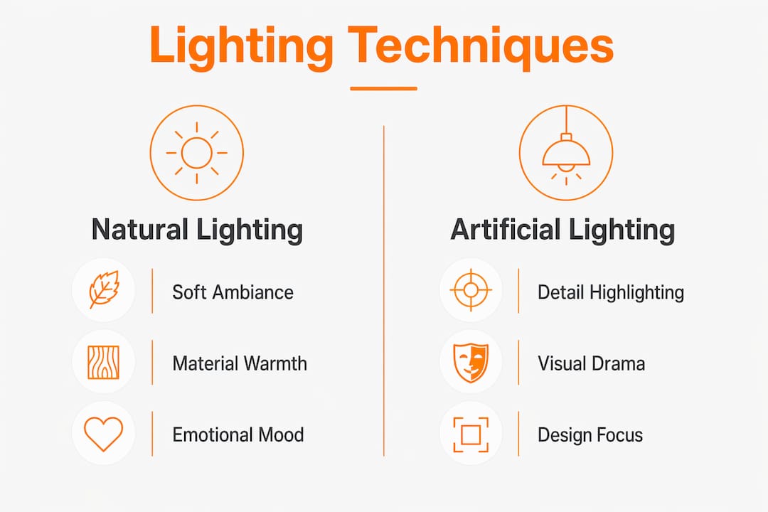
Natural vs. artificial lighting: which works better in renderings?
Neither natural nor artificial lighting is universally superior. Each serves a different purpose, and the most effective architectural renderings use both in combination.
Natural light simulation creates soft, ambient illumination that is particularly powerful for setting mood and ambiance. Daylight scenes communicate openness, warmth, and livability. For residential projects, a well-placed sun angle with accurate sky modeling can make a living room feel genuinely inviting. Natural light also interacts with materials in ways that feel familiar to clients, which accelerates their emotional connection to the design.
Artificial lighting serves a different function. It highlights architectural details, creates drama, and gives designers precise control over what the viewer sees. A recessed cove detail, a pendant over a dining table, or a wash of light across a textured stone wall all require artificial sources to read correctly. Artificial lighting also allows renderings to show night scenes and evening ambiance, which are often the most compelling images in a real estate or hospitality presentation.
| Lighting Type | Strengths | Best Use Cases |
|---|---|---|
| Natural | Soft ambiance, material warmth, emotional resonance | Residential interiors, daytime exteriors, lifestyle renders |
| Artificial | Precise control, drama, detail emphasis | Commercial spaces, night renders, feature highlights |
| Combined | Full realism, depth, and spatial accuracy | High-end residential, hospitality, pre-construction presentations |
The combined approach produces the most convincing results. Poor lighting increases eye strain and decreases occupant satisfaction in real spaces. Clients who review renderings with mismatched or unconvincing light sources lose confidence in the design before they ever see it built. Getting the lighting mix right is not just an aesthetic decision. It directly affects project approvals and stakeholder alignment.
For architects working with luxury residential projects, the interplay between natural and artificial sources is especially critical. These clients expect renderings that feel as considered as the architecture itself.
What are the most common lighting mistakes in renderings?
Most lighting failures in architectural renderings come from a small set of repeatable errors. Recognizing them is the first step to avoiding them.
- Flat ambient flooding: Setting ambient light too high eliminates shadow and contrast. The scene looks evenly lit but reads as lifeless. Reduce ambient intensity and let accent sources carry the visual weight.
- Ignoring shadow quality: Soft shadows from distant or diffuse sources look natural. Hard shadows from poorly placed point lights look artificial. Match shadow softness to the light source type and distance.
- Mismatched color temperatures: Mixing a 3000K warm source with a 6500K daylight source without intention creates an unpleasant, unrealistic color cast. Every light source in a scene should have a deliberate color temperature that supports the overall mood.
- Generic light sources instead of photometric data: Using default area lights or point lights instead of IES files for fixtures produces light spill and intensity profiles that do not match real fixtures. This makes material validation unreliable and increases revision cycles.
- Ignoring vertical surfaces: Underlit walls make spaces feel smaller and darker than designed. Prioritizing vertical illuminance corrects spatial perception and makes the rendering feel architecturally accurate.
The underlying principle behind all these mistakes is the same. Shadow quality and contrast are as vital as illumination for photorealistic results. Quantity of light alone does not equal quality. A scene with fewer, better-placed sources will always outperform a scene with many poorly considered ones.
For projects where shadow and contrast define the visual character, such as high-end residential builds with strong architectural geometry, these principles are not optional. They are what separates a presentation-ready rendering from one that requires multiple rounds of revision.
Key takeaways
Lighting quality in architectural renderings depends on deliberate control of indirect ratios, shadow depth, color temperature, and photometric accuracy, not on brightness alone.
| Point | Details |
|---|---|
| Indirect light ratio | Aim for 35%–65% indirect light to create natural, comfortable spatial perception. |
| Vertical illuminance | Prioritize walls and ceilings over floors to establish accurate spatial scale. |
| 3:1 accent ratio | Set accent lighting three times brighter than ambient to create clear visual hierarchy. |
| Shadow as a tool | Use shadow depth and contrast to define form and prevent flat, unconvincing renders. |
| IES photometric files | Replace generic light sources with manufacturer IES data to match real fixture behavior. |
Why lighting is the most underestimated decision in visualization
After completing over 1,000 projects at Rendimension, one pattern holds across every project type: clients rarely comment on lighting directly, but they always respond to it. When lighting is right, they say the rendering “feels real.” When it is wrong, they say something is “off” without being able to name it. That gap between perception and articulation is exactly where lighting does its work.
The insight that shapes how we approach every project comes from a principle we return to constantly: lighting should be experienced, not noticed. It is invisible architecture. When a client leans forward in a presentation and says “I can see myself living here,” that reaction is almost never triggered by the furniture or the finishes. It is triggered by the light.
What we have learned is that shadow management accelerates stakeholder alignment faster than any other single adjustment. A rendering with correct shadow depth communicates spatial hierarchy without explanation. The eye reads it immediately. Clients understand the design intent without needing a verbal walkthrough. That speed of comprehension shortens approval cycles and reduces revision requests.
The mistake most teams make is treating lighting as a final pass rather than a foundational decision. Color temperature, indirect ratios, and vertical illuminance need to be set before materials are finalized, not after. Changing the light source at the end of a project forces material re-evaluation across the entire scene. Building the lighting framework first means every material decision is made under the correct conditions.
Good lighting does not call attention to itself. It calls attention to the architecture. That is the standard every rendering should be held to.
— Rendimension
See the difference expert lighting makes in your renderings
Lighting decisions made early in the visualization process determine whether a project presentation lands or falls flat. Rendimension’s team builds every rendering on a foundation of accurate photometric data, deliberate indirect-to-direct ratios, and shadow management that reflects the actual design intent.
Whether you are presenting a luxury residential project or a large-scale commercial development, Rendimension’s professional 3D rendering services deliver photorealistic results that move clients from interest to approval. Every scene is lit with manufacturer IES data, calibrated color temperatures, and vertical illuminance priorities that make spaces read accurately and compellingly. Explore Rendimension’s full range of architectural visualization services to see how expert lighting transforms a 3D model into a presentation that closes deals.
FAQ
Why does lighting matter more than geometry in renderings?
Lighting controls how geometry reads to the viewer. A detailed model with poor lighting looks flat and unconvincing, while a simpler model with expert lighting communicates spatial quality and material character far more effectively.
What is the ideal indirect-to-direct lighting ratio for interior renders?
A ratio of 35%–65% indirect light produces the most visually comfortable and realistic interior scenes, according to a 2026 MDPI study on light distribution in interior spaces.
How do shadows improve rendering quality?
Shadows add depth, separate planes, and give materials three-dimensional presence. Without proper shadow management, surfaces read as flat textures rather than physical materials with weight and form.
What is an IES file and why does it matter in architectural visualization?
An IES file is a photometric data file from a fixture manufacturer that defines the exact light distribution profile of a real-world light source. Using IES files instead of generic lights produces accurate light spill and intensity, which improves material realism and reduces revision cycles.
How does color temperature affect a rendering’s impact on clients?
Color temperature determines how materials read and how spaces feel emotionally. A warm 2700K–3000K source makes residential spaces feel inviting, while a cool 5000K–6500K source reads as clinical or commercial. Mismatched temperatures create unrealistic color casts that undermine client confidence in the design.