Architectural presentation tips: Engage, persuade, and impress

TL;DR:
- Effective architectural presentations connect with diverse audiences by tailoring content and clarifying objectives. Clear layout, visual hierarchy, and strategic simplicity enhance understanding, supported by appropriate tools and confident delivery. Focusing on one primary idea per segment and practicing thoroughly increases persuasion and project approval success.
Crafting an architectural presentation that lands with every audience is one of the most underestimated challenges in professional practice. A stunning design can stall in approval because the presentation failed to connect, or a modest concept can win unanimous support simply because it was communicated with clarity and confidence. Whether you are pitching a residential development to private clients, defending a civic project before a planning jury, or aligning a construction team on technical specifications, the gap between a good project and a great presentation can determine real outcomes. This guide gives you practical, field-tested strategies to close that gap.
Table of Contents
- Define your audience and set clear objectives
- Master layout, visual hierarchy, and simplicity
- Choose the right presentation tools: Static boards vs. digital innovations
- Clarity in communication: Verbal delivery and documentation
- Our take: Why less is more in architectural presentations
- Take your presentations to the next level with Rendimension
- Frequently asked questions
Key Takeaways
| Point | Details |
|---|---|
| Know your audience | Customize every presentation to what each stakeholder values most. |
| Focus your visuals | Use grid systems, hierarchy, and clean layouts for visual clarity. |
| Choose the right tools | Pick between static or digital formats based on audience and context. |
| Communicate clearly | Practice delivery, use visual aids, and avoid jargon for better engagement. |
| Less is more | Curate content for impact, leaving out anything that doesn’t support your big idea. |
Define your audience and set clear objectives
Before you touch a single layout or render a single image, you need to know exactly who is sitting across the table. Different stakeholders hear the same information through completely different filters, and presenting without accounting for that is one of the fastest ways to lose a room.
Audience-tailored content means recognizing that clients focus on experience and benefits, juries on process and concept, and engineers on technical details. Those are fundamentally different conversations. A client wants to feel the space before it is built. A jury wants to understand your design thinking and whether the concept holds together intellectually. An engineer wants buildability, tolerances, and coordination. Using the same slide deck for all three groups is not efficient, it is damaging.
Setting clear objectives before you start building your presentation will save you hours of revision. Ask yourself: what is the single most important outcome of this session? Is it approval, feedback, funding, or sign-off? Each objective drives a different structure. Approval-focused presentations need strong emotional resonance and a clear call to action. Feedback sessions need open-ended framing that invites dialogue. Funding pitches need data, timelines, and risk management to be front and center.
Here are the key questions to answer before structuring any architectural presentation:
- Who is in the room, and what is their technical literacy?
- What decision do I need them to make by the end?
- What objections or concerns are they most likely to raise?
- What visual format will communicate most efficiently in this context?
- How much time do I have, and how should I allocate it?
Use your presentation checklist to confirm every element serves your defined objective before the final review.
Pro Tip: For jury panels, keep verbal sections to a strict five to seven minutes and let your visuals and physical models carry the weight. Juries respond to confident brevity, not exhaustive explanation.
Master layout, visual hierarchy, and simplicity
Once you know your audience and your objective, the next challenge is organizing your material so it guides the viewer through your story without confusion. This is where visual hierarchy and layout principles become essential, including grid systems, white space, and clean typographic structure to direct the viewer’s eye and ensure genuine readability.
Grid-based layouts are not just a design preference. They signal professionalism and discipline. A consistent grid means images align, text blocks have breathing room, and the viewer’s eye knows where to travel next. Breaking the grid should be intentional and rare, used only to create emphasis on a singular element that demands attention.

White space is one of the most misunderstood tools in visual design. Many architects feel the pressure to fill every inch of a board or slide with information, reasoning that more content justifies more value. The opposite is true. Dense layouts force the viewer to work hard, and tired viewers disengage. Strategic white space tells the viewer: this is important enough to stand alone.
The following table illustrates the difference between effective and ineffective board layouts:
| Element | Effective layout | Ineffective layout |
|---|---|---|
| Text quantity | Minimal, supporting visuals | Paragraphs competing with images |
| Image scale | One dominant hero image | Many small images of equal size |
| White space | Generous margins and padding | Packed edge-to-edge with content |
| Typography | 2 font sizes, clear hierarchy | Multiple fonts, inconsistent sizes |
| Color palette | Limited, purposeful accent colors | Random or overly bright colors |
| Flow | Logical left-to-right or Z-pattern | No clear reading direction |
Apply visualization best practices when preparing boards so your renders and drawings work with the layout rather than fighting against it.
Pro Tip: Follow the 7-7-7 rule for slide-based presentations: no more than 7 lines of text per slide, no more than 7 words per line, and one dominant idea per slide. This single discipline will transform even an average design into a compelling one.
Choose the right presentation tools: Static boards vs. digital innovations
With your layout principles in place, the next decision is medium. The format you choose must match the context, the audience, and the complexity of the project. Not every situation calls for cutting-edge interactivity, and not every jury room has a projector setup that supports high-resolution video.
Traditional static boards still hold real authority in certain settings. Physical boards carry a tactile presence that screens cannot replicate. Jury panels often appreciate the ability to walk past a pinned presentation and observe it from different distances. There is also no technical failure risk with a physical board. For academic reviews and urban planning hearings where physical artifacts carry symbolic weight, traditional boards remain the right choice.
Digital presentations, on the other hand, open the door to animation, real-time navigation, and remote access. Interactive 3D presentations let stakeholders explore spaces before construction begins, which dramatically accelerates buy-in from non-technical audiences. The ability to toggle between design options in real time during a client meeting turns a one-way presentation into a genuine dialog.
However, the risk with digital tools is overload. Too many animations, excessive transitions, and back-to-back 3D walkthroughs can overwhelm audiences and dilute the impact of your strongest assets.
“The most powerful presentations are not the ones with the most technology. They are the ones where every visual element earns its place. Ruthless curation separates presentations that communicate from presentations that confuse.”
Here is a quick comparison to help you decide which format fits your situation:
| Format | Best use case | Strengths | Drawbacks |
|---|---|---|---|
| Physical boards | Juries, academic reviews | Tactile, no tech dependency | Static, not updatable |
| Digital slides | Client briefings, team alignment | Easy to update, shareable | Requires reliable setup |
| 3D walkthroughs | Developer pitches, public consultations | Immersive, emotionally engaging | High production time |
| Interactive models | Large-scale or complex developments | Real-time exploration | Requires capable hardware |
| VR experiences | High-value residential or commercial | Unmatched spatial understanding | Cost and setup intensive |
Clarity in communication: Verbal delivery and documentation
Even the most visually spectacular presentation can fall apart if the delivery is uncertain. The spoken component of your presentation is where confidence and clarity become your most important assets, yet it is consistently the least rehearsed element in most architect’s preparation routines.
Clear verbal delivery means speaking confidently, avoiding technical jargon with non-specialist audiences, maintaining eye contact rather than reading from slides, managing your timing carefully, and closing with a distinct call to action or next step. Each of these elements requires deliberate practice, not just familiarity with your material.
AIA and RIBA both emphasize clarity in technical documentation and visual communication as defining characteristics of professional practice. That standard extends to verbal communication. Your documentation and your speech should tell the same story.
Follow these steps to build a polished verbal delivery:
- Script your opening sentence. The first 20 seconds set the tone. Write it out word for word and rehearse it until it feels natural.
- Build a verbal outline. Identify the three to five core points you must communicate regardless of how the conversation evolves.
- Rehearse with a timer. Practice your full delivery at least twice before the real event, and time each section.
- Eliminate filler phrases. Record yourself and listen back. Phrases like “basically,” “kind of,” and “um” undermine your authority.
- Prepare for Q&A. List the five most likely objections or questions and prepare concise, evidence-backed responses.
- Rehearse transitions. The moments between sections are where pacing breaks down. Smooth transitions keep the room engaged.
- End with a clear ask. Never close with “so that’s it.” State exactly what you need from the audience: approval, feedback, a follow-up meeting, or a decision.
Supporting your verbal delivery with precise architectural drawings gives technical stakeholders the documentation they need while your visuals engage the room emotionally. Strong documentation also demonstrates that the project is development-ready, which directly influences investor and client confidence.
Stat callout: Research across professional presentation contexts consistently shows that structured, rehearsed delivery significantly increases audience retention and decision-making confidence. Clarity is not a soft skill, it is a strategic advantage in every stakeholder meeting.
Our take: Why less is more in architectural presentations
Here is something most presentation guides will not tell you: the biggest risk in your next architectural presentation is probably not that you have said too little. It is almost certainly that you have said too much.
After reviewing hundreds of architectural presentations across residential, commercial, and civic project types, a clear pattern emerges. Ambitious architects and developers consistently overload their presentations. Extra concept boards, supplementary renders, extended technical appendices, multiple design alternatives presented simultaneously, all of these additions feel valuable to the presenter and create confusion for the audience.
The counterintuitive truth is that editing your presentation takes more skill and more courage than building it. Removing a slide you spent hours on requires real discipline. But every element you keep should earn its place by directly reinforcing the primary outcome of the session. Anything that does not serve that goal is not neutral, it actually works against you by diluting the impact of your strongest content.
The most persuasive presentations we have seen focus on one clear idea per segment. One spatial concept per section. One competitive advantage per slide. One emotional story rather than a catalog of features. Audiences remember one powerful thing far more reliably than they remember ten adequate things.
Applying visualization best practices is partly about what you include, but more importantly about what you are willing to leave out. That curation discipline is what separates presentations that win approvals from those that generate questions and delays.
Pro Tip: Before your final rehearsal, go through every section of your presentation and ask: “Does removing this hurt my primary objective?” If the honest answer is no, cut it. You will never regret making a presentation tighter.
Take your presentations to the next level with Rendimension
Putting these strategies into practice requires more than methodology. It requires visuals that genuinely match the quality of your design thinking. Flat drawings and low-resolution renders undercut even the best-structured presentation, while photorealistic imagery and immersive walkthroughs do the persuasive work before you say a word.
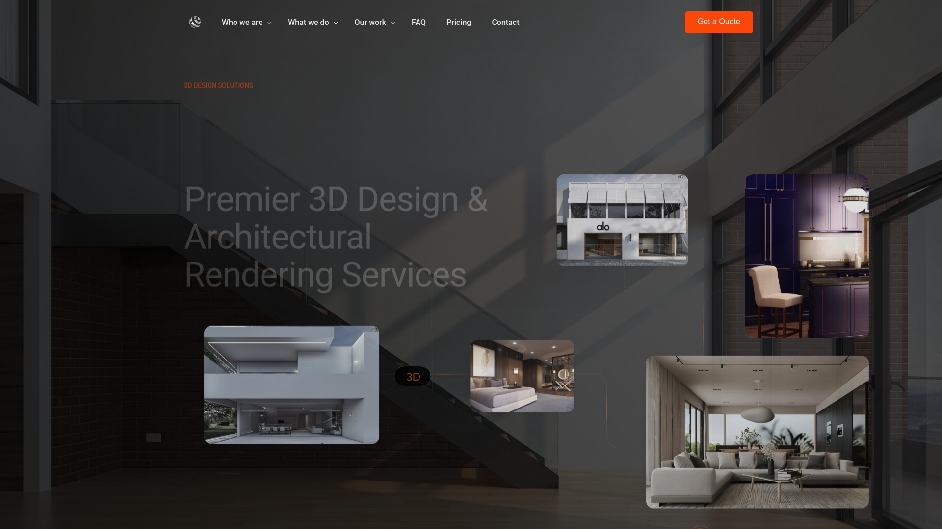
Rendimension’s 3D rendering services give your presentations the visual authority they need to impress clients, win jury reviews, and accelerate stakeholder approvals. From photorealistic still renders to fully navigable project walkthroughs, every deliverable is built around your specific presentation context and audience. With over 1,000 projects completed globally across residential and commercial developments, our team brings both technical precision and presentation strategy to every project. Explore our full range of visualization expertise and see how the right visuals transform your next pitch into your strongest one yet.
Frequently asked questions
What is the 7-7-7 rule in architectural presentations?
The 7-7-7 rule suggests each slide should contain no more than 7 lines of text, 7 words per line, and a single dominant idea, keeping information clear and preventing visual overload.
How should I tailor my architectural presentation for a jury vs. a client?
For juries, keep verbal sections short and let visuals lead; for clients, focus on experiential benefits and emotional storytelling rather than technical process.
What are common mistakes to avoid in architectural presentations?
The most damaging mistakes are visual clutter, excessive jargon, and failing to adapt content to the audience, all of which undermine the readability and impact of even a well-designed project.
Why is practicing the delivery important for architectural presentations?
Rehearsed verbal delivery sharpens clarity, builds audience confidence in your project, and ensures your key messages land consistently regardless of how the conversation evolves.
Recommended
- Step-by-step visual storytelling for architecture success
- Architectural Visualization Checklist For Flawless Presentations
- Present 3D Renderings To Clients: Boost Engagement 45%
- 7 Details Clients Notice First: Micro-Design Elements That Change Perc – BcardsCreation
- Tips on Designing Offices – Offices in Malta To Let & For Sale