Project Visualization Workflow: Architecture

Project Visualization Workflow for Architecture Pros

TL;DR:
- A project visualization workflow transforms raw project data into visual formats to improve communication and decision-making across stakeholders. Using appropriate tools like Esri ArcGIS, Autodesk DPD, Gantt charts, and Kanban boards, teams layered visuals tailored to specific audiences and purposes. Ensuring a common data environment and deliberate design choices minimizes errors and enhances clarity in project presentations.
A project visualization workflow is the structured method of representing a project’s progress, processes, and data visually to improve clarity, collaboration, and decision-making. For architects, real estate developers, and design professionals, this goes far beyond a color-coded Gantt chart. Tools like Esri’s ArcGIS dashboards, Autodesk’s Digital Project Delivery, and visual management methods like Kanban boards each address a different layer of project communication. This article gives you a tactical guide to selecting the right methods, building effective presentations, and avoiding the pitfalls that turn polished visuals into unusable noise.
What is a project visualization workflow and why does it matter?
A project visualization workflow translates raw project data into visual formats that different audiences can act on. In architecture and real estate, that means converting BIM models, schedules, cost data, and site progress into dashboards, timelines, and spatial views that stakeholders can read without a technical briefing.

The industry term for this practice in the AEC sector is visual project management, and it covers everything from high-level executive dashboards to daily task boards used by site teams. The distinction matters because the tools and design choices that work for a project director reviewing a 50-story development differ completely from what a construction manager needs on a Monday morning.
Getting this right has measurable consequences. Autodesk’s Digital Project Delivery connects people, data, and workflows in a secure cloud common data environment, reducing the versioning errors and interpretation drift that cause rework. When your visual workflow is built on unreliable or siloed data, every chart you produce is a liability rather than an asset.
How to define the purpose and audience for your visualization
Starting with purpose, message, and audience before selecting any tool or chart type is the single most important step in building a useful project visualization workflow. Stony Brook University’s data visualization guidance makes this explicit: the medium, the message, and the intended decision all shape what the visualization should look like before you open any software.
Ask three questions before you build anything:
- Who is the audience? An executive reviewing project health needs aggregated metrics with drill-down options. A project manager needs task-level detail and dependency visibility. A real estate investor needs progress tied to financial milestones.
- What decision should this visual support? Approvals, resource allocation, and client sign-offs each require different data and different formats.
- What medium will this be viewed in? A printed site report, a live web dashboard, and a video walkthrough each impose different design constraints. Color choices that read clearly on a monitor may fail entirely in print.
Inclusive design is not optional in professional practice. Color-blind friendly palettes, such as those using blue-orange contrast instead of red-green, make your visuals readable for a wider audience and signal attention to detail that clients notice.
Pro Tip: Run a quick feedback loop with one representative from each audience group before finalizing any visualization. Ask them to describe what the visual tells them. If their answer does not match your intended message, the design needs revision, not the audience.
Which visualization tools work best for architecture and design workflows?
The right tool depends on the question your visualization needs to answer. No single platform covers every layer of a complex architecture or real estate project, which is why the most effective teams use a layered approach.
BIM-linked dashboards with Esri ArcGIS
Esri’s ArcGIS workflow enables real-time 3D construction progress dashboards with indicator widgets that show project status in under 30 seconds. The platform links BIM data to filter widgets that let users drill into a 3D scene viewer by discipline, zone, or completion status. This is particularly powerful for large-scale commercial developments where spatial context matters as much as schedule data.
Autodesk Digital Project Delivery
Autodesk’s platform integrates multi-discipline live data covering BIM, GIS, cost, and schedule tracking in one cloud-based common data environment. The result is that every stakeholder accesses the same version of the project, reducing the interpretation drift that happens when teams work from different file versions. For real estate developers managing multiple consultants, this is the difference between a coherent project narrative and a weekly reconciliation exercise.
Kanban vs. Gantt: choosing the right visual management method
Gantt charts answer timing and dependency questions; Kanban boards support prioritization and work-in-progress limits for operational flow. They are not competing tools. They answer different questions.
| Tool | Best for | Strength | Limitation |
|---|---|---|---|
| Gantt chart | Phase planning, milestone tracking | Shows dependencies and timeline clearly | Can become cluttered on long projects |
| Kanban board | Daily task flow, team coordination | Visual WIP limits, fast status updates | No inherent timeline or dependency view |
| ArcGIS dashboard | Spatial progress, BIM-linked status | Real-time 3D context, executive-ready | Requires GIS expertise to configure |
| Autodesk DPD | Multi-discipline project data | Single source of truth, live updates | Higher setup and licensing investment |
Pro Tip: Combine Gantt and Kanban views in your workflow rather than choosing one. Use the Gantt for phase-level planning presentations to clients and executives, and run Kanban boards for the site team’s weekly execution. Both views feed from the same data source to stay synchronized.
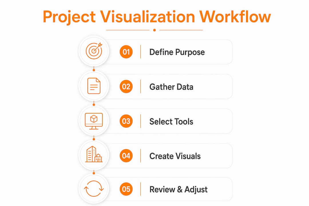
Step-by-step process for building an effective visualization presentation
Building a project visualization presentation that actually works in a client meeting or stakeholder review requires more than assembling charts. The process below applies whether you are building an ArcGIS dashboard for a construction site or a design review deck for a residential development.
- Establish a single source of truth. Before any visual is created, confirm that all project data lives in one common data environment. Autodesk’s Digital Project Delivery model demonstrates that repeatable and accurate visualization depends on stakeholders accessing the right information in the right format from one authoritative source.
- Select visualization types based on your defined purpose. A spatial progress report needs a 3D scene viewer. A schedule review needs a Gantt chart. A team standup needs a Kanban board. Matching the format to the question prevents the common mistake of using a visually impressive tool that answers the wrong question.
- Apply deliberate visual design choices. Status colors in BIM dashboards, such as green for complete, amber for in progress, and red for blocked, must be consistent across every view. Esri’s dashboard design uses indicator widgets and breakdown charts to give executives a simplified overview while allowing project managers to access detailed breakdowns.
- Build in progressive disclosure. Present aggregated metrics first, then allow drill-down by discipline or zone. This respects the cognitive time budget of senior stakeholders while giving technical reviewers the depth they need. A dashboard that opens on a single completion percentage with clickable zones is more effective than one that opens on 40 data fields.
- Add narrative and annotation. Guiding viewers through data narratives with annotations and background context improves comprehension beyond what static charts achieve. Label key milestones, flag anomalies, and include a one-sentence explanation for any metric that requires interpretation.
- Validate before presenting. Run the visualization past one technical reviewer for accuracy and one non-technical stakeholder for clarity. If either group cannot read it correctly in under two minutes, revise before the formal presentation.
Pro Tip: For client-facing presentations, export a static snapshot of your live dashboard as a PDF alongside the interactive version. Clients who review materials offline will not have access to your live data environment, and a static version prevents misinterpretation from outdated cached data.
Common challenges in project visualization workflows and how to solve them
Every team building a project visualization workflow hits the same set of problems. Recognizing them early saves significant rework.
- Data integration gaps. When BIM, GIS, cost, and schedule data live in separate systems, visualizations go stale within days. The solution is a common data environment, not a manual export process. Autodesk’s platform and Esri’s ArcGIS both offer integration pathways, but they require deliberate setup.
- Layer management in BIM visualizations. Publishing BIM data as 3D object scene layers loses the BIM discipline hierarchy, requiring manual layer organization and filtering strategies to maintain clarity. This is not a bug. It is a known trade-off that requires a deliberate naming convention and layer structure before you publish.
- Complexity overload. Adding every available data point to a dashboard does not make it more useful. It makes it unreadable. Modular dashboard design, where each view serves one audience and one question, is the most reliable fix.
- Audience mismatch. A visualization built for a project manager will confuse an executive and bore a site engineer. Separate views for separate audiences, fed from the same data source, solve this without duplicating effort.
“The most effective project visualization workflow integrates multi-disciplinary data into a secure, cloud-based common data environment, enabling collaboration and data-driven decisions.” This principle, drawn from Autodesk’s Digital Project Delivery model, applies equally to a two-person design studio and a 200-person construction program.
For architecture and real estate professionals preparing projects for visualization, the preparation steps you take before building any visual are as important as the tools you choose.
Key takeaways
A project visualization workflow succeeds when it starts with a defined audience and purpose, draws from a single source of truth, and layers complexity progressively from executive overview to operational detail.
| Point | Details |
|---|---|
| Start with audience and purpose | Define who will use the visualization and what decision it must support before selecting any tool. |
| Use a common data environment | Platforms like Autodesk Digital Project Delivery eliminate versioning errors and keep visuals current. |
| Layer Gantt and Kanban views | Use Gantt charts for phase planning and Kanban boards for daily execution, fed from the same data. |
| Apply progressive disclosure | Present aggregated metrics first, then allow drill-down to prevent cognitive overload for senior stakeholders. |
| Validate with real users | Test every visualization with one technical and one non-technical reviewer before formal presentation. |
What we have learned from 1,000+ visualization projects
The most common mistake we see in architecture and real estate visualization is not a technical one. Teams spend weeks configuring ArcGIS dashboards or building elaborate Gantt charts, then present them to clients who cannot read them in a meeting room without a guided tour. The visual is polished. The communication fails.
The fix is not a better tool. It is a better starting question. At Rendimension, every project begins with the same two questions: who is looking at this, and what do you need them to do after they see it? That discipline, borrowed directly from data visualization best practices, prevents the “pretty but unusable” outcome that wastes budget and erodes client trust.
We have also seen firsthand that the teams with the most effective workflow visuals are not necessarily using the most sophisticated platforms. They are the ones who maintain a genuine single source of truth. When your BIM model, your schedule, and your cost data all update from one environment, your visualization is always current. When they do not, you are presenting a snapshot that may already be wrong by the time the meeting starts.
The other insight worth sharing: non-technical stakeholders respond better to narrative than to data density. A 3D walkthrough with annotated milestones and a one-sentence status summary per zone communicates more in three minutes than a 40-row Gantt chart does in thirty. Combining architectural visualization techniques with structured workflow data produces presentations that clients remember and act on.
— Rendimension
How Rendimension enhances your project workflow presentations
Rendimension specializes in photorealistic 3D renderings and immersive visual experiences built specifically for architecture, real estate, and design professionals. When your workflow data tells the story of a project’s progress, Rendimension’s 3D rendering services give that story the visual weight it needs to move stakeholders from review to decision.
From detailed architectural visualization to immersive 3D walkthroughs and VR experiences, Rendimension transforms project data and design concepts into presentations that clients and investors can see themselves in. With over 1,000 projects completed globally across residential and commercial developments, the team works collaboratively from concept to final delivery. If your next project presentation needs to do more than inform, explore what Rendimension can produce for your workflow.
FAQ
What is a project visualization workflow?
A project visualization workflow is the structured process of converting project data, including schedules, BIM models, and progress metrics, into visual formats that support communication and decision-making across different stakeholder groups.
Which tools are best for visual project management in architecture?
Esri’s ArcGIS dashboards work well for BIM-linked spatial progress views, while Autodesk’s Digital Project Delivery suits multi-discipline data integration. Gantt charts and Kanban boards address timeline planning and daily task flow respectively.
How do you visualize project progress for non-technical stakeholders?
Use progressive disclosure: open with a single aggregated status metric, then allow drill-down by zone or discipline. Add annotations and a brief narrative summary so viewers understand context without needing a technical briefing.
Why does data integration matter for workflow visualization?
Without a common data environment, visualizations reflect outdated or conflicting data. Autodesk’s research shows that a shared data source reduces versioning errors and interpretation drift, making every visual more reliable and every decision better informed.
How often should project visualization dashboards be updated?
Live dashboards connected to a common data environment update continuously. For static presentations, update before every formal stakeholder review. Presenting a visualization that is more than one reporting cycle old risks decisions based on inaccurate project status.