Construction Visualization for AEC Pros

Construction Visualization Examples for AEC Professionals
TL;DR:
- Construction visualization transforms architectural data into compelling visual content to communicate project details effectively. Techniques like photorealistic renders, immersive walkthroughs, and live dashboards enhance decision-making, stakeholder engagement, and project tracking. Choosing the appropriate method depends on project stage, audience, and communication goals, with proper BIM model prep being essential for quality output.
Construction visualization is the practice of converting architectural drawings, BIM data, and construction schedules into compelling visual content that communicates design intent and project status to every stakeholder in the room. The best construction visualization examples today include photorealistic 3D renders, immersive walkthroughs, and live progress dashboards built from tools like Enscape, V-Ray, and ArcGIS Online. These outputs do more than impress clients. They accelerate decisions, reduce costly misunderstandings, and give developers a competitive edge in pre-sales. This article covers the most effective visualization techniques in construction, with concrete examples, software context, and direct comparisons to help you choose the right approach for each project phase.
1. Immersive 3D walkthroughs as architectural visualization examples
A 3D architectural walkthrough is a navigable or pre-rendered video sequence that lets clients experience spatial flow, scale, and atmosphere before a single foundation is poured. Photorealistic walkthroughs accelerate off-plan sales by enabling clients to emotionally connect and understand spatial relationships before construction. That emotional connection is what separates a signed contract from a “we’ll think about it.”
Two formats dominate the field. Pre-rendered walkthroughs, produced in V-Ray or Corona Renderer, deliver cinematic quality with controlled lighting, vegetation animation, and environmental effects. Real-time walkthroughs, powered by Enscape embedded within Revit or SketchUp, allow instant design iteration during live client sessions without separate export steps. Each format serves a different moment in the project lifecycle.
Cinematic quality comes from camera path design, not just render settings. Composing camera paths with easing curves and planned narrative arcs transforms a walkthrough from a technical flythrough into a story about how people will live or work in the space. A well-paced sequence moves from the street approach to the entry sequence to the primary living areas, building anticipation at each cut.
- Pre-rendered walkthroughs: best for marketing launches, investor decks, and planning authority submissions
- Real-time walkthroughs: best for design review sessions, live client feedback, and VR presentations
- Cinematic techniques: atmospheric haze, time-of-day lighting, and animated occupants increase realism
- Camera height: set at 5.5 feet to simulate human eye level and reinforce spatial scale
Pro Tip: Lock your primary camera angles before the modeling team begins detailing. Geometry outside the camera frame does not need the same polygon density, which cuts production time significantly without sacrificing final image quality.
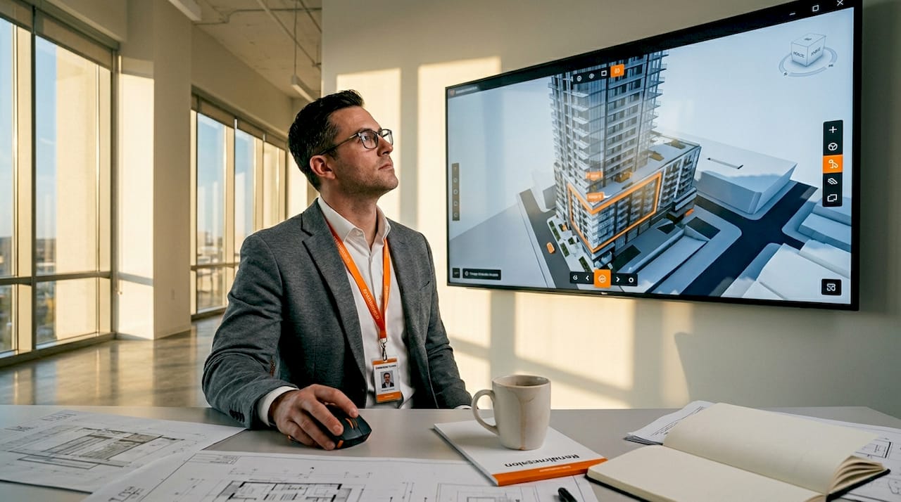
2. 3D construction progress dashboards for real-time project tracking
A 3D construction progress dashboard combines BIM geometry with live project data to give every stakeholder a single, accurate picture of where the build stands today. A BIM and ArcGIS dashboard integrates live data for interactive progress visualization, enabling users to understand project status in under 30 seconds. That speed matters enormously in weekly executive reviews where time is limited and decisions are expensive.
The technical pipeline starts in Autodesk Revit, where the BIM model carries status attributes for each element. Those attributes feed into ArcGIS Online, where color-coded symbology maps construction phases visually onto the 3D model. Green elements are complete, yellow are in progress, and red are behind schedule. Filtering by zone or trade discipline lets project managers isolate exactly the information they need without scrolling through spreadsheets.
Dashboards consolidate multiple discipline data layers into a live, interactive 3D visualization with editable status fields, providing a shared visual layer accessible via URL that removes meeting dependencies entirely. A field supervisor can update a status field on a tablet, and the executive team sees the change reflected in the dashboard within minutes.
Key features that make these dashboards effective:
- Color-coded status symbology mapped directly onto 3D building geometry
- Phase and zone filtering to isolate specific trades or construction sequences
- Live data feeds from Revit BIM models updated by field teams
- URL-based sharing so all stakeholders access the same version simultaneously
Pro Tip: Simplify dashboard interfaces for non-technical stakeholders by displaying only three to five key metrics alongside the 3D model anchor. Focused dashboards with few metrics greatly improve comprehension for executives and clients who are not BIM-trained.
3. Photorealistic exterior and interior 3D construction renders
Photorealistic architectural renders are still images produced at high resolution that depict a building’s exterior or interior with the visual accuracy of professional photography. 3ds Max combined with V-Ray or Corona remains the dominant pipeline for photorealistic architectural visualization, offering decades of material library support and advanced lighting capabilities. This pipeline is the industry benchmark for a reason: the output is indistinguishable from photography when executed correctly.
The foundation of photorealism is Physically Based Rendering, or PBR. PBR materials simulate how light interacts with real-world surfaces, whether that is the micro-roughness of brushed concrete, the reflectivity of low-e glass, or the translucency of stretched fabric. Pairing PBR materials with an accurate sun position, HDRI sky lighting, and artificial light sources placed where fixtures actually sit produces images that hold up under client scrutiny at full resolution.
Rendering times for a single high-resolution architectural frame range from 15 minutes to several hours depending on scene complexity, with animations multiplying this time by frame count. This production reality means that render farm services and efficient scene optimization are not optional luxuries. They are standard practice on deadline-driven projects.
Post-production is where good renders become great ones. Post-production in Photoshop, used by 68% of professionals, refines raw renders with color grading, atmospheric effects, and compositing for polished final images. Rendering in separate passes, such as diffuse, reflection, and shadow layers, gives the compositing artist precise control over each visual element without re-rendering the entire scene.
Pro Tip: Render your exterior shots at three times of day: golden hour, overcast midday, and dusk with artificial lighting active. Each version serves a different marketing context and gives your client a choice without tripling your modeling work.
4. Comparing visualization techniques: strengths and best use cases
Choosing the right visualization format is a strategic decision, not a stylistic one. The table below maps the three primary construction visualization techniques against the criteria that matter most to AEC professionals.
| Technique | Visual fidelity | Interactivity | Best project stage | Primary audience |
|---|---|---|---|---|
| Photorealistic still render | Very high | None | Pre-sales, planning approval | Clients, investors, authorities |
| Pre-rendered 3D walkthrough | High | Low | Marketing launch, investor pitch | Buyers, developers, media |
| Real-time walkthrough (Enscape) | Medium-high | High | Design review, live client session | Architects, clients, project teams |
| BIM progress dashboard | Medium | Very high | Construction phase | Project managers, executives |
| VR immersive experience | High | Very high | Premium sales, design validation | High-value clients, design teams |
Still renders deliver the highest image quality per asset but offer no interactivity. Pre-rendered walkthroughs add narrative and motion but are fixed once exported. Real-time tools like Enscape sacrifice some visual fidelity in exchange for the ability to change materials, time of day, or camera position on the fly during a client meeting. Progress dashboards are not marketing tools at all. They are operational tools that happen to use 3D geometry as their interface.
The emerging trend worth tracking is VR for immersive experiences. Headset-based presentations using Oculus Quest 2 or similar hardware place clients inside a 1:1 scale model of the building before it exists. For premium residential and high-end commercial projects, this format commands attention and justifies premium pricing in a way that flat screens cannot replicate.
Pro Tip: Use mixed visualization approaches on complex projects. A photorealistic render suite handles the marketing campaign, a real-time walkthrough runs the design review, and a BIM dashboard manages construction. Each tool does one job exceptionally well.
5. Real-world construction project visualization examples that delivered results
The most instructive construction visualization examples are the ones where the output changed a project outcome, not just impressed a client. The Landmark Villa project in North Mauritius is a documented case. A strategically designed visualization package achieved 93% visual clarity and 65% faster stakeholder alignment. The team used dramatic, site-specific framing to convince planning authorities that the structure integrated sensitively with a protected coastal environment. The visualization did not just show the building. It made an argument.
Cinematic walkthrough projects in the luxury residential sector consistently demonstrate that atmospheric storytelling drives emotional engagement. A shift toward cinematic visual narratives creates emotional resonance with clients, which is crucial for premium real estate pricing. When a walkthrough opens with morning light filtering through a floor-to-ceiling window and moves through a kitchen designed around a specific lifestyle, buyers stop comparing floor plans and start imagining their lives in the space.
BIM-to-dashboard implementations on large commercial projects show a different category of benefit. Teams that deploy live ArcGIS dashboards report fewer status meetings, faster executive sign-off on phase completions, and a significant reduction in the “I didn’t know that was behind schedule” conversations that derail projects. The visualization does not replace project management. It makes project management visible to everyone simultaneously.
Key lessons from these examples:
- Visualization selection should match the decision being made, not the technology available
- Site-specific framing and environmental context increase approval rates with planning authorities
- Cinematic storytelling in walkthroughs correlates directly with faster sales cycles in premium markets
- Live dashboards reduce information asymmetry between field teams and executive stakeholders
Selecting a visualization vendor requires evaluating architectural understanding, not just software skills. Camera angle selection, lighting balance, and narrative structure reveal whether a studio understands architecture or just operates software. The difference shows in every frame.
6. How BIM geometry quality affects visualization output
BIM models built for coordination and clash detection are not automatically ready for photorealistic visualization pipelines. BIM models require significant geometry cleanup before use in high-end architectural visualization to avoid artifacts and achieve photoreal quality. This is one of the most overlooked steps in construction visualization step by step workflows, and it is where many projects lose time and budget.
Revit models carry duplicate faces, non-manifold geometry, and construction-phase elements that are invisible in plan but create visual noise in renders. A visualization studio’s first task is to audit the model, strip unnecessary geometry, and rebuild surfaces that will appear in camera. This process, sometimes called “visualization prep,” can take 10 to 20 percent of total project time on a complex commercial building.
The practical implication for architects and project managers is to plan for this step explicitly. Provide the visualization team with a model export that includes only the elements relevant to the views being produced. Separate the structural model from the MEP model. Flag which materials are confirmed and which are still under review. These inputs directly determine how quickly the visualization team can move from model receipt to first draft images.
For federal and regulatory submissions, where visualization packages must meet specific accuracy and documentation standards, clean BIM geometry is not optional. It is a submission requirement that affects approval timelines.
Key takeaways
Construction visualization works best when the format matches the decision being made, not the technology that happens to be available on the project.
| Point | Details |
|---|---|
| Match format to decision | Use still renders for approvals, walkthroughs for sales, and dashboards for construction tracking. |
| Cinematic storytelling drives sales | Atmospheric walkthroughs create emotional resonance that accelerates buyer decisions in premium markets. |
| BIM cleanup is non-negotiable | Revit models need geometry prep before entering any photorealistic visualization pipeline. |
| Dashboards replace meetings | BIM-to-ArcGIS dashboards give all stakeholders live project status, reducing information gaps. |
| Vendor selection requires architectural judgment | Evaluate studios on camera angle choices and storytelling quality, not just software credentials. |
What Rendimension has learned from 1,000+ visualization projects
The most common mistake we see from architecture and development teams is treating visualization as a single deliverable rather than a communication strategy. A project needs different visual outputs at different stages, and the teams that plan for this from the start consistently get better outcomes than those who commission a render package at the last minute before a sales launch.
The shift toward cinematic and immersive formats is real and accelerating. Clients who received a set of still renders five years ago now expect a walkthrough at minimum, and the most competitive developers in markets like Miami, New York, and Dubai are moving toward full VR presentations for high-value units. This is not a trend driven by novelty. It is driven by results. Immersive formats close deals faster.
One observation that does not get enough attention: the best visualization work comes from studios that ask hard questions about the project before they open any software. What decision does this image need to support? Who is the audience? What is the emotional story of this building? A studio that starts with camera angles before understanding the project’s narrative will produce technically competent work that fails to move anyone.
Our recommendation for teams selecting a 3D visualization partner is to review their portfolio specifically for projects similar to yours in type, scale, and market. A studio that excels at luxury residential may not understand the communication needs of a mixed-use transit-oriented development. Portfolio specificity is the most reliable signal of relevant expertise.
— Rendimension
See your project through Rendimension’s lens
Rendimension has delivered over 1,000 architectural visualization projects across residential, commercial, and mixed-use developments globally. The team specializes in photorealistic 3D rendering and immersive 3D walkthroughs that give architects, developers, and real estate professionals the visual assets they need to win approvals, close sales, and align project teams. Every project begins with a detailed brief review to match the visualization format to your specific communication goals. If your next project needs visuals that work as hard as your design does, contact Rendimension to discuss a tailored visualization package built around your timeline and stakeholder requirements.
FAQ
What are the most effective construction visualization examples?
The most effective examples combine photorealistic still renders for marketing and approvals, 3D walkthroughs for client engagement, and BIM-integrated dashboards for construction phase tracking. Each format serves a distinct communication purpose within the project lifecycle.
How long does a photorealistic architectural render take to produce?
A single high-resolution frame takes between 15 minutes and several hours depending on scene complexity, with animations multiplying this time by total frame count. Render farm services and efficient scene preparation are standard practice on deadline-driven projects.
What software is used for construction visualization?
The dominant pipeline for photorealistic work is 3ds Max with V-Ray or Corona. Enscape is the leading real-time option for live client sessions embedded within Revit or SketchUp, and ArcGIS Online handles BIM-to-dashboard integration for construction progress tracking.
When should a project use a 3D walkthrough instead of still renders?
Use a 3D walkthrough when the goal is emotional engagement, spatial understanding, or off-plan sales. Still renders are more appropriate for planning authority submissions, print marketing, and investor decks where a single definitive image carries more weight than motion.
How do BIM models connect to construction progress dashboards?
Revit BIM models export geometry and status attributes into ArcGIS Online, where color-coded symbology maps live construction data onto the 3D model. Stakeholders access the shared visual layer via URL and see real-time updates without attending status meetings.